Just a couple of days ago, Instagram announced their latest iPhone app called ‘Layout.’
On their blog, Instagram describe ‘Layout’ as an app that: “lets you easily combine multiple photos into a single image. It’s fun, it’s simple and it gives you a new way to flex your creativity.’
While Instagram are definitely not the first ones to go into the collage business, you can be sure that by them introducing this new opportunity we are going to see an overflow of new collages created by users and brands.
In this post I want to give you a quick introduction of ‘Instagram Layout’ and how you can use it for your marketing efforts.
Introduction and first use
‘Layout’ is super simple and intuitive to use.
Here are the basics you need to know about:
If you’re unfamiliar with collage apps, they basically allow you to take multiple photos and combine them into one photo using different layout.
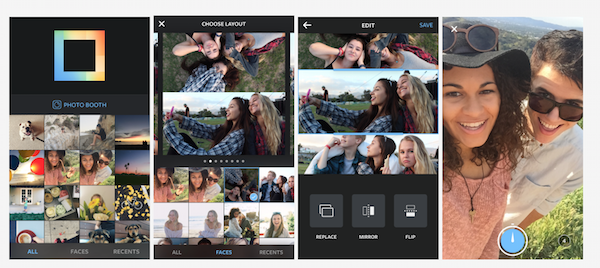
When you open Instagram’s new app, you are presented with images from your camera roll. When clicking on the image a list of pre-made collage layouts will appear, showing you a preview.
After you choose the template you want to work with, you can do whatever you want with it – the usual pinch to zoom, adjust section sizes, flip and rotate photos within the collage etc.
Another feature you can use is ‘photo booth.’ This feature basically allows you to use the front camera to upload a selfie as a part of the collage.

Instagram Layout – Taken from the Instagram blog
4 Ways you can use Instagram Layout for marketing
Since the app was launched (March 28, 2015), there aren’t any real world case scenarios of using the app for marketing. So i’ve created a few examples for inspiration.
1. Show features or product category
Let’s say you have a product with multiple related features, or several products under the same categories and you want to promote them together – creating a collage is a great way to do so.
For example, Noha Kegan’s SumoMe have some really great WordPress plugins that are amazing for bloggers to use.
In terms of functionality, SumoMe have four great plugins to help you build your mailing list. ‘List builder,’ ‘Leads,’ ‘Scroll Box,’ and ‘Smart Bar.’
Using ‘Layout’ he can easily put them all together into a great collage of ‘List Building’ Plugins and market them as a bundle on Instagram and Twitter.
For example:

The SumoMe bundle
Another example is having a coffee brand. You want to sell bundles of capsules based on the ones you know your customers love using ‘Layout’ you can simply add them all in to one simple image.

The Espresso Example
Pro tips:
- Make sure the relations between products is understandable.
- They need to make sense as a bundle.
- All images in the collage should relate to the same target audience.
- Tell a story flow (image 1 leads to 2 etc.).
2. ‘Layout’ makes creating comic strip-like images very easy
By adding a series of images, you can create a story about your product or brand in a way your readers and followers can relate to.
Here’s a quick example – How to install an app update on your mac:
Pro tip:
Make sure your story is self explanatory, or at least amusing to watch.
3. Show your product from different angles (Great for Ecommerce sites)
As amazon will tell you, showing your products from as many different angles as possible, helps your potential users feel more familiarised with the product, and can encourage them to buy it.
Using ‘Layout’ you can simply add some images of your product into one collage, teasing potential customers to find out more about your product on your site.
For example, we just got a new Nespresso machine for the office (Leah and Dan are coffee lovers while i’m a bit of an addict).

Show your product from different angles
Pro tip: Make sure the angles of your pictures are flattering to your product, and are the angles your users actually experience or care about when buying the product.
4. Show a process
I don’t know about you, but I’m huge fan of seeing processes in motion. I love seeing the step by step of a process of a produce, or a ‘how to.’
Collages are a great way to summarize short visual processes.
For example, last week I gave a talk on creating converting landing pages that convert and actually build a mockup wireframe during the talk.
I could’ve easily showcase the process in a simple collages such as this:

The landing page Wireframe process
Pro Tip: How to create a good process collage?
- Focus on one message or story you want your users to experience.
- Make sure every image captures the essence of each step.
- Have an impressive final image.
Conclusion
Looking at past tendencies – if Instagram are trying to encourage users to create and share collages, this new trend will arise soon enough.
In order to leverage this new marketing and trend opportunity, you have to move fast.
What do you think of Instagram’s new app? How will you use it in your marketing efforts?
(262)
Report Post


