Columnist Brian Rigney offers three ways for retailers to deliver rich consumer experiences in the moments that matter.

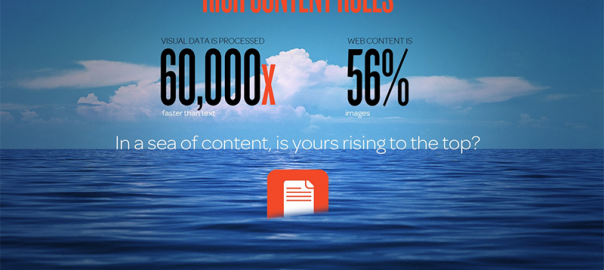
There was a time when content was king, when content ruled the airwaves and was the hook by which brands fished for consumers. But today, content is a sprawling ocean, and consumers aren’t swimming in it; they are drowning in waves of undistinguishable content.
Yet still, brands need to catch these people and reel them in — but they only have tiny windows of opportunity to do it: They have moments. And they have to make the moments matter.
Time is a scarce resource to most people, and in a world awash with content, they no longer have time to really consume. Instead, any brand wanting to attract the attention of a putative customer needs to look at delivering “instant digital gratification” in that moment as they sail past.
It is all about delivering the best possible customer experience, instantly. In 2014, MIT neuroscientists showed how the brain is capable of identifying images seen for as little as 13 milliseconds. Elsewhere, an oft-quoted 3M report suggests that humans process visual data 60,000 times faster than text.
Consumers clearly respond to images. For brands, this means that the tiniest of moments of exposure to memorable creative content provide the all-important recall. Beyond recall, brands — particularly retail brands — need to focus on the ways that the initial engagement begins a user journey that ends in transaction.
How To Deliver Instant Digital Gratification
So what is the key to being fast and instantly engaging and gratifying?
Richness.
Savvy retailers invest in product images — a hero shot that displays a product in its best possible light to encourage the consumer to engage. But richness takes that logic a step further, balancing visual impact with easy consumption.
Richness is about immersing the consumer in powerful images and combining that experience with intuitive design elements, such as making that initial experience transactional with a shop the look or a buy now button displayed during the first moments that a consumer visits your site.
A tall order? Well, yes. It is pretty much marketing nirvana, but it can be done. There are essentially three basic steps that you need to get right to deliver this rich, readily accessible and engaging experience — instant digital gratification — and it is already proving itself with some forward-thinking retailers as a way to drive the bottom line.

Start With The Endgame
So where to start with moving to a rich and instantly engaging experience? It is fundamental to ask yourself what it is that you want your consumers to do. Usually, that’s to buy something, but there may be other priorities such as building social sharing, gathering data or introducing loyalty.
Whatever the desired outcome, it is essential to build around it from the critical moment that the consumer first gets hooked by your site and then bake that logic into all of your design decisions.
Balance Visual Impact With Ease Of Consumption
Richness is all about images — images account for about 56 percent of website content and, as research shows, are a much more immediate hook than text. Fifty-five percent of all page views on the Web get less than 15 seconds of attention, so using rich graphics and videos that engage and connect with the audience are essential.
Alongside the judicious use of text, rich creative executions need to be kept in balance to avoid the destroyer of many positive digital experiences: page bloat.
The average top 1,000 Web page is 1,795KB in size — and that average has grown by 20 percent in just six months and by 186 percent since 2010. The increase in page size can add up to a slow load time and a negative user experience.
We are in danger of bombarding consumers with content while at the same time jeopardizing our original intent — to deliver a rich, positive brand experience. And with an ever-growing number of consumers coming online via a mobile device, the speed of network connectivity and its ability to allow pages to load instantly is a real curve ball.
Additionally, a reported 47 percent of consumers expect a website to load in two seconds or less, and 40 percent abandon a website if it takes more than three seconds to come into view. So consumers need speed as well as richness if you are to attract and engage them in the moment.
Familiarity And Uniqueness
It’s a perpetual problem for CMOs: how to stand out from the crowd in terms of design and user journey while at the same time creating an experience that is familiar and follows a clear navigational logic.
The standard approach is to use templates in the design process to achieve familiarity — from hero image to a (sometimes endless) grid of product images within a few straightforward clicks. All too often, this process drops the consumers in an experience that displays too much loosely related product, and worse, if they hit the back and forth buttons, they are dropped back at the start of the grid page.
This template approach is not acceptable in the rich world. Instead, aim for a design that seamlessly takes users where you want them to go. This means keeping consumers immersed in a rich experience for as long as possible — and making it easy for them to jump to the checkout instantly in a way that is both familiar and in context to the user’s actions and expectations, while unique enough to be memorable.
With richness, experience is everything. Adobe and Econsultancy’s Quarterly Digital Intelligence Briefing in January 2015 found that 22 percent of digital marketers see user experience as the most exciting trend of the year.
Delivering the experience across every touchpoint — omnichannel — is as much about people as it is about channels. Being rich means delivering immersive, even playful, user experiences across every digital touchpoint.
The best content experiences are aspirational, easy for the consumer to use and commerce enabled, allowing users to shop the look, not just see the hero banner and then shop the grid. And in general, the longer the exposure to beautiful, inspiring creative, the more positive the brand experience and the more likely the consumer is to convert to a sale.
Why invest in rich assets as the hook when they can be hook, line and sinker?
Some opinions expressed in this article may be those of a guest author and not necessarily Marketing Land. Staff authors are listed here.
(Some images used under license from Shutterstock.com.)
Marketing Land – Internet Marketing News, Strategies & Tips
(224)
Report Post


