There are two types of people in this world – those who visit nearby farmers’ market to purchase their apples and those who wait in long queues outside stores to get their hands on the next Apple release.
Release of the first generation iPhone introduced innovative features such as a touch screen interface and a virtual keyboard to revolutionize the modern smartphone industry – initiating the smartphone era. Every year, Apple brings forward the new and improved Apple devices and sales begin with a bang!
Similarly, emails have also been a rage among marketers around the globe ever since the addition of HTML and CSS properties have made them…’Mailable Microsites!’ As a movement to combine design with function, Apple’s native email client has been the leading email client (with 52% market share) to support it.
What makes an interactive email a ‘Mailable Microsite’?
It’s the age of mobiles. Subscribers no longer wait to go through their inbox on their desktops and instead open their emails from their mobile devices. With the heap of emails flooding their inbox, the overall attention span for going through different emails is just 3 seconds. So how can email marketers stand out of the competition?
By increasing the user interactivity within the emails, your subscribers tend to spend more time with your emails and this in turn helps in conversion and progression through the sales funnel. Effects that are achieved on webpages using Javascript are now being easily replicated in emails by the means of Keyframe animations. By making different elements flutter away, flip, dissolve or zoom out when clicked or tapped, you raise user’s curiosity and this leverages into improved UX.
Keyframes achievable in Emails
Rotating Banner & Slider in Email: A simple way to showcase multiple images within your email without increasing the overall email length. Rotating banner functions automatically, whereas the slider necessitates user interaction.
Accordion in Email: Similar to the musical instrument, the content of your email collapses and expands if and when the specific tab is clicked by the user. This reduces the overall email length and the subscriber is free to interact with only those sections that are of interest to them.
Interactive Menu in Email: Even though only used when you need to hide the overhead navigation menu, with the help of 3 different types of collapsing menus, those susbscribers interested to explore the other aspects in your emails shall engage with it. This provides ease in terms of accessibility.
Integrated Forms in Email: You can bypass the need to redirect the user to a landing page for lead generation by integrating forms right inside your emails.
Video Playback in Email: Human brain tends to process visual information much faster than the textual information. With the latest iOS10 update, it is now possible to embed video playback inside your email itself.
Animated GIF in Email: A lightweight cousin of video and widely supported in different email clients, animated GIFs maintain the user experience without worrying about playback issues.
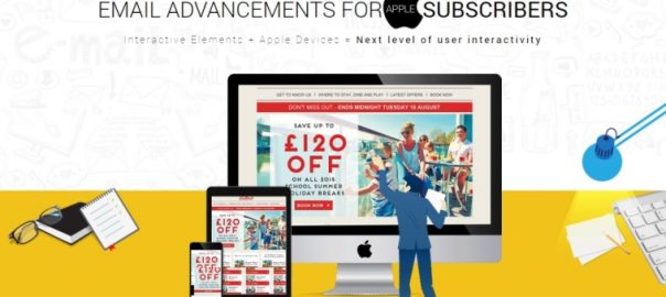
Interested in knowing which other interactive email elements are being loved in emails opened by Apple subscribers? Monks’ latest addition to the email design Infographics titled ‘Email advancements for Apple Subscribers’ lists them out along with sample emails.

(34)
Report Post


