Have you ever been in the supermarket with a list of items that you need for a recipe or a weekly shopping trip—but you just can’t seem to find that one last item on your list? Frustration creeps in as you wander from aisle to aisle. You may give up and leave the store and make your purchase elsewhere. Or maybe you start to question how the store is being managed since items are not placed in logical areas where customers can find them.
This demonstrates how prospective clients may feel when they are on a website with a poorly designed user experience. User experience (UX) is defined as the overall experience of a person when using a product (such as navigating around a B2B web design).
When clients experience shortcomings on your website—like not being able to find what they are looking for or long load times, this causes disappointment and frustration. These negative experiences and emotions result in an unhappy user. This bad experience decreases conversion rates and tarnishes brand trust. Clients now associate their negative emotions and experience with the company or product.
Customer experience is the new marketing.
— Steve Cannon, President & CEO of Mercedes-Benz USA
So how do you know if your B2B website is measuring up and providing a positive experience for customers? Below are 5 must-haves for a user-friendly journey on your website:
-
? Good User Flow
What separates mediocre websites from great ones? A satisfying customer journey. Knowing how your customers navigate to your B2B website and what information or services they need once they are there, helps to create the best user experience possible.
Knowing your client’s objectives and goals helps you determine the best B2B web design for your end users. By creating a clear path for your users, you make it easy for them to do things like request a demo, read-up on the latest industry news, and navigate to your product or service offerings.
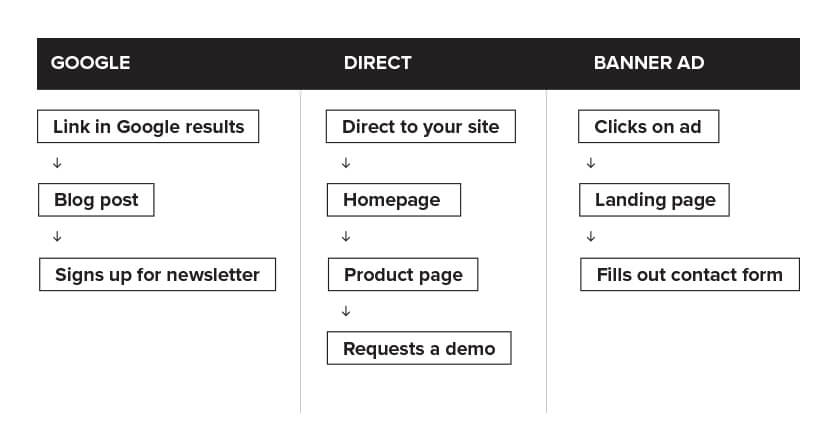
An example of user flow based on traffic source:

-
? Intuitive Navigation and Site Map
Making navigation simple and easy to understand helps users avoid friction and dissatisfaction. On the other end of the spectrum, poor placement of content and a non-intuitive site hierarchy leaves a user lost and confused. Want to start a conversation with a potential client? A bright, bold CTA may be the answer. Want a customer to choose from an extensive product offering? Pair down their options and make their choices easier and more intuitive for them.
Gartner showed that “measuring satisfaction on customer journeys is 30 percent more predictive of overall customer satisfaction than measuring happiness for each individual interaction.”(Source: Gartner) Intuitive B2B web design creates a seamless, consistent experience throughout your website.
-
? Speedy Load Times
Speed matters significantly for site ranking and organic search. In 2018, Google indicated that site speed is one of the signals used by its ranking algorithm. Businesses that don’t deliver fast and simple website experiences are at a huge disadvantage. If a client has to wait too long for a page to load, they will most likely click away.
It’s important to take the time to see how you can increase the speed of your site. There are many online tools to help assess speed times and troubleshoot potential problem areas, including Google’s PageSpeed Insights.
A few common culprits that cause slow website loading times are:
- Image and video files that are too large
- Messy or uncompressed CSS, HTML, and JavaScript
- Too many third-party widgets and plugins
- Slow web hosting services.
Performing a website speed audit is the first step in figuring out if your B2B website is underperforming.
-
? Mobile Friendly
In 2019, Google announced that it will no longer decide its rankings based on the desktop versions of sites. Google made this switch when it realized that more than half of people online are now using a mobile device. To be relevant and found in 2019 your site MUST be a responsive, mobile friendly website.
-
? The Right Color Scheme
Choosing the right color combination for your B2B web design is important on many levels. In order for your content to be legible on various screen sizes, resolutions, and brightnesses you need to consider account color contrast and color theory. Users may not be able to quickly read that awesome headline or that “contact us” button may be getting lost due to a lack of contrast. Color also elicits an immediate emotional response from users. Creating a color scheme on your B2B website that is professional and speaks to your target audience is crucial.
Digital & Social Articles on Business 2 Community
(26)
Report Post


