Placing your call-to-action and form above the fold of your landing page is a well-documented best practice – is it not? It turns out the answer isn’t nearly as clear as some may make it seem. In fact, based on our experience and research higher conversion rates have little to do with whether a button or form is above the fold, and a lot to do with the overarching purpose of the template and whether the actionable element is accompanied by the right amount of quality copy.
Of course, what works best for one company may not work best for another and the only way to be sure is to run multi-variate or A/B tests. There are just too many variables to assume a one-size fits-all solution (industry, quality of web traffic, quality of content, value of the offer being featured, brand aesthetics, etc.).
In today’s post, we’re going to dive into this important question further and take a look at some case studies on both sides of the aisle.
What “above the fold” means in 2016
The fold is the portion of a Web page that is visible to a website visitor without scrolling. However, the fold today is very different than it was only five years ago for three primary reasons:
- The number of screen resolutions that your site is being accesses through is much greater
- Mobile traffic and responsive design further negates the practicality of a universal fold
- Scrolling has also become prevalent among nearly all website visitors, in fact 91 percent of users scroll to the bottom of Web pages, regardless of visual design cues
If you want to see how this applies to your site, use this handy tool, Where Is the Fold to see exactly where the fold is on different resolutions on your website or landing page. You can also see exactly what screen resolutions your site is being viewed in with this simple two-step report in Google Analytics.
So, can I put my CTA and form below the fold? Here’s what you need to know:
Fortunately, this isn’t a question we have to spend too much time hypothesizing over. It’s been studied again and again, so instead of discussing hypotheticals let’s take a look at a few case studies that address this question specifically.
The fold is a myth
Bnonn Tennant, has discussed on the KissMetrics blog that the fold is a myth:
“Asking for a commitment before you’ve made the value of it clear to your prospect is really self-defeating. The only answer you’re likely to get is no. Plus it can seem very “in your face”—it rubs people the wrong way, and actually increases anxiety because it seems pushy or salesy.”
Building trust, crafting persuasive and clear copy, and showing value is far more important than the position of the elements themselves. Even though the Nielson group might say that only 20 percent of people read below the fold, that’s because 80 percent of readers will never read past your headline! The point is those 80 percent of visitors were NEVER going to convert regardless of where you put the button or form.
Everyone scrolls
UX research conducted by Huge, shows that website visitors today will nearly always reach the bottom of the website irregardless of the visual cues presented to them. This particular study compared three unique treatments to a control and found that in all cases at least 91 percent of users scrolled and at least 73 percent of users reached the bottom of the page.

The key takeaway is that designers can work to create the best experience possible in the context of the broader design. Additionally, they should not feel obligated to use scroll arrows and short or animated images just to prompt the user to scroll down the page.
Long landing pages can increase conversion rate
When you’re trying to convey a complex concept to a website visitor, limiting yourself to placing both the content and CTA or form above the fold isn’t always the best course of action. In cases such as these taking the time to fully convey the value of your offer or company can decrease friction and increase the probability of a conversion.
In one experiment run by Content Verve they were able to increase conversions by over 304 percent by placing the CTA below the fold instead of above it.

In another example from MECLABS a below the fold treatment increased the conversion rate of the page 220 percent over the control that included both the form and CTA above the fold because the variation layout was able to clearly convey the value proposition of the company.
CTA placement doesn’t always impact conversion rate
Of course, the real confounding factor here is that sometimes testing the placement of your form or CTA isn’t going to make a difference. This is particularly true for certain visitors that already know your brand and have moved into the consideration and decision stages of the buyer’s journey and because of this are going to convert on your offer regardless of CTA placement.
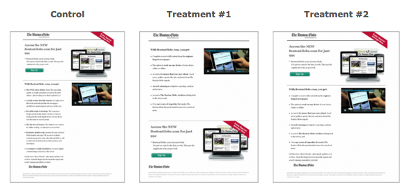
A great example of this is the experiment that MECLABS ran for the Boston Globe testing three different layouts for a subscription landing page. What they found was that there was no significant difference between any of the treatments.

The reason for this is that the Globe audience has strong brand awareness and is highly motivated so as long as the CTA was made clear somewhere on the page. The CTA didn’t matter as much as the the trust and desire visitors already had to engage with them.
In Conclusion
“There are no expert marketers; there are only experienced marketers and expert testers.” – Dr. Flint McGlaughlin, Managing Director and CEO, MECLABS.
Does the fold matter? Absolutely. Is it the most important factor in conversions? No.
Use these best practices to determine what will be most effective for you, form a hypothesis and test, test, test!
- The biggest factor in increasing motivation and therefore conversions is to focus on the content’s value proposition (regardless of length) and build trust with the user
- Use situational awareness–is the value proposition you’re conveying complex or easily understood and tailor design accordingly
- The number of resolutions your site is being viewed on is increasing drastically and mobile traffic and responsive design make the concept of a universal fold impractical
- Use Google Analytics to determine what resolutions your site is being viewed in, design for those dimensions
- Users today are trained to scroll
- The only definitive way to know what’s best for your specific use case is to test
What has your experience been testing CTA and form placement on your website and landing pages? Let us know in the comments below:
Digital & Social Articles on Business 2 Community
(55)
Report Post


