Contributor Kris Jones explains why having a responsive web design is a great first step but combining AMP with a PWA design is better.

As mobile-first indexing nears, the need to optimize for mobile has never felt so pressing.
Even in its current iteration, mobile search is incredibly important for advertisers and businesses of all sizes. Consider these statistics:
- A majority of Google searches occur on a smartphone or tablet.
- 50 percent of local mobile searches are for local business contact information, says Hubspot:

- According to BrightEdge, 69 percent of mobile searchers stated they were more likely to buy from a brand with a mobile site that addressed their concerns.
Now, with mobile web design, speed takes precedence over almost any other ranking factor. Unfortunately, I’m not sure if half of the web is seriously optimized for mobile search.
According to Think with Google, 70 percent of mobile web pages take 7 seconds to load visual content above and below the fold.
Common mobile site errors include:
- Blocked JavaScript and cascading style sheets (CSS) files.
- Failed redirects.
- Poor graphical interfaces (e.g., tiny text and poor image pixelation).
- Clunky search functions.
- Obtrusive interstitials.
Fixing many of these issues requires investing in a responsive content management system (CMS) and the right configuration for your mobile site.
Yet many questions remain as to what configuration truly works best for your website. Responsive web design has dominated the industry as the preferred configuration, but as the mobile web becomes more competitive, should the industry move on?
Is responsive web design enough?
Now, creating a standalone mobile website is good from the end-user perspective, but it severely diminishes your website’s equity from a search engine optimization (SEO) perspective.
Beyond this, mobile domains can be a costly investment and even more costly to maintain.
My digital marketing firm uses responsive web design (RWD), as well as accelerated mobile pages (AMP) to create a truly mobile-friendly website for our clients. But we must remember that responsive web design was not designed for speed, it was designed for designers.
Chances are your CMS has a responsive web design plug-in.
RWD web pages take advantage of fluid grids to render images and on-page elements in proportion to their device. For technical teams, this presents clear advantages to mobile design, including:
- Responsive handling of on-page layout for different devices.
- Retaining all content on a single uniform resource locator (URL), as opposed to an m. domain.
- More cost-effective than creating a standalone mobile site.
- Sites can be accessed offline using hypertext markup language 5 (HTML5).
While RWD does have its advantages, it was mostly created as a low-cost way to optimize websites for mobile search devices. It was also a way to complete this with little effort as possible.
Problems with RWD websites still persist:
- Slow loading speeds: above 10 seconds without proper onsite optimization
- Designers still need to optimize for touch, as opposed to scroll-and-click interfaces
- Data visualizations need to be optimized for small screens (i.e., charts and graphs)
So, why is this important? While RWD is an effective solution for small businesses and publishers on a budget, many established businesses are already making the switch to higher-speed configurations, such as accelerated mobile pages and progressive web applications (PWA).
Is AMP the answer or a red herring?
AMP represents Google’s big push to speed up the internet, but is it only on its terms?
As a quick primer, AMP is essentially an HTML framework that works the same as a content delivery network, serving stripped-down versions of web pages to increase page speeds. AMP is ideal for publishers who serve news articles and blog posts. It’s very similar to Facebook’s Instant Articles format.
AMP is currently being employed by multiple search engines, and even AdWords ads. Using the “Fast Fetch” tag, AMP continues to become faster and easier to implement.
According to Google, over 900,000 domains have already adopted AMP, and that number continues to grow.

In fact, numerous publishers have reported astounding success after switching to AMP:
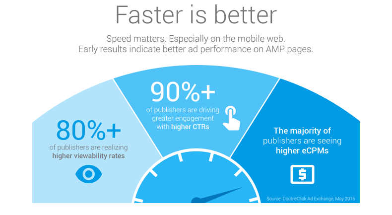
Google has also made it no secret that it prioritizes AMP web pages for its mobile news carousels.

Mobile web speed obviously has a huge impact on the user experience and your conversion rate.
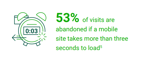
Using Google’s cache, web pages with AMP load 2x faster at one-tenth the latency of traditional web pages. But herein lies the issue with AMP.
While we’d consider faster loading speeds as contributing to more valued user experience, it’s the sacrifice that AMP needs to undergo that has severely limited its digital marketing value and adoption.
Since AMP is loaded using Google’s cache and served as a different version of the original document, clicks are hard to track since they technically don’t occur on the publisher’s website. This has a significant effect on engagement. By serving a watered-down version of a web page, AMP is great for serving informative blog posts, but there’s an obvious disconnect between the initial click and further engagement with the site.
This means that publishers and e-commerce stores must theoretically offer two different versions of their offerings. AMP is essentially search-result ad copy.
As a side note, another thing affecting AMP’s adoption is Google’s failure to communicate with its customers.
Ask the average web user what an AMP article is or if they could recognize one, and you’ll probably receive a blank stare. Ironically, Google is doing a disservice to its own user experience by not properly communicating the importance and advantages of AMP to individual users. Instead, it’s relied on publishers to make the switch of their own volition.
Does this mean that AMP is a red herring that should be ignored? Not exactly, and it all depends on your website. Unfortunately, there’s another configuration that threatens RWDs hegemony and AMP’s burgeoning adoption.
What about progressive web apps?
You may be familiar with PWAs, although very few sites actually leverage this genius technology.
PWAs are websites that act like an app in every way but don’t require a download.
PWAs are accessed through the web browser and utilize Javascript or CSS, along with HTML, to create nearly instantaneous load speeds. Leveraging their universal resource identifiers (URI), PWAs are linkable when bookmarked or shared by a web user.
The main advantages of PWAs include:
- Ability to work offline.
- Universal access on all devices and web browsers.
- Comparable load speeds with AMP.
- Faster transitions between web pages and navigation than traditional mobile domains.
- Native app-like interfaces.
- Indexable and linkable.
- Ability to send push notifications.
Primarily, PWAs are used by e-commerce stores to create faster checkout times and a better end-user experience. PWAs can increase engagement on your site and increase conversions through their ability to leverage offline resources and push notifications to continually communicate with users.
But there are also drawbacks to PWAs. It’s a rather costly investment and incredibly difficult to implement, meaning you’ll probably have to hire a professional web designer to do so.
A larger concern would be: why not just invest in an app? Users visit hundreds of websites weekly and have numerous apps stored on their phone. Their primary demand, above all else, is fast loading speeds, which AMP provides.
With this in mind, which mobile configuration is best for your website, as we embark on the mobile-first era?
Which mobile configuration is best?
AMP is ideal for publishers who only seek to drive more traffic to their blog or publication. Many website owners have struggled to implement AMP because many CMS’s still don’t have a plug-in available. Even still, with Google’s new mobile “AMP Stories,” WordPress and many notable CMS’s struggled to properly implement AMP.
On the other hand, PWAs work across all browsers, and progressive enhancements have made them secure from viruses and unwanted content.
In terms of speed, PWAs and AMPs both have nearly instantaneous load times. The biggest difference here is the speed of navigation that comes from PWAs, as all web pages will be hosted in this format, unlike AMP.
From a ranking perspective, AMP may be a ranking signal (no one knows yet), but if PWAs host nearly identical loading speeds, I don’t see AMP as possessing a clear advantage over PWAs.
From a web design perspective, AMP is a nightmare, as it strips away many of the graphical and user interface elements of the native design. On other hand, PWAs are able to render and serve all of your design elements in an app-like display, which makes them more user-friendly.
After switching a hypertext transfer protocol secure (HTTPS) PWA, AliExpress improved its conversion rate by 104 percent across all browsers.
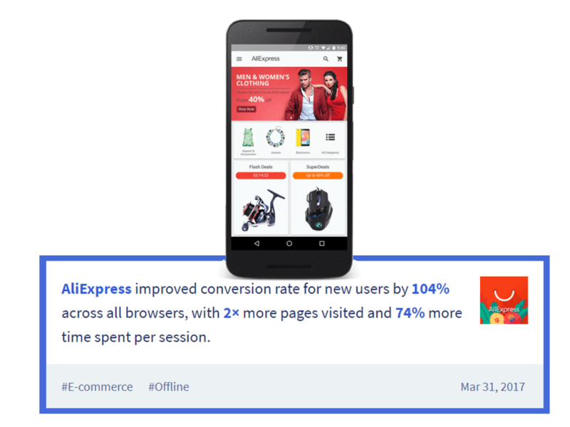
Finally, PWAs are responsive to different browsers and can react to user permissions to create a smooth checkout experience.
In the end, the best solution is to combine both for a truly fast, homogenous experience. Major brands, such as The Washington Post, have already done this. With the greater search visibility and speed of AMP articles and the app-like interface of PWAs, combining both could significantly increase your user signals and offer a better experience for users.
Conclusion
The need to go mobile cannot be overstated, although we’re already past beating the dead horse. Responsive web design is a great first step, but I don’t believe it goes far enough for businesses competing in a competitive niche. This is especially true for publishers.
For e-commerce platforms, combining AMP with a PWA design truly offers the best mobile configuration available today. All I can say is, make the switch to a mobile-friendly website before it’s too late.
[Article on Search Engine Land.]
Opinions expressed in this article are those of the guest author and not necessarily Marketing Land. Staff authors are listed here.
Marketing Land – Internet Marketing News, Strategies & Tips
(90)
Report Post