Irrespective of your business size, landing pages help you move people through every stage of the buyer’s journey. But it’s quite frustrating when your landing page fails to roll in leads or bring customers.
So, what can be done to get your landing page noticed and actually, get prospects to sign up? This article covers a few points that can help you have amazing landing page designs.
1. Include Features Instead of Benefits
People visit your website to find out what is in it for them. Your landing page must reveal solutions to their pain points. Some marketers only talk about their product and its features which is a wrong practice.
Bad Example

This page is not customer-centric. All it has is a huge heading and no mention about the benefits for a particular user.
Good Example
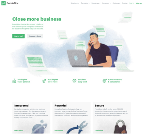
Pandadoc’s landing page is customer-centric as it clearly explains the value proposition and offers visitors the option to choose between a free trial and demonstration.
Quick Tip
It’s all about your customers so speak of the benefits you offer to them.
2. Saying Too Much
Visual clutter is one of the reasons as to why prospects abandon a landing page. You have 10 seconds to communicate your value proposition through your landing page. These 10 seconds let visitors decide whether to trust your brand or not.
The best way to do this is to ensure that your landing pages have these core elements:
- Simple design
- Unique selling propositions
- Social proof
- CTA (with or without the form)
Bad Example
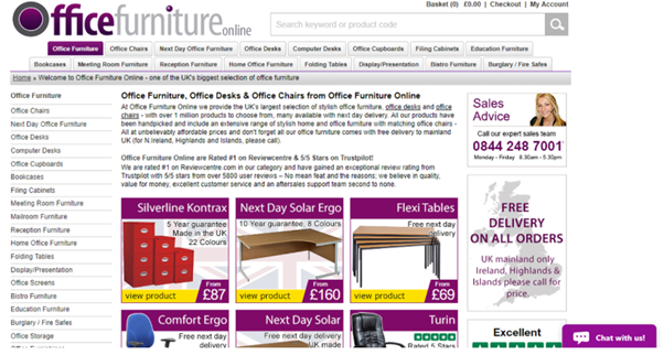
This landing page from Officefurnitureonline is messy. It can confuse your visitors and ultimately, they will bounce off the page.
Good Example
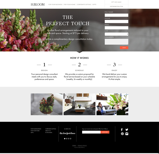
On the other side, H. Bloom, an online floral arrangement service uses high-resolution images and plenty of white space that gives the visitors enough space to breathe. It has all the landing page elements organized perfectly well.
Quick Tip
For a good landing page, use professional design with a simple layout and clear images. Also, don’t forget to mention your unique selling proposition.
3. No Clear Call-To-Action
Once you get visitors to your page, it’s time to convince them to subscribe or sign-up. Do you have a visible call-to-action button? Is it enticing enough to make the subscriber click?
If you use too many CTAs, it would confuse the prospect. Therefore, keep your CTA short, actionable, and attention-grabbing. It should prompt your visitors to take the next step.
Bad Example
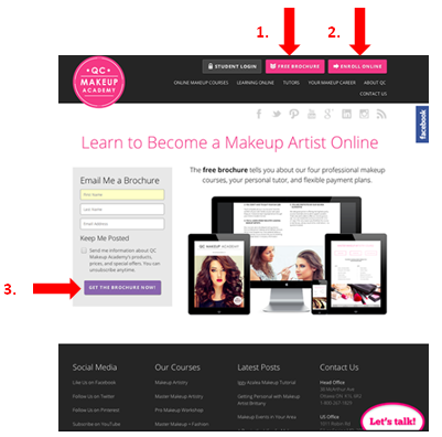
QC Makeup Academy’s landing page has three different CTA buttons that confuse the visitors and make them feel lost.
Good Example

On the other hand, Casper’s landing page has a single CTA that clearly stands out and lets visitors take the next step.
Quick Tip
For your CTA to prompt instant action from the subscriber, make sure that it is clearly visible and placed above the fold.
4. Poor Mobile Experience
The global mobile data traffic is projected to increase to almost sevenfold between 2017 and 2022. Consequently, optimizing your websites with mobile experience will safeguard you from the perils of losing credibility and money.
Bad Example
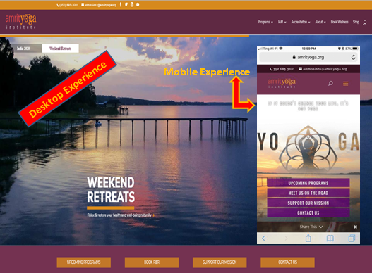
The mobile version of the Amrit Yoga Institute website takes too long to load which would make the visitor leave the page..
Good Example
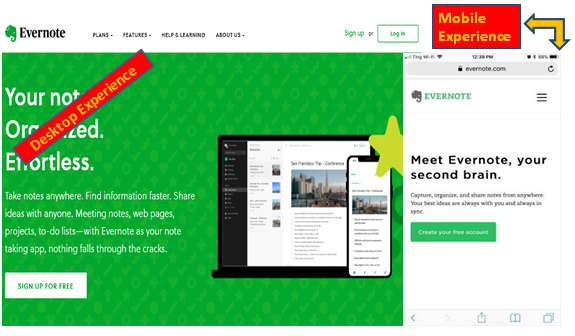
Evernote’s landing page imparts a smooth mobile experience as it has a simple design without using any heavy imagery.
Quick Tip
Use simple design, fewer images and text with clear navigation buttons to make exploration easy.
5. Make Your Content Skimmable
Your visitors are super busy, so you should try to keep your content easily skimmable. Include headings, bold text, and easy-to-read body text. This way, you can improve the readability of the page and convey the message more effectively.
Bad Example
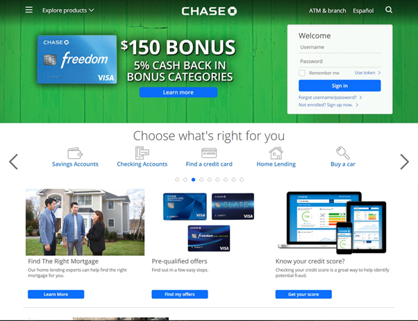
Chase has a cluttered landing page with irrelevant CTA. The design looks messy and the multiple CTAs could confuse the visitor.
Good Example

Look at this page of Uber. It uses simple words, visuals, and animations to get their message easily skimmed by visitors.
Quick Tip
Simplify your copy by using eye rests like bold typeface, bullets, and checklists. Use less text and more visuals.
6. Using No Image
The human brain can retain 65% of the information when paired with relevant images. Use this fact in your landing page and make it visually attractive to grab the visitor’s attention.
Bad Example

This image from Salesforce has good content with value proposition but there aren’t any visual images.
Good Example
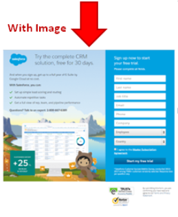
This is another landing page from Salesforce which is good enough to capture instant attention. It has everything from concise content to perfect illustrative image that aligns with the theme.
Quick Tip
Use images that tell a story, connect with the emotions, build trust with the prospects and drive conversions.
7. Using The Wrong Image
Using the wrong image on your landing page does more harm than having no image at all. Sometimes, marketers use irrelevant, poor quality or boring images that make visitors abandon the page.
Bad Example
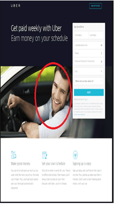
The smile on the driver’s face in the above landing page from Uber doesn’t make us believe that it’s a real Uber driver.
Good Example
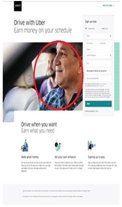
Contrary to it, this landing page of Uber has an image of a friendly and relatable person which makes the image appear more genuine. Besides the image, it includes other elements too, that are needed for a conversion. (A short form, clear CTA, and relevant copy)
Quick Tip
Use interesting, relevant and high-resolution images that instill positive emotions and build trust.
8. Hard To Find The Opt-in Form Or Sign-Up Buttons
The end goal of a landing page is to get quality leads. If this doesn’t happen, it’s a waste of time for marketers.
So how do you handle this? The answer to this is to craft irresistible offers with easy sign-ups.
Bad Example
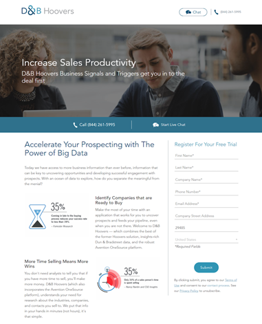
This landing page of D&B Hoovers covers everything. However, the long form of the landing page may cause friction to prospects to easily sign-up.
Good Example
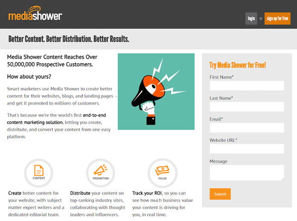
Here is the landing page from Media Showers. The color contrast makes the free offer quite noticeable. The form, being short, will entice the visitors to easily fill it up.
Quick Tip
Keep your opt-in form short, use good color contrast and clearly visible CTA button.
9. Seeking Too Much Information At One Go
Landing pages that ask for too much data scare the new visitor. However, you need a few details to follow up with new leads.
With the use of killer content, you can earn their trust and have leads giving their details and signing-up to know more about your organization.
Bad Example
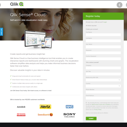
Qlik’s landing page is designed pretty well from the point of view of copy. However, it’s asking for too much data which the first time visitor may not be willing to share.
Good Example
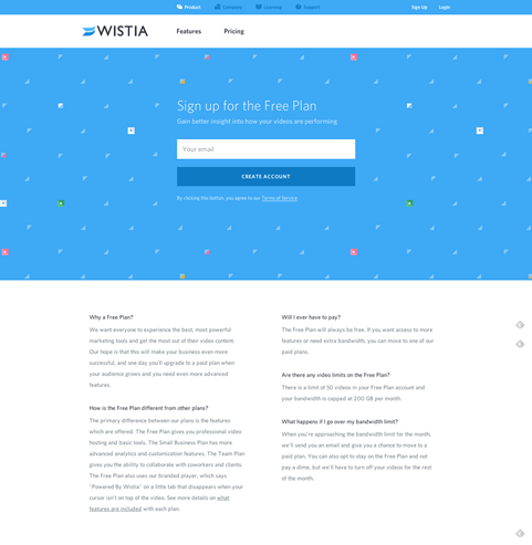
Here is Wistia’s landing page. It uses good color contrast with a short form that prospects won’t mind filling to create an account. The second fold has FAQs which helps to clear the prospect’s doubts, making sure that they convert.
Quick Tip
Keep your form short, highlight your product’s benefits and craft irresistible offers that lead to a conversion.
Conclusion
When crafted well, landing pages get your leads closer to the sales funnel. Just follow the steps discussed above and you’ll be bringing in more sales, that’s the bottom line of every business.
Digital & Social Articles on Business 2 Community
(44)
Report Post

