If you’re running a small business, your website should be a major contributor to your overall success.
All to often, business owners miss this mark completely. They think it’s enough just to have a website at all. Something prospects can come to to “check them out.”
Well I’m here to tell you: You can do much, much better than that.
Your business’ website should not exist as a digital brochure, simply conveying information. It should draw prospects in, and be persuasive enough to entice a sale, or at least generate a hot lead.
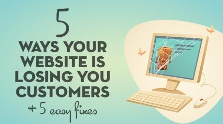
Take a look at the infographic by the team at The Deep End, to see exactly where your site may be going wrong, along with actionable tips on how you can improve. After you make the necessary changes, your website should not only make you look extremely credible, but will go a long way toward helping you achieve your ultimate business goals by bringing in more customers.
See a brief explanation of each point after the jump. Enjoy!
No Call-to-Action
There’s a really great way to make sure your site visitors take the action you want them to — ask them! If you want them to share a blog post, say so at the end of the article. If you want them to come into your brick and mortar location, tell them. By just presenting information without specifying a desired action, you’re missing a major opportunity.
It’s All About You
Writing persuasive web copy is very nuanced. While you may be tempted to write about what makes your business so great to work with, it does little to connect with your customers.
So skip the brags, and go right for what your customers will get out of working with you, and what that will do for them.
Some People Aren’t Ready to Buy/Convert
By going right for the sale, you’re leaving out a large chunk of your audience — those who aren’t ready to buy just yet. And to think they’ll remember you and come back when they are is a risky assumption.
Instead, offer them something in exchange for their email address — a freebie, or even the promise of weekly deals in their inbox is usually enough to do the trick. That way, you can market to them via an email campaign while they think things over.
Bad/Outdated Design
This one is a no-brainer, but it’s rampant nonetheless. While an outdated design looks bad enough on it’s own, it makes you look bad by association. By looking less credible, would-be buyers are likely to keep moving to one of your competitors.
Lack of Trust Signals
People are wired to minimize risk, so they tend to go with whatever option they feel is the surest bet. This is why ratings and reviews go such a long way in building trust.
So ask some of your current or former customers if they wouldn’t mind leaving you a nice review. Be sure to add their photo next to it for added credibility, and even consider video testimonials.
There you have it. Five of the biggest pitfalls business websites fall prey to, and five ways around them. If you follow this advice, you will be in a much better spot to properly entice your site visitors to become actual customers for your business.
Digital & Social Articles on Business 2 Community(58)
Report Post


