Landing pages are an essential part of your marketing strategy as your audience moves deeper into your website and explores your products and services. Landing page optimization comes down to achieving an ideal blend of persuasive content, value and minimal design to drive conversions.
A landing page optimization strategy is the only way to consistently improve your funnel and even a 1% increase will mean big changes to your bottom line.
To drive conversions, you’ll need to understand why, how and what types of landing pages can be used across the customer lifecycle. This means understanding the key elements and activities that are involved in every aspect of landing page optimization.
Our landing page optimization guide will show you exactly how to design successful landing pages with a complete tutorial on how to optimize your landing page strategies and get better results.
What is Landing Page Optimization?
First, what is a landing page?
Landing pages receive traffic from anywhere besides same pages on your website. In other words, they’re catching and directing user attentions from a wide range of channels to other parts of your website. Specifically created to make outstanding first impressions, effective landing pages satisfy user’s needs while prompting them to convert in exchange for an appealing offer.
While home pages are for general information and overall directory, most viewers won’t arrive to your site via search rankings. Instead, these visitors arrive via social media, links, affiliate materials – and these are all best directed to a landing page.
For example, landing pages are used to:
- Drive sales through PPC and Display: Using AdWords, Bing and different Ad Networks to draw in potential buyers for your product and services.
- Create anticipation around a product launch or event: Create a signup landing page for events or hype the upcoming release of an upcoming product.
- Segment users by different offers, promotions and channels: A complementary aspect of conversion rate optimization, steer user action to your site while filtering segments with pages tailored to specific needs and buyer personas.
- Increase SEO rankings: Any search engine optimization on your site should be extended to landing pages. Ensuring custom URLs have the proper keywords in the proper places.
Landing pages are the teeth of a comb, allowing you to pull apart densely grouped viewers and separate strands of users for individual attention. Did these viewers arrive from social media? Or email? Organic search? Landing page optimization allows you to see how viewers arrive from unique channels and then cater messaging specifically to them and net more conversions.
Effective landing pages are specific, free of distracting general information and focused toward a desired action. As search engine optimization develops, every deep-linked product detail on your site becomes like it’s own landing page.

(Source)
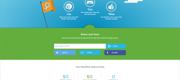
Looking at an example from Parkwhiz, we see a well-optimized page designed for referral conversions. The headline captures attentions using active language promising reciprocal benefits for both parties. The easy 1-2-3 step icons below guide viewer attentions to the lower portion where to “Share and Save” is a simple process, instantly recognizable and quickly done via social share icons.
The design layout is perfectly minimal here, both friendly and simplistic in loyal blues and cheery greens helping viewers perform the conversion in a pleasing environment. The parking app guides their users into a conversion space with this prime example of referral programs done best.
It’s best to provide users with direction, telling them exactly what to do, where to do it and how it’s done. Best performing landing pages will always speak to reader’s basic human motivators like fears, wants and needs.
How to Create Powerful Landing Pages
Before looking at the core guidelines of landing page content, we must remember viewer intentions.
What did the user come to your landing page to get?
High-converting landing pages always consider what motivating factors contributed to the click and from what channel users arrived. The path users take to reach your site can tell us a lot about where they are in the buying funnel and how they expect to be treated.
Viewer intent will directly influence the messaging on your landing page, so prepare to create a different (perhaps many) landing pages for user segments and different campaigns.
Here are a handful of styles you can use for various goals:
- Click-through landing page: The purpose of a click-through landing page is getting visitors to warm up to your offering with an enticing, briefly informative message. Your goal is to get them to click-through to your product or service via the CTA.
- Referral landing page: This landing page promotes word of mouth marketing via social networks. Beyond getting visitor sign-ups, the goal is to drive engagement and use referral optimization techniques to spread the word about your brand to other potential users.
- Mobile landing page: More important every day, mobile conversions require a landing page that is lean, mean and always quick-loading. Think of any mobile landing page as an elevator pitch.
- Microsite: Setup as specific to different products, services or events, microsite landing pages are good for helping interested users achieve a more full understanding of your offering before a sale.
- Product detail landing page: A cutout section to inform about a specific product or service, product detail landing pages are also a good point to utilize social proof with testimonials.
- Lead generation: Lead gen landing pages are used to capture personal information about prospects such as name, email address, phone number, company size, etc. for later use in nurturing the prospect down your marketing funnel.

(Source)
Here’s a good example of a blog pop-up from Wishpond. The minimal data entry makes the conversion process super-simple, perched right above that bold, enthusiastic CTA box. The copy is successful because it uses a list to highlight benefits to the reader while employing active verbs throughout. A headline as confident as the “The Complete Guide to Pop-Ups” is very convincing, especially when formatted as cleanly as this pop-up is.
Driving conversions with landing pages requires a unified brand aesthetic, otherwise viewers will be confused by where they’ve arrived. Guide their eyes with power words, quality design principles and consistency for maximum results.
7 Key Guidelines for Landing Page Design
#1 Maintain message between headlines and landing page headline:
If someone is searching for “referral marketing optimization,” the landing page will convert more if it also includes the phrase “referral marketing optimization.”
#2 Secondary headlines promote body content:
Use active verbiage to prompt readers to keep reading. As always, content should be user-centric, short, value-laden and speak to user’s pain point.
#3 Friendly, branded tone
Talking with viewers as you would across other channels is important, making them feel at ease and more likely to take the desired action.
#4 Use trust signaling
Social proof is huge when convincing viewers to convert. Badges, icons, security seals, testimonials – all create the impression that your brand is worth the time and effort.
#5 Powerful CTAs
Active verbs like “Get,” “Build,” “Create,” all drive better results than suggestive language or weak words. Remember, tell your users how to engage and make it worthwhile.
Employ buttons that really pop from the landing page. You don’t want to make it difficult for viewers to convert.
#6 Keep it simple
No links, please. One CTA is all you need for a landing page, these distract your visitors from the one desired action.
#7 Make it all fit nicely
Yes, you should have interesting, original images or video to support your value proposition.
You’ll want to fit these and your messaging in the first ⅓ of the screen space, or what’s called “above the fold.” Viewers not having to scroll significantly increase the chances of conversion.

(Source)
Postcron takes all these principles to heart on their landing page. Viewers instantly recognize the fun, branded language and the thumbnail of their referring friend. The reciprocal rewards are made more appealing by the value proposition that perches neatly above the actionable green CTA button at center. Postcron also uses a testimonial and brand icons to affirm the value recognized in the brand. This brand leaves nothing to chance when driving conversions through their referral marketing program.
How to Test Your Landing Pages
Landing page optimization hinges upon running tests and adapting your pages according to the best results. Google Analytics is the primary means to track and measure visitor activity and conversions on your landing pages.
Start into Google Analytics by assessing the effects of a single page. If you see poorly converting pages, look to factors like bounce rate and conversion rate. Find these inside your Google Analytics under Content>Site Content>Landing Pages.
Other than bounce rate, look at other analytics points such as average visit duration and percentage of new visits. Data and testing is crucial for giving insights on traffic segments and understanding what each visitor expects from your landing page when they arrive. For example, those arriving from social media might prefer a video, while those arriving from your blog might want a white paper.
It’s important to set and measure conversion goals within analytics to move past “gut” feelings of how successfully pages are converting. For example, measure:
- Email subscriptions
- Content downloads
- Time on site
- Page views
- Social media shares
- Live chat engagements
- Form fill completions
- Referrals
What you define as a “conversion” is variable and can be defined in various ways. First, a “success URL” counts towards a conversion if a user finds a certain page, such as a download page. Measuring the visit duration can also be tallied as a conversion past a certain time, as can the number of pages a user visits.
Event tracking is another powerful way to track conversion goals. An event – such as an ebook download, social share or referral conversion – will be counted as a conversion. Defining discrete events as conversions lets you measure conversion goals against search traffic.
For example, comparing the search and landing page data sets allows you to see things like which other URLs bring you highest converting traffic and which keywords earn you the highest converting traffic.
Testing various aspects of page form will be crucial. You’ll want to isolate variables that could perform better, so expect to perform as many tests as it takes:
- Call to action
- Headline
- Form headlines
- Body copy
- Data input form
- The offer
- Trust signals
- Directional cues
- Design layout
How do you test these various aspects?
A/B split testing is the first and often best option, since it allows you to gauge how one variable is affecting your conversions. Swap out your CTA or your headline and run an experiment to see which performs better between a “split” in your total traffic. Google’s Content Experiments provides a free A/B test tool here.
You could run multivariate testing, switching more than one variable, but this becomes difficult to assess accurately. After all, which aspect of the landing page did visitors react to? Though it may take more time, A/B split testing is more accurate and can be used within smaller data sets more effectively.

(Source)
Heat mapping software is powerful for letting you see how visitors interact with all your landing page variations. With these visualizations, you’ll see color-coded reports revealing where users click, move their mouse, scroll and stay on the page. When you know which landing page variables are attracting interest – or not – you can be sure to alter pages for optimized conversions.
Lastly, if you’re using Google AdWords for PPC, it will be necessary to include AdWords conversion tracking. This will let you view all conversion data for sites sending your traffic.
Conclusion
Landing page optimization requires time and effort to do properly. Testing variables on each page, across all user segments and campaigns, this is the surefire way to drive the most conversions.
When designing landing pages, stick to the core principles of copywriting and good design. You want to present users with a simplified, easily navigated interface that will help them to share their information with you and receive value in turn. Making sure CTAs are bold and obvious, copy is powerful and succinct, and that images are arresting will be crucial.
Whether you’re using landing pages with PPC ads, as a user segmentation tool, or to create buzz around an upcoming release, utilize various styles of landing pages for different functions. Ultimately, the more specific with users, the more effective you’ll be at netting conversions and seeing what page dynamics really work with your brand.
Business & Finance Articles on Business 2 Community
(106)
Report Post


