 There are advertising opportunities across all the major social media platforms that drive demand for your products and services and are well within the reach of many small business budgets. Whether you choose to advertise on Facebook, focus on Google AdWords or branch out into Twitter or LinkedIn, your ad needs to click through to a landing page created specifically for that campaign and designed to convert visitors into leads and ultimately into customers.
What is a landing page?
A landing page is a dedicated, standalone page created specifically to convert visitors into leads. It is highly focused on a single objective and in most cases, its goal is to collect information about your visitor that will allow you continue to contact them. Your landing page has to simultaneously create a great first impression, meet the visitor’s expectations based on the ad they clicked, communicate trust and credibility and convert these visitors into leads.
Why should I use a landing page?
Many think just creating a page on your website for the advertising is enough to capture leads. Depending on the offer, a specific page on your website may work. But in most cases, successful campaigns use a landing page that aligns with the ad to reinforce your message and dramatically increase its conversion rate.
When should I use a landing page?
Although landing pages can be used for any promotional marketing activity where you want someone to take some action, you absolutely should create a landing page when you are paying for advertising and want to measure your return on investment. By focusing on a single objective that matches the intent of the ad that your visitors clicked, you help your visitors make a decision to give you their contact information without all the usual distractions of a general website page.
What is landing page optimization?
Landing page optimization ensures that all of your landing page elements work together to engage your visitor and maximize the conversion rate of visitors to leads. You should never set it and forget it but review and improve the elements so you can improve your conversions.
Landing page optimization focuses on things such as:
- Headline. In addition to making it congruent with the ad, font size, prominence and clarity of the headline can keep the visitor on the page longer.
- Content and copy. Too much content can distract the reader and cause them to lose focus on the value of your offer.
- Image or video placements. Using an image that captures attention, visually illustrates the offer and directs the visitor to the call to action makes the offer more real and inviting. Videos on landing pages keep people on the page longer and increase conversions.
- Colors and contrast. Contrasting color combinations can help key areas of your landing page stand out (like the button) while other color combinations can have a psychological effect on the visitor.
- Form placement. Put your form high on the page where it can be found with visual cues to move their attention to the form.
- Button text variations. Use of “submit” on the form button wastes an opportunity to strengthen your call to action. Use stronger phrases that align with your offer such as “Try it for Free”, “Join Now” or “Take a Tour”.

Making small changes to your landing page can increase conversions dramatically. Try out small changes over time and see if your conversion rates increase. Like all other online marketing, things change year to year. Make sure you stay up to date with the latest landing page optimization trends to get the most out of your advertising dollars.
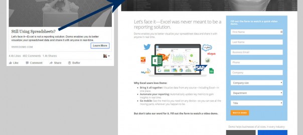
The following is an example of an ad and landing page that works. (The form is a bit long but otherwise it meets best practices).

Landing page best practices
- Focus on a single objective. The goal is to provide visitors an easy path to conversion. If your page has multiple actions, you may paralyze your visitor resulting in them taking no action.
- Ensure the landing page headline matches the messaging from the ad that was clicked. Generic landing pages used for all of your ads is a waste (like sending visitors to your home page). Make sure your landing page matches the specific call to action you put into the ad itself.
- Clarify your value proposition. Answer the question “what’s in it for me if I sign up or buy from you”? It’s the promise of value you deliver, explains how you solve their problem and why they should buy from you.
- Include a clear call-to-action. If you are trying to collect contact information, make sure what you want the visitor to do is very simple and easy to find. Put the form where they can easily see it as soon as they get to the page and define the action you want them to take through the button text.
- Write simple and succinct copy, using bullets, headings and white space. Cluttered, overly long landing pages scare away a visitor. They don’t have time to read a lot of copy. If there are too many things to do on the page, they’ll get frustrated and leave.
- Include directional cues to your call-to-action and put it where it can be seen. The combination of clear copy, visual cues and contrasting colors can guide your visitors to the action you want them to perform.
- Eliminate distractions and unnecessary components. Remove items such as navigation, social widgets, blog posts and any content that is not specifically aligned with the ad.
- Encourage visitors to give you their information. Only ask for information you need in the landing page form. If you are giving something away like a paper or free product, send the link to the fulfillment in an email rather than including it on the thank you page. At a minimum, you will get a valid email address.
- Include social proof to demonstrate your credibility. People want to see who else is using your product or service. You may be the best at what you do but without social proof, people won’t want to take a chance. Showcase key customers and get testimonials to increase your credibility and prove that you are trustworthy company.
- Design your landing page to work on mobile devices. More and more visitors are reaching your website via mobile devices. Ignoring this market could cost you conversions, especially from Facebook advertising where there are 1.39 billion mobile monthly users.
Creating an effective landing page for your marketing campaign helps visitors easily understand your message and the value you provide them. Your advertising attracted that visitor because they are looking for something specific. Make sure your landing page aligns with the advertising, delivering on the message that drove the visitor to that page.
Digital & Social Articles on Business 2 Community(118)
Report Post