Do you know which strategy works best to convert a visitor into a qualified lead in the journey of conversion? Yes, you got it right! It’s landing pages.
Landing pages are an essential part of any inbound marketing campaigns, because they have the unique ability to convert a stranger into a qualified lead.
So what do you do to craft a landing page that converts? The answer to this is – craft a landing page backed by subscriber psychology.
Psychology actually serves as a magic wand in optimizing your conversions. Understanding the minds of your customers is your license to grabbing their attention.
Though your consumers are humans who come from different walks of life, their minds all work in a similar way, which makes their behavior quite predictable. By doing this, you can make predictions such as what makes visitors take actions and what makes them leave your page.
In this article, we’ll talk about how to design a landing page backed by psychological principles that are sure to persuade visitors to take action.
Use Compelling Headlines
Use sensational headlines to grab visitors’ attention and entice them to stay longer on your page to assess your offers. People care a lot about themselves, so create a landing page that is focused on your visitors. Do all you can to make the page about the visitor – speak in their language, fix their problem, offer them something for free, etc.
Use the ‘self-theory’ principle. Take the unique selling point of your product/service and pin it flawlessly on your landing page to get the most out of your headline. Use proper keywords to grab the attention of your prospects.
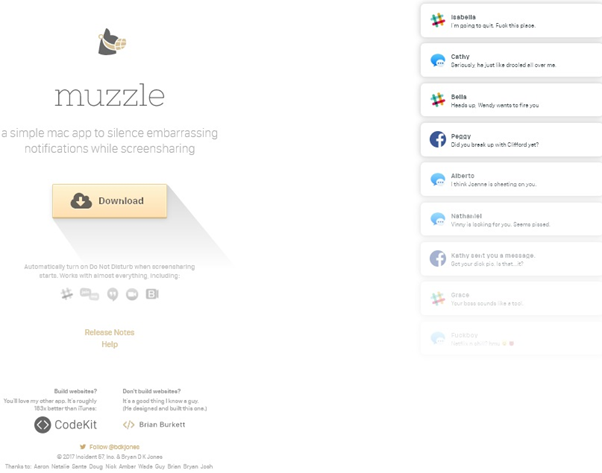
Source: Muzzle
In the above example, Muzzle a mac app that mutes on-screen notification fully embraces this don’t disclose mentality on their landing page. Visitors who visit their page are greeted with a lot of notifications in the upper left of the screen. They have sensationally used the animation to convey the usefulness of the app without detailed explanation.
Use Directional Visual Cues
‘Deictic gaze’ theory states that human sight instantly goes to where someone else is looking. Directional cues points out those spots on your landing pages that can help in conversions.
Directional cues like arrow, lines, asymmetrical layouts, encapsulation, human visuals can be used to effectively guide your visitors by hand and direct them towards your CTA button.
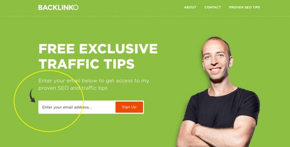
Source: Backlinko
Here we can see that Backlinko uses an arrow (which is a form of directional cue) to guide its visitors to enter their email address and sign-up.
Engaging Videos
Having videos on landing pages can boost conversions by 80%. In order to drive higher engagement rate, you need to ensure that your video should be as long as 2 minutes.
Usually explainer, testimonial, and background videos are used on landing pages.
Three reasons why videos should be included on your landing pages are:
- It increases the time people spend on your page and lets the brand’s message seep in.
- It builds the trust factor when you feature either yourself or an employee.
- It serves as a good option for people who hate reading.

Source: Lockergenie
In the above example, LockerGenie uses a video on the landing page. It keeps their audience hooked by describing the painpoints in detail. The five seconds of the video displays an animated man running across with a handful of laundry.
As you watch the video, you tend to get more curious as to what’s going to happen next. Now that’s an audience investment. The brand used the first five minutes to relate to visitors and then built investment in the story to keep them watching.
A good landing page video should:
- Have a good script.
- Be to the point.
- Use humor.
- Include benefits and solutions.
- Use a professional tone.
- Have a visual appeal.
- Have the right call-to-action.
- Use right music.
Design a Persuasive Copy
No one has the time to read an essay to find out about your product/services. Secondly, it’s better to use simple language for better understanding. So how do you create a persuasive copy?
For this, you can try the ‘loss aversion’ tactic. Humans are scared to lose something. In reality they value not losing something more over actually acquiring something. So telling your visitors what they will be missing out if they don’t convert is surely going to get them to take action particularly when you combine this with a freebie offer.
It’s human nature to hate losing stuff and love getting free stuff. Create a copy that blends these two factors as it will help in conversions.
‘Urgency’ is another technique that you can incorporate into your landing page. Here you are letting your prospect know that they should act immediately to redeem the offer and are indirectly coaxing them to convert. Usually a countdown timer is used in this tactic.

Source: Udemy
The above example Udemy uses an urgency tactic to persuade customers to sign up in order to redeem the offer. The brand has also used a timer that grabs the attention of the audience on the offer validity period .
The ‘decoy effect’ is a cognitive bias. It refers to people changing their preferences when a third asymmetrically dominated option is presented along with two original options. This technique works well for sales pages and convinces the prospect to select the option that you want them to.
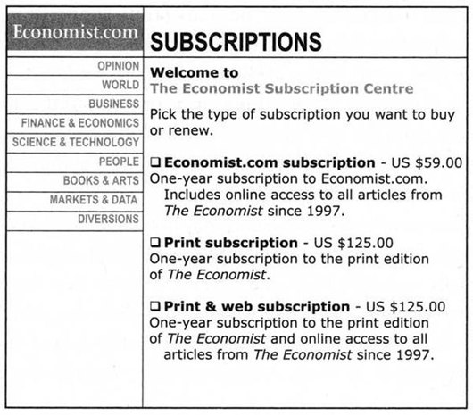
Source: Pinterest
This example from The Economist has three pricing tiers. Amongst the three pricing tiers one would obviously go for the third option over the second one as in same price they get the print +digital option which is quite valuable.
Utilization of White Space
White space and specific color combinations offer visitors soothing visual experiences. Select few elements and isolate them on your landing pages like CTA or forms so that they can grab maximum attention. By surrounding key elements in white space you efficiently tell your visitor what you want them to focus on and persuade them to click through the CTA button.
Consider the ‘Von Restorff Effect’ when it comes to color ass people tend to remember things that are different from the rest. For your landing pages, design a CTA button that is preferably of a contrasting color (a color that hasn’t been used anywhere on your page). This makes it very obvious for the visitor to know where to go and redeem the offer.
If you are not sure about which color to use, then follow your brand palette. For instance, if your page is black select red color for your CTA Button.
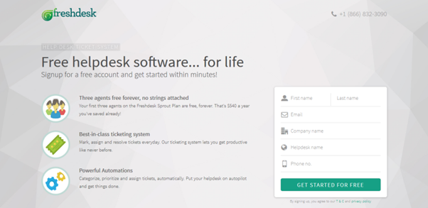
Source: WordStream
Check out how Freshdesk, surrounded their CTA button with white space and designed it in a contrasting color to make it stand out of the page.
Craft Attractive CTA
CTA button and lead capture form are two important elements of a landing page. While the form collects the lead’s information, clicking the CTA button converts the stranger into a qualified lead.
Being important elements, they should stand out and grab the attention of the visitor. ‘Encapsulation’ or creating a surrounded window of focus is a good way to highlight your form and draw attention to it. This can be done using contrasting colors.
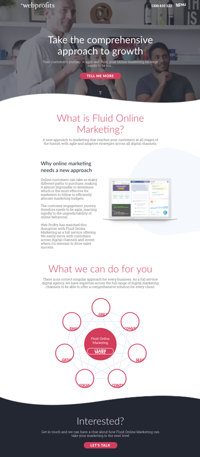
Source: HubSpot
This landing page of Webprofits has a CTA button on the top that states ‘Tell me more’. It stands out in contrast to the background as well. There is a downward arrow to encourage scrolling.
They give the visitors an opportunity to learn more about their brand before providing them the conversion option. At last, they include a strategic CTA “Let’s Talk” that directs them back to the top to fill up the form.
Social Proof
Consumers are influenced a lot by other people’s opinions and habits. A study states that 88% of consumers trust online reviews as much as personal recommendations. Today’s consumers rely on social proof and opinions before they make a buying decision.
Use this psychological principle in your landing page by adding customers’ testimonials. Having short reviews from your satisfied customers is a great way to boost the credibility of your brand. Customize your landing page based on the consumer’s interests and needs. This will keep them engaged for a longer time with your brand.
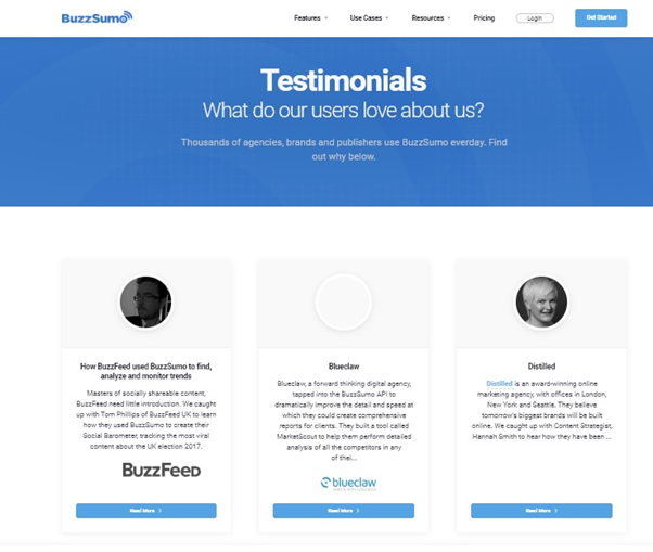
Source: BuzzSumo
BuzzSumo on their website features case studies and customer testimonials which let visitors read about the entire story and understand what product/service can improve their pain points. Such transparency is extremely compelling for potential prospects and visitors.
Final Say
With the right design and key elements backed by psychological principles, you can craft a top-notch landing page that would persuade visitors to take action.
If you are just getting started with your landing page optimization, the pointsdiscussed here will help you understand the mind-set of your target audience. This will help you design offers that persuade them to convert which will optimize your conversion rates.
Make sure you A/B test the above tactics to know which works best for you. Follow the above strategies and watch your conversion rates skyrocketing!
Digital & Social Articles on Business 2 Community
(82)
Report Post
