Landing pages are excellent lead generation tools and marketers should be familiar with how to optimize them for conversions. However, that doesn’t mean all marketers are in the loop and aren’t making some of these landing page no-nos. Are you a culprit of any of these rookie landing page mistakes? (Don’t worry, we’ve included landing page tips in case you are).
Unclear Call-to-Action
A website should encourage visitors to navigate from page to page in a natural flow, linked by calls-to-action (CTA). Landing pages that don’t really direct the reader where to click next are at risk of poor conversion rates and could be pushing away potential leads.
Tip: use a distinct CTA button with actionable text that matches the action you want the visitor to take. CTAs that use text like “Click here”, “Submit” or “Buy Now” are overdone and marketers may have trouble getting click throughs without some creativity. Instead, think of the CTA language as a completion of this sentence : “I want to ______”. Examples of CTA text that fit this fill-in-the-blank strategy include “Learn More About X”, “Try the App”, or “Create My Profile”.
Too Many Calls-to-Action
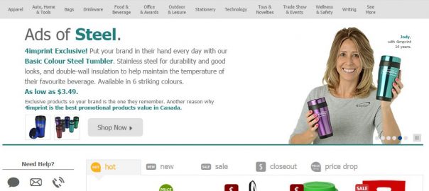
The other side of the sword is landing pages that ask their reader to do too many things. *WARNING* This screen shot may cause marketers to burst out into nervous laughter and sweat. This website (and many others you’ve probably cringed over) is busier than Santa on Christmas Eve and looks overwhelming to a new visitor that isn’t certain where to click.

Tip: Simplify your landing pages by sticking to one or two colors and determining what the goal or action you want the visitor to take on that page. Then, create a headline, short copy and one call-to-action to match that goal.
Being Nosey
Marketers need to be watchful of being nosey in two ways; asking their readers to share too much information too soon, and using that information too soon. In the context of landing pages, the reader can be completely immersed in the content on that page and be ready to move onto the next step and share their contact information in order to receive what they’re looking for, but a long form can quickly cause that person to bounce. This is particularly true if it’s the individual’s first visit to your site. You wouldn’t ask a stranger to share their home address with you if you bumped into them on the street, and a long form with fields requesting personal details is a similar concept.

Tip: While forms are necessary on landing pages to qualify the lead, only ask the bare minimum. A good rule of thumb is to base the number and depth of your form fields on the type of offer. If it’s a top of the funnel offer solely to educate the reader (and doesn’t mention your company or brand), a form including First Name, Last Name, and Email Address is probably sufficient. As the lead moves through the sales funnel and converts on a bottom of the funnel offer, you can get away with asking a little more detail like phone number or another personal detail that’s relevant to your business.
Cheesy Stock Photos
Either the amount of employees who high five each other in front of white backdrops has really become popular in the workplace, or stock photographers need to step their game up. Most marketers are aware of the role visuals play in marketing, but this can have the opposite effect if the photos are impersonal (and ridiculous). When marketers are having trouble finding an image that truly communicates what they’re trying to convey– that’s the first red flag. Images should say 1,000 words, but unfortunately staged stock photos just don’t make the cut, and in turn have become a landing page pet peeve.

Tip: Spend a little money and invest in some professional photos of your products, employees, or office. They’ll speak 1,000 words+ some.
Bad Design
There are plenty of pet peeves when it comes to websites as designs can be subjective. What might look appealing to one person can look atrocious to the next. However, most marketers can agree that web design can quickly turn ugly if:
- There are too many colors
- The navigation is cluttered or overwhelming
- Users need to pinch and zoom on mobile devices

Tip: Work with your designer to set goals for your website, create buyer personas, and develop a design that’s mobile friendly, with content to nurture those people into leads.
Digital & Social Articles on Business 2 Community
(42)
Report Post


