If you want to have a strong data-driven organization, it’s essential to use data throughout your design process. Columnist Brian Massey shares tips to help you be a data leader in your design decisions.

It can be hard to change things. I know. I started writing about conversion optimization in 2007, when it wasn’t even big enough to be called “nascent.” It took many years of writing and teaching before people started asking for optimization services.
But the alternative is to simply be a follower.
If you’ve been working to change the way your organization does advertising and marketing, I welcome you to our tribe. Welcome to those who choose to lead.
The key to a data-driven organization, as I have written, isn’t just in the analytics and A/B testing. It’s about using data throughout the design process.
Forcing data on someone may sound authoritarian, but you will find that it reduces the time your design team wastes, frees your copywriters to do what they do best and builds confidence with your executive team.
Eventually, everyone will love it. For now, my leader, you will have to deal with some bumps along the way.
The data-driven design process is a winding road
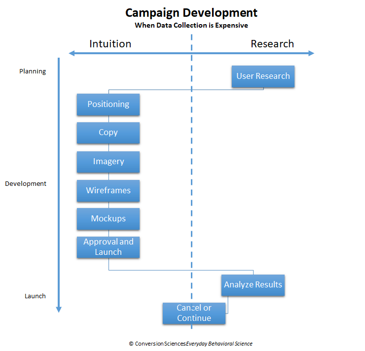
We are shifting our design process. Data no longer is something we look at after we launch. Analytics systems, marketing automation systems and customer relationship management systems all arrive on the scene too late. We want to begin optimizing before we launch.
This means shifting from a design process that relies on the intuition and experience of others…
… to a design process that provides you with data to help you make decisions along the way.
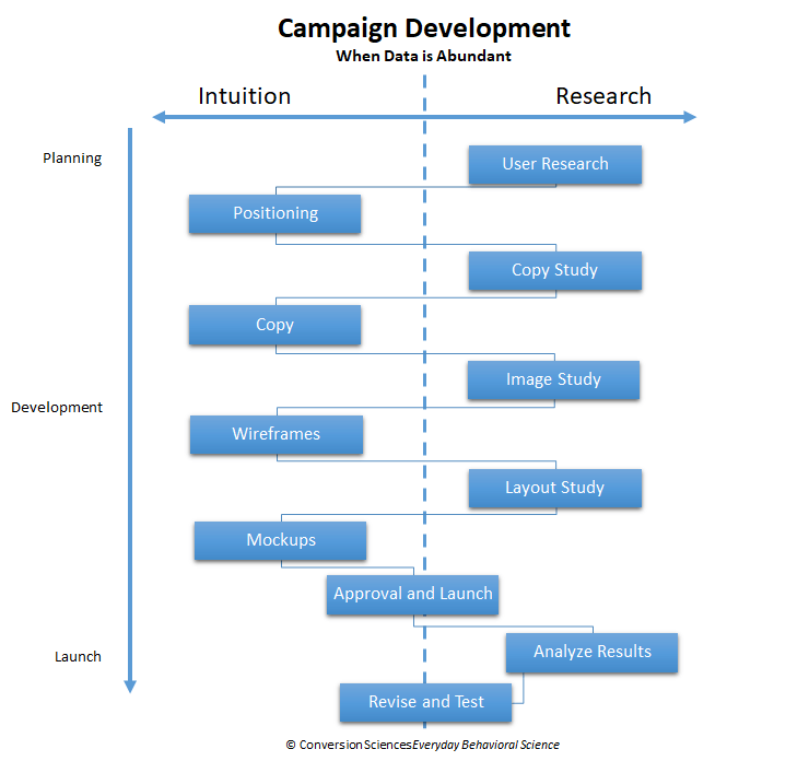
When data is abundant (like today), end-users are more involved in design decisions. As it should be.
As we saw in “9 studies for landing pages that work,” the introduction of these studies doesn’t have to lengthen the design process. In fact, it takes much longer to launch a campaign just to measure how badly it will perform.
Let’s get it right the first time, then go for exceptional returns.
As you drive change in your organization, you’re going to run into several obstacles. Here is how you use data to overcome these blocks to your ambitions.
Don’t start with the wireframes
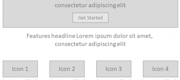
Most design processes begin with “gray pages” or “wireframes.” To develop these, all a designer has to do is draw a bunch of gray boxes and paste some “Lorem ipsum dolor bull baloney” into them.
I don’t understand Latin, but I know how to read “Lorem ipsum dolor sit amet.” To me, it reads: “Something that looks like progress.” Lorem ipsum wireframes are a deliverable early in the design process to show that work is being done.
Designers deliver wireframes because it looks like they are making progress on the project, but wireframes should come later in the process. Here’s why.
If you are creating a data-driven organization, then your first response is, “I don’t know. Let’s collect some data.” A typical way to do this is to commission a panel of pretenders and liars to look at the mockup and ask them questions like:
- What is the next step?
- Where would you click next?
- Does this website solve your problem?
But you can’t user-test a lorem ipsum wireframe!
It’s impossible to get any good data. The only questions you could answer is, “Do you like gray boxes?”
Wireframes with prototype copy are a great candidate for user testing. Be patient, and don’t let your designers start here.
Which of these mockups do you prefer?
It is a time-honored tradition that designers develop three design treatments and ask their boss or their client to choose the one they prefer. The premise is that any of the designs would work, so why not let the client choose?
This also spreads the blame around if the new page or website tanks.
If you are a data-driven organization, this is unacceptable. I know you really want to see the designs and make suggestions, but we are not designers. We are not our target audience. We are a test group of one.
Turn to our proven data-driven response: “I don’t know. Show me some data.”
At first, this is going to cause some fear and confusion with your design team. They may not know how to collect data cheaply and quickly. You may have to show them.
After that, when they present those three options, they will have a solid recommendation. Then you can weigh in on what works for your brand and voice.
Here’s the copy
Designers cannot persuade with design. Copywriters can persuade with copy.
When you develop wireframes before copy, you put copywriters in the position of filling boxes. This is quite different from the higher calling of creating a persuasive arch supported by a visual hierarchy.
Filling boxes may work for e-commerce product descriptions, but in almost all other pages, copy should influence design. Landing pages, home pages, how it works, about us, emails… all should take a visitor on a journey toward a solution. This cannot be done by asking them to hop between boxes.
Why not ask your designer to deliver three mockups? Then you can run these through a user test and see which is most persuasive.
Blank stare?
If words are more persuasive than design, why are we getting one version of copy, but three mockups of the design? This seems backwards.
Ask your writer to write three headlines and one paragraph that is conservative, safe.
Ask them to write three headlines and one paragraph that is aggressive, gutsy.
Ask them to write three headlines and one paragraph that is their most interesting twist on the value proposition.
Pick the best headline and put these options into a wireframe and show them to a panel of survey participants. Ask the questions:
- Does this company seem credible?
- Does this company sell a solution to your problem?
- Do you feel this company’s products are more or less expensive than the competition?
- What do you think the values of this company are?
If you ask the right questions, your survey participants will guide you to the right solutions. One of the three options may rise above the others. Or one may fall.
Once you have a direction to go with your copy, the rest of your decisions become easy. The images on your pages will improve because they will support the copy. The calls to action will improve because they will be in the voice of the website. Your information architecture will improve because you’ll know what words to choose for sections and navigation.
The CEO wants to see the designs
If you’re one of those crazy people trying to lead an organization from below, we welcome you. Unfortunately, helicopter executives can throw a wrench into your design changes, wanting to review and change your designs and copy at each stage of the process.
In my experience, this is because they don’t trust their team. Yikes. Data is the solution.
I have rarely seen an executive who, when presented with proper data, would choose his own intuition instead. Executives feel the need to fill vacuums with decisions, or their teams get bogged down. Fill the vacuums with data, and you’ll find your bosses to be more trusting and less arbitrary in their participation.
Congratulations on your choice to lead
Data-driven organizations will be the winners in your marketplace, and every marketplace. You have chosen to lead this transition in your business. My commitment is to give you tips and tools to be a data leader in your organization. This is not going to be fast or easy, but we’ll all be glad to visit your website when it is designed with us in mind.
Some opinions expressed in this article may be those of a guest author and not necessarily Marketing Land. Staff authors are listed here.
Marketing Land – Internet Marketing News, Strategies & Tips
(92)
Report Post