— May 16, 2018
LinkedIn profile tips to leverage the new 2018 layout design
Once again LinkedIn has updated the profile design.The top header of your profile now shows more relevant details you want people to learn about you immediately upon viewing your profile. Here are some LinkedIn profile tips to help you make the most of the new update.
Edit Your Header Image
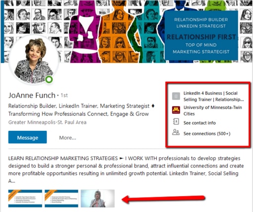
You notice your profile picture now is on the left side versus the middle of the header. You may have to edit your header images if the placement of your picture covers up any text. The header image is 1584px X 396px. The image size has not changed.
LinkedIn profile tip one is to leverage this header space to brand yourself and your company. A great image attracts people and helps you stand out from the crowd. You can create a custom graphic using a tool such a Canva or upload a favorite photo that speaks to who you are, just don’t leave the space blank with the default blue space.
Here is the updated version you see from desktop:
Create a Compelling LinkedIn Headline
Your LinkedIn profile headline is now left justified. Be sure your headline includes your keywords that identify your title or what you do. I encourage you to add words that are interesting and compelling and avoid the most overused buzz words that I share in my article, Is your LinkedIn Profile Dominated with Overused, Meaningless Words?
You have 120 characters to let people know who you are, so use them wisely. Please do not add the name of your company after your title as it is not necessary because your company name is in your experience section.
NEW to the right of your headline now shows your current company, where you went to school, your complete contact info and a link to our connections. Your contact information is the most important part of this section and you want to make it easy for people to get ahold of you.
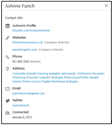
In addition, add your website URL’s, phone and address if applicable. In the example above, I do not want to add my address, so I have added additional keywords to describe what I do. Take advantage of all the contact space available and make it easy.
LinkedIn Summary Section – Tell Your Story
Notice in the new profile design you see above three full lines from your summary description show up before the ‘show more’ link. Previously you only saw two lines as shown in the image below. This is prime real estate in your LinkedIn profile so be sure those first lines are speaking to your ideal connection if you are prospecting or start to tell your career story. The goal is to encourage the profile visitor to click on the ‘show more’ to learn additional details.
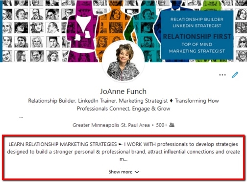
With the summary section you are allowed 2000 characters to tell your story. Be creative, informative and clear. Know your objectives for being on LinkedIn. It could be as simple as relationship management, brand awareness, building authority in a niche market or prospecting. LinkedIn profile tip – some of my colleagues suggest putting your contact information at the beginning of your summary so it appears front and center, I however like the idea of using language that tells the visitor right off how you help because the contact information is now to the right of your headline. It is something to test and see if you gather feedback.
Put yourself in the shoes of the visitor, will they know where you work, what you do and something more about? Will they know your career history, what you’re good at and how you serve others?
Add Multi-media in Summary
Three thumbnail images of your multi-media are now being show directly under the first three lines of your summary (see the first image at the top of the page). Previously there were no images showing unless you scrolled down into each section of the profile. You want to be sure the image, video or PDF shows something interesting enough that the visitor may click on them.
Multi-media in general adds visual interest to your profile coupled with the visual adding some value to your visitor. This is a great section to add a company informational video, images of your product or service or a PDF white paper that a visitor can download.
Update LinkedIn Skills Section
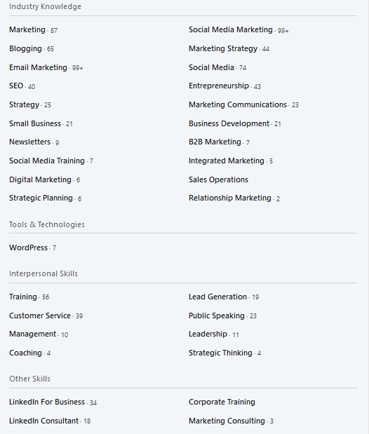
Have you noticed the updated version of the skills section? LinkedIn is now dividing your skills into topic categories. They are industry knowledge, tools & technologies, interpesonaal skills, and a all encompassing bucket titled “other skills.” LinkedIn is using some form of artificial intelligence to sort and categorize. Remember, you can search by skill and recruiter especially use this feature to find and vet candidates. I encourage you to update this section of your profile and be sure it is up to date.
LinkedIn Endorsements
As a strategy to stay top or mind with specific people in your network such as clients and prospects I recommend you go directly to the individual’s profile and endorse some of the skills you have knowledge about. It helps their profile in terms of credibility and they are notified that you took the time to endorse or I like to say, recognize them. Often, those same people will reciprocate and endorse you back.
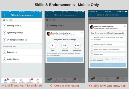
The desktop version is what is shown above, however, mobile version is different (see below).
You are asked to rate the skill and confirm how you know they have this skill.
LinkedIn Experience Section
Often, I see LinkedIn profiles that have the name of the business and the individuals title and little to no description. Don’t assume the visitor knows what your company does or what your role is with the company.
Be clear about what your company does, and bullet point out your services. When I update individual profiles I also like to articulate who the types of clients the company serves along with the type of results they can expect working with the individual and company. If a visitor must guess what you do, they most likely will move on and not take the time to ask.
Conclusion: LinkedIn Profile Tips
Think of your LinkedIn profile as a resource so when visitors open it, they know who you are, what you do and why you are credible. Tell your story in both words and multi-media. Don’t be afraid to be both unique and willing to share your accomplishments. Remember, people are most often meeting us online before we meet offline and first impressions matter and it starts with a profile that is complete, engaging and informative.
For a professional profile update, learn how I can help you stand out.
**Originally posted on my blog
Digital & Social Articles on Business 2 Community
(105)
Report Post


