— August 24, 2017
Blogging is a big part of what we do, and a major component of the successful inbound lead generation and search ranking efforts we execute for clients.
Given Google views each post as a page on your site, the more of them you have, the easier it is to get their attention. Likewise, fresh blog articles give you something to talk about in social media, and can be used to draw interested visitors via email.

For all the attention we pay to blog posts, we recently discovered (through discussion about a couple of clients’ websites) that we’ve take blog roll layout for granted.
Generally, we tend to prefer a list-type format with the newest posts at the top, with a teaser preview of each article flowing chronologically down the page. You can see an example of this design by opening our main blog page in a new tab (desktop view).

Cyrus Shepard Moz
A blog is so much more than a pageview generator.
It speaks in your voice, provides a gateway to your community, acts as your moral center and facilitates communication with the rest of the world. And done right, it’s an unbeatable marketing tool.
The major thinking behind this approach is that blogs are typically the “attraction” front end of a lead capture process that moves the reader to a related offer. The last thing we want is for a prospective customer to be distracted.
But, is this type of layout necessarily the best? Or, could increased content readership (aka branding/consumerism) via a grid view lead to a satisfying ratio of conversions as well?
After doing a bit of self-examination – and taking the time to study a few examples and web analytics – we still favour the list option for lead capture. However, to help you get thinking about your choices, we thought we’d dig a bit deeper into a few of the reasons why…
List Style Blog Roll Design is All About Purpose
Within our approach to inbound marketing, blogs are essentially being used for search visibility and as a lead attraction tool. Posts are bait, for lack of a better term. We want to bring visitors to blog posts and then “hook” them with a call to action. That could be a download, a subscription, or even a link to another related piece of content.
Each of these goals lends itself well to a linear progression. In other words, within the blog article itself we want to have as few distractions as possible. So, we want to have a feature image that grabs attention, some interesting and insightful text, and then an offer to take the next step. That works well with our list format, and encourages the kinds of conversions we are working hard to generate.
Food for thought: some companies have such a big marketing base that the readers of one blog post category are going to be completely separate from the readers of another.
Grid Blog Designs De-Emphasize Conversions in Favour of Encouraging Readers to Consume More Content
From our point of view, a main blog page with many different blocks is likely to leave a visitor choosing from images as much as topics. Because preview pictures are going to dominate the space, they carry an inordinate amount of weight when it comes to grabbing attention, so pick your images wisely.
Additionally, unless images are all formatted similarly (consistent colour schemes, fonts and headline sizes, placement of copy, etc.) they are going to have a mismatched feel when presented side-by-side-by-side.

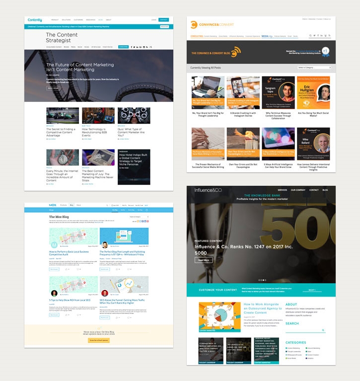
Content Strategist, Convince & Convert, Moz, Influence & Co example grid-style layouts.
That can be problematic from an aesthetic point of view, and can mean some of the best ideas are going to get skipped over because they have weaker preview images.
A bigger issue, though, is that grid blog layouts don’t have much room for details like dates, categories, and other indicators, not to mention the preview text. So, your best blog posts can end up getting lost or ignored simply because, they don’t stand out graphically.
One way around that issue, of course, is to simply keep your most popular blog posts at the top. However, then you just create other issues. For one thing, it’s nearly impossible for your newer posts to generate enough interest for them to display the top of your feed.
And for another, it can give the sense that your blog hasn’t been updated in quite a while, since someone who visits your page is going to see the same articles they viewed the last time they stopped by. Timing is a big consideration for blogs. people expect them to have new content regularly.
One could make the argument that it doesn’t matter whether blogs are ordered by date so long as they are arranged by topic. There is probably some truth in that, but most of your visitors and prospects are still going to want to see your newest ideas at the top of your feed.

The 3 Times When a Grid Layout Make Sense
In looking through various examples on the web, we see three occasions where grid-based blog rolls actually make a lot of sense.
- The first is in marketing situations where a company is posting material that isn’t timely, and is formatted very consistently. In other words, they have a lot of blog articles that can be read by people who are researching general information and don’t need up-to-date thoughts or ideas. Additionally, these types of marketers tend to have heavy email distribution, so new posts can be broadcast directly to subscribers without having to be “found” online. To a first time visitor, these sites may appear inviting at first, but will soon lose their shine.
- The second situation where grid blog roll layout might be used is when a company is trying to suppress how often they post. In that sort of scenario, a graphical layout of the most popular topics (and an absence of information about dates, activity, and other details) makes sense. After all, the blog isn’t so much a journal of ongoing ideas as it is an information repository designed to make it look like the company is engaged and sharing their thoughts. Tip: stale sites fall down search rankings.
- And the third is actually the best argument in favour of a grid style layout. The site has fans. Lots of fans voraciously consuming content. That said, these sites should be looking at a more magazine-style layout presenting features and mixed media meant to entertain readers, rather than convert them. It’s good, old fashioned branding and it has a place.
It goes without saying that we don’t encourage the first two of these grid approaches, and frankly would be very skeptical of the first. Even if you did have many subscribers and were to blog about topics that hold up over time, the disadvantages of that type of layout are still too significant. If the point is to generate leads, it makes sense to keep things in a sequential order leading to the point of conversion.
What Should Your Blog Look Like?
Hopefully, we’ve made our points well enough that you understand why we prefer a certain type of look for a marketing blog. We think it’s all about usability, convertibility and encouraging conversion action from your content.
However, we are always open to experimenting with different thoughts and ideas. That’s how the topic came up in the first place. So, we invite other opinions. Whether you agree with our assessment on blog roll layouts or not, leave us a comment below or reach out in social. Let us know what you see as a best fit for your business, or if there are specific things you look for when deciding which posts to read.
Maybe you’ll inspire us to think about a whole new format for blogging that works even better!
Digital & Social Articles on Business 2 Community
(108)
Report Post


