In 2014, the average conversion rate across industries was between 1.13%-3.69% on desktop. These numbers fluctuated even more when factoring in mobile and tablets. While there are many factors contributing to these low numbers (volume for one), a big reason e-commerce sites lose on conversions is because they cast nets that include users who either can’t afford to transact, or aren’t in the transactional mindset.
The Internet contains many diverse personalities, but they all boil down into two distinct types: the transactional and the aspirational. As an e-commerce business, your goal is always to aim your “pick-up lines” (well-crafted ads) at beautiful, sophisticated, and clever Madame Transactional, rather than her ugly friend with a glowing personality, Chiquita Aspirational. Here’s how:
Begin The Courting Process: Target The Transactional User Over The Aspirational User
Read (Search Query) Body Language
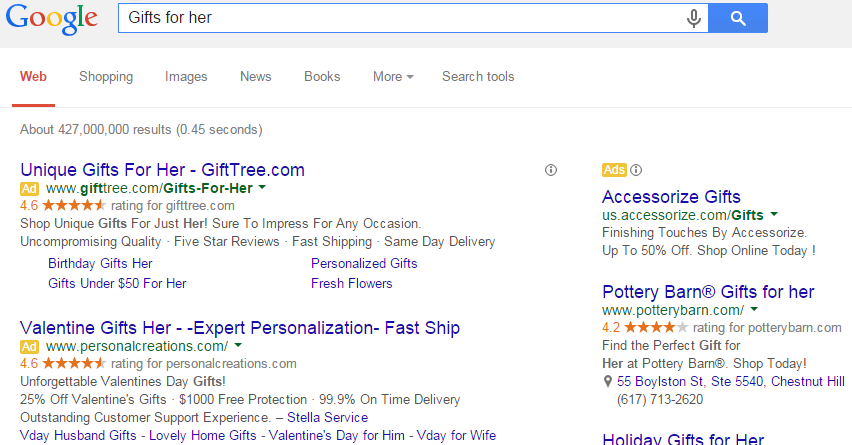
Are you getting those hints that the user is digging you, or at least is interested in the vague idea of you? Are they being specific about their commercial intent while also spelling out where they want this to go (as in, did they spell out the exact model/product type in their query without the dubious word “review”)?
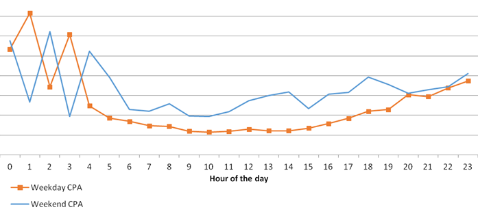
Transactional users tend to act quickly because they’ve already done the research aspirational users still need to do. Knowing when they are most likely to convert (are they weekend warriors or is the weekday their time to purchase?) will help you target the ads to when they are most likely to say yes to your PPC advances. In this instance, “gifts for her” implies someone is actively searching for a present, and while they may have hints of research in their behavior, they have more urgency than a user searching for “what do I get my girlfriend?” Conversely, the query “geeky couple’s t-shirts” is more specific and indicates an even more transactional nature.
Put Out Your Own Vibe
Transactional users don’t have time for insecure or indecisive e-commerce ads. If you want them, tell them so with tightly knit keywords in your ad groups (no more than 20-30), as well as eye-catching ad text.
Headlines are a place to show off your winning personality, or how you can specifically answer the transactional user’s needs. The description should detail long-term-relationship-worthy qualities, as well as the call to action. Absolutely include extensions to shove your competition out of the way, as well as show off in the best way possible in front of the transactional user.
Aspirational users may slip through the cracks, but by crafting a robust negative keyword list, targeting the ads to the right time and device, and including demographics in the segmentation, you can filter out as many as possible, without alienating them from becoming transactional users.
Paint A Pretty Picture For Them
Don’t limit yourself to only text search ads. Leverage Google Shopping to show the transactional user what they have to look forward to if they choose you over the competition, including promotions (which help increase your presence in the rankings), clean photos of the product, and a product description that invites conversions. Also, while display ads have significantly lower CTR, they can be a meaningful way to entice transactional users to think of your brand, or remind them to act on a purchase they have been meaning to complete.
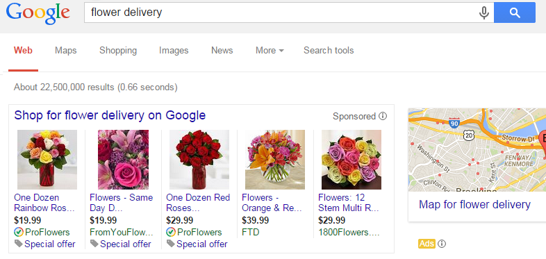
In the example above, the flowers act as additional engagement, as well as grabbing attention away from the text ads closer to the fold.
Chatting Them Up: From Click To Landing Page To Shopping Cart
Now that you’ve got your transactional user engaging with you, it’s time to get them to transact. One of the biggest pitfalls in e-commerce is when the landing page behind a well-crafted ad doesn’t deliver on the confidence of the ad. This happens when the ad leads to the home page instead of the promised product, an index page with multiple options of a product type when the ad specified a single product, or worse, there is a complete disconnect in the products available vs. the products promised. Here’s how to follow-through on that great pick-up line:
Be Clear With Your Intentions
You just sent out the “come hither” vibe to the transactional user who’s got their wallet half-open already. If you want them spending money, put them in a place that leaves them with the least amount of room to avoid doing so. Sending a transactional user to the home page (unless the ad is only about the brand) is like buying a hot stranger a drink and then having nothing to say. They’re open and receptive, but with a limited attention span. There should be a clear path from the product they just expressed interest in to the shopping cart that will allow them to pay for it.
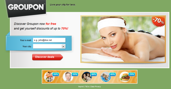
While not every landing page is oriented around a lead gen form, this one does a really good job of illustrating an easy path to victory. The user lands on the page and is incentivized to provide their email because of the clear savings they see on the right.
Choice is the enemy of the decisive: While it is good to give some options (color, size, etc.), showing multiple products can impede the transactional user’s purchasing confidence. Should they research more? Does the ad they just clicked on lead to the best price? Unless the query included terms like “ideas” or birthday/fill in the blank holiday, there is no reason not to send the user to the exact product they searched for or at least one they are likely to convert on.
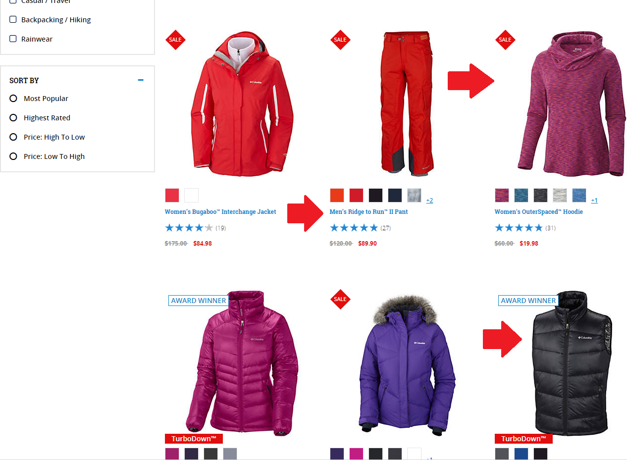
If there is truly room for interpretation, at least apply filters so the user sees you’re listening to their wants and needs. Additionally, don’t be afraid to push the transactional user towards the purchase by listing a limited amount available near the “add to cart” button. If there’s even a hint of doubt in the transactional user’s mind, seeing the limited quantity available or limited amount of time available is an easy way to push them to action. The example landing page resulted from a “women winter coat” query, yet there’s a pair of men’s snow pants, a fashion hoodie, and a vest on the same landing page as the more relevant products. By having these extra items on the page it detracts from the focus of the user, which may ultimately result in a bounce.
Don’t Be Afraid To Recommend Products
The focus of the page should be on the product the user is searching for – but it’s okay to make educated recommendations on other products they might want. This is especially useful when you incentivize your users to spend more so they get free shipping or other deals.
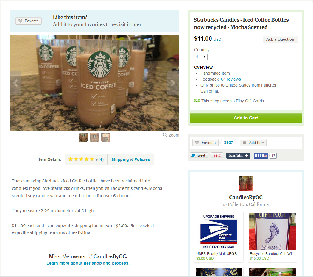
These recommendations should be below the fold (the user should need to scroll down to see them). These can also be suggested when the user adds their initial item to the shopping cart. In this example, we had to scroll down to see the recommended products from this Etsy vendor, and the eye is focused more on examining the product in view as well as adding the candles to the shopping cart.
Sealing The Deal: Getting Through The Conversion Process Without Shopping Cart Abandonment
You’ve won over Madame Transactional and she’s ready to take you home. At the same time, the conversion is at its most vulnerable just before the transaction is completed. Shopping cart abandonment is a very real problem: 68% of shopping carts get left behind. This leads to a lot of questions and insecurities, but luckily there’s still hope. Shopping cart abandonment can be both cured and prevented!
Enable Repeat Business Without Gate-Blocking The First
Every e-commerce site tries to achieve the perfect client relationship. Happy repeat customers means the focus of campaigns can be on capturing new business, rather than chasing after old. The problem is, in order to retain information about a user, they need to create login credentials (which has the potential to be way too time-intensive for fast-paced e-commerce).
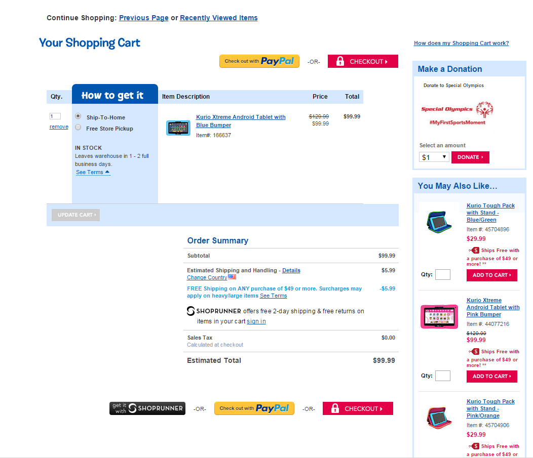
A great workaround is to use the free Facebook “sign-up feature” or to allow users to pay with PayPal. This means the user can complete the transaction effectively, without being forced to enter lots of information before the perceived transaction. If your site doesn’t lend itself to a third party functionality, think about limiting the amount of info needed to sign up to name and email. They will enter in the other info through the course of their payment. In the Toys R Us example below, they not only allow the consumer easy check-out options, they give them the chance to meaningfully expand the order.
Don’t Be Afraid To Sweeten The Deal
Some transactional users play hard-ball and look to game the e-commerce system. While the ultimate goal must be the best ROI possible, it makes more sense to create a brand evangelist who got one or two deals, than a one-time butterfly. These deals can be free shipping, a certain percentage off, or even free samples. It’s worth noting that email marketing makes up 7% of e-commerce leads that convert (search makes up 15%), so while in an ideal world every transactional user converts in the first instance of hitting the site, there’s a given percentage that will need to think about it overnight, and convert via your email promo in the morning.
Follow-Up On A Great Time With Remarketing
Whether the user converted or not, tasteful remarketing is a must. When a client has already bought from you, they are establishing the habit of returning to your site for products you sell. If they didn’t convert, there’s still a chance to win their business by reminding them your product is still there and potentially at a slight discount. It is vital that the segmentation of the remarketing fall under the likelihood the user will respond favorably to the prompt: users who buy can get an email once or twice a month with recommended products based on the products they purchased, while a user who bounces before converting, but puts the product to the cart might need a once or twice a week reminder to complete the transaction.
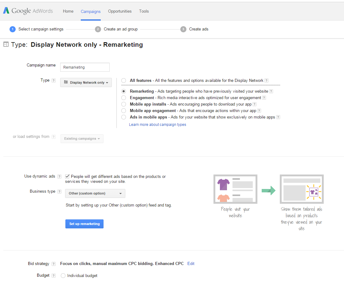
Best part of remarketing: you can turn the users who might be aspirational into transactional users through the magic of well-structured remarketing. Think of them as the beer goggles of PPC!
(290)
Report Post