— January 23, 2019
Think of your brand’s website as a city. Your city is unique and has a variety of attractions to visit. If you could give someone a map of your city, what would it look like? Which attractions are you going to highlight? Would you recommend visitors take Main Street to get there?
Make sure your city’s map leads visitors to what they’re looking for with a well-designed navigation menu. A navigation menu is the block on your website dedicated to guiding users through your site. Poorly optimized menus create user frustration leading to lower conversion rates, traffic, and rankings. Follow these steps and best practices to ensure your website’s navigation is living up to its full potential.
Popular Navigation Structures
When it comes to choosing your navigation menu structure, there is no ‘one size fits all’ option. What’s most important is that you’re choosing a structure that fits your site’s architecture. Let’s begin by reviewing some popular navigation structures.
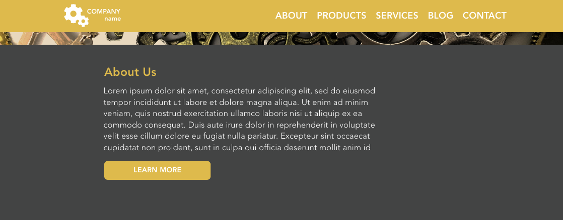
Traditional Navigation – Traditional navigation menus are the most commonly used navigation structure. These menus are horizontal blocks of categories that live at the top of the website.

Sticky Navigation – Sticky navigation, or fixed scrolling, follows users as they scroll up and down the page. Sticky navigation is a great option for sites with long or infinite scrolling. This style encourages visitors to check out other areas of your website at any point of their site exploration. While they are loved by some, others might find them distracting and disorienting. I recommend looking at sites that currently utilize this structure to determine if it’s a good fit.

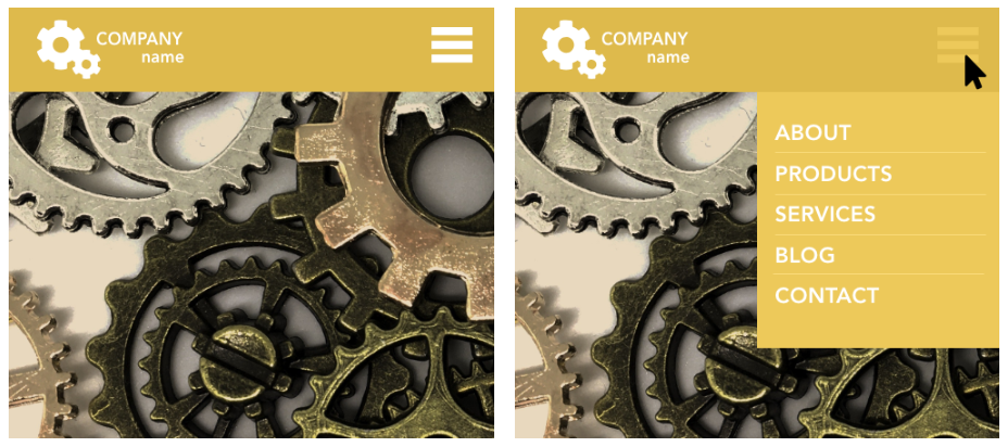
Hamburger – Hamburger navigational menus are collapsible, square-shaped icons with three parallel lines. Once clicked, the icon reveals the navigation menu. This menu style is modern, stylish, and mobile-friendly. Most mobile websites utilize this structure in the far left or right corner of the page.

Sidebar – Sidebar menus live on the right or left side of websites providing more room for large expanses of text. This structure is beneficial for websites with several descriptive categories that may not fit on a traditional horizontal menu. They’re most commonly used in conjunction with traditional menus on ecommerce websites.

Order & Quantity
Once you’ve selected a style that will resonate with your users, determine what your navigation items will be. To maximize your site’s user experience, you should cut out the non-essentials and limit your navigation items to 7 or less. This is a perfect example of a “less is more” scenario. Too many items will overwhelm your site’s visitors and distract them from high-impact landing pages. To determine what your high-impact pages are, consider what your goals are for your website and where you want visitors to go.
Once you’ve determined your final items’ order of importance, arrange them accordingly. Menu items placed in the front or top of the menu are more likely to be seen.
Communicate Effectively: Avoid Using Generic Labels
You may be wondering how descriptive your navigation items should be. To maximize your site’s user experience, reduce your bounce rate, and stay relevant in search engines, use popular keyphrases within your industry. Steer away from using generic terms like “Products” and “Services”. Descriptive, SEO-friendly labels will make it easier for users to find the specific products and services they’re looking for.
Dropdown Menus: Yay or Nay?
Dropdown menus are quickly becoming a thing of the past. Most web designers argue that using dropdown menus is bad practice due to the fact that they’re an additional decision a user must make. If you were able to engage a user for one click, would you want to risk that for one more? Mitigate the risk of a user leaving your site by eliminating dropdown menus.
Worried your subcategories will be lost without dropdown menus? Combat this by introducing your subcategories within its corresponding category.
Colors & Fonts
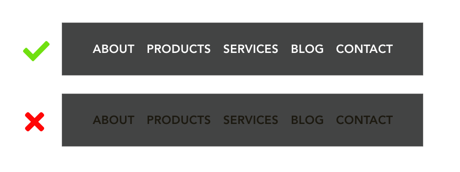
Even though the primary reason for having a website navigation menu is to improve your site’s user experience, it’s still important to make sure it’s visually appealing. Choose colors that are easy on the eyes and contrast well. If there is any hesitation that something could get lost, reevaluate your site’s color scheme.

When choosing a font for your navigation, make sure the text is readable and large enough in size. Avoid using decorative typefaces such as script or handwritten fonts. Decorative fonts are harder for users to quickly process. Reference Typography on the Web for more information about choosing the best typeface for your website.
Putting It All Together
When crafting your website, it’s easy to get caught up in areas other than the navigation menu. An under-developed menu creates user confusion and frustration. Remember to limit your navigational items, describe them appropriately, and choose the best structure for your site’s needs.
Digital & Social Articles on Business 2 Community
(69)
Report Post


