What if your primary objective isn’t to convert? How do you measure the success of your content shared on social? Columnist Mark Traphagen explains why average time on page isn’t the answer.

In many cases, your content and landing pages that get social traffic have a clear success metric: conversion. You want to know if traffic coming from your organic or paid social media leads to the specific conversion action the page is supposed to generate.
But what about when your goal is something other than a measurable conversion? What if the main objective of your content is establishing brand authority and reputation? What is the best success measurement in that case?
Why average time on page is NOT the answer
When your main goal for your content is to help, inform or entertain your users so that they form a positive association with your brand, then the action you want them to take is to read it.
Getting people to read what you’ve written is more of an achievement than you might think. Landing them on the content from your social links is only the beginning of the battle. A Columbia University study showed that 59 percent of the links shared on social media had never been clicked on by the people who shared them. In other words, they shared them without reading them.
But once you get past that hurdle, and a real human has clicked a social link and come to your page, how do you know if that person has actually read the content?
The most obvious metric for measuring that would be average time on page. It seems reasonable that the longer someone stays on a page, the better chance that they’ve read what’s on the page.
However, there are two deep problems with average time on page as a valid “did they read it” metric:
- Time on page is not a guarantee the page was read. Time on page simply measures how long the visitor had the page open on her browser. It has no way of ascertaining what (if anything) she did while it was open. She could have opened the page and then been distracted by something else, only to close the tab later without having read the content. We simply have no way of knowing if the visitor went any farther than the above-the-fold portion.
- Time on page doesn’t always measure actual time on page. This is a lesser known but actually more insidious problem with this metric, at least for Google Analytics. The truth is that average time on page only registers any time for users who navigate to another page on the same site in the same session. Any visitors who land on a certain page, spend some time there, and then leave that page without visiting another page on the site in the same session are recorded as 0:00 time on page.
Why does that happen? It has to do with the way the Google Analytics pixel on your site is fired. It’s triggered when someone first arrives on one of your pages (creating a session), and that starts the clock ticking.
However, to fire the pixel again and thereby stop the average-time-on-page clock requires the pixel seeing another page load. If the user closes the browser, the tab the page was in, or hits the browser back button to leave your site, none of those actions can trigger the pixel, and therefore no time is recorded, even though a session is recorded.
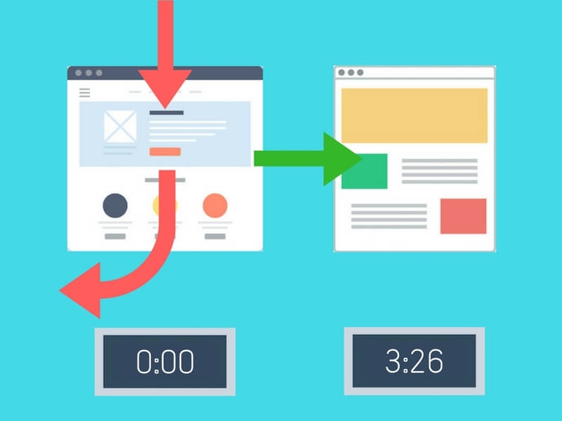
In the illustration below, the top red arrow represents visitors entering a landing page on your site. The green arrow is a visitor who then navigates to at least one other page on your site. The time recorded (3:26) is the total time they spent on the first page before moving to the second.
The curving red arrow represents someone who viewed the landing page for any length of time, but then left your site without navigating to any other pages. As you can see, zero time on page is recorded for that visitor.
Let’s take a look at how much that quirk of Google Analytics distorts the average time-on-page metric. Let’s suppose three people visited one of your pages today. Here are their actual times on the page, and the action they took after viewing the page.
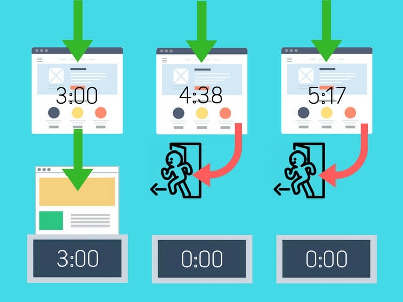
Visitor 1 went from your landing page to another page of your site, thus firing the analytics pixel and causing the three minutes spent before moving to that next page to be recorded as time on page for the first page. But the other two visitors, even though they stayed longer on the landing page, both left the site without visiting another page. The pixel did not fire a second time, and they both were recorded as 0:00 time on the page.
Here’s the rub. Visitors 2 and 3 both still got registered as a session on your site. And average time on page is calculated by dividing total time on page by the number of sessions that entered the page. So, in our example, since visitors 2 and 3 were recorded as zero time on page, visitor 1’s three minutes gets divided by three sessions, and becomes just one minute average time on page. So it ends up looking like your visitors spent far less time on this page than they actually did.
Actual Average Time on Pages = 4:30 [(3:00 + 4:38 + 5:17)/3]
Reported Average Time on Pages = 1:00 [(3:00 + 0:00 + 0:00)/3]
That distortion can be especially misleading for your brand-building content. At my agency, a keystone of our marketing is our big data studies. We know from talking to prospects and customers that these major content pieces play a significant role in developing a strong reputation and trust in our prospects, and therefore are an important part of the journey for those who become customers.
While we love it when visitors are inspired to visit more than one page on our site, we’re quite pleased if they just come to one of our anchor content pages and actually read it. It’s very common for people to come to a blog post and then leave; the content is what they came for. But as I noted above, we still consider that one-page visit a success if the person actually viewed the content.
So if we can’t rely on average time on page to tell us which content driven by our social campaigns is most effective, to what metric can we turn?
The solution: scroll depth
What is scroll depth? It’s a measurement of how far down a page of web content someone has gone during their time on the page. For any content that is deeper than the above-the-fold space of a browser window, scrolling down is a positive action the user must perform to see all of it, and anyone taking such action is more likely to have been a reader of the content.
It’s reasonable to assume that the more visitors who go deeper down the length of a page, the more interesting and engaging the content. So scroll depth can be thought of as a different kind of engagement metric, one you can use in conjunction with other engagement metrics (page visits, social shares, comments and so on) to gauge how users react to your content.
There’s a problem, though, with scroll depth as a metric: Google Analytics doesn’t measure it.
Thankfully, there are third-party solutions that do, and some integrate with your Google Analytics. It won’t be my purpose here to review them all, but a little research will turn up numerous plugins or services that may work for you. As a WordPress site, we use the WP Scroll Depth plugin. It measures when visitors scroll to 25 percent, 50 percent, 75 percent and 100 percent of a page. It can also be configured to trigger when a user scrolls to a certain element of a page.
WP Scroll Depth records those four scroll points as Google Analytics (GA) events, so they can be displayed in the Behavior section. In GA, an event is triggered when a visitor performs any predefined action, such as clicking a call-to-action button. In this case, each scroll depth percentage is defined as a labeled event, so it can be tracked and associated with other dimensions of your analytics.
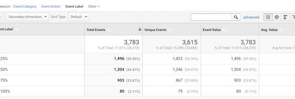
Here’s what scroll depth looks like for one of the content pages on our site:

As you can see, 60.45 percent of the visitors who scrolled down this page went beyond 25 percent. Knowing that this was a long content piece, and that many people have a natural aversion to actually reading longer pieces, we see this as a very successful post.
Scroll depth and social campaign success
Scroll depth is a useful metric, not only for evaluating individual pages on your site, but also for evaluating which of your social media campaigns and sources bring you the most actual readers.
Scroll depth by social network sources
To evaluate how deeply each of my main social networks scrolls my content, I start in Google Analytics.
- Go to Acquisition > All Traffic > Channels and click on “Social” in the Default Channel Grouping Channel.
- Click on the Secondary Dimension button, type “Event Label” in the search box, and click on the Event Label chicklet.
- Set “Show rows” at the bottom of the view to a sufficient number to show all the data you want.
You’ll now see an unsorted table of all of the sources Analytics puts under Social, along with the WP Scroll Depth scroll percentage labels.
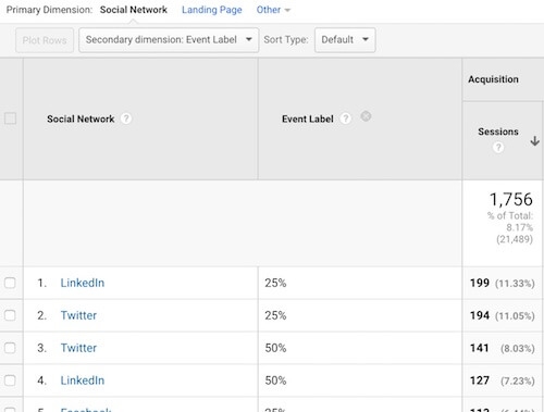
To make this data useful, export it as an Excel spreadsheet (using the Export tab at the top of the Analytics view).
In Excel, do the following to get this data in an easy-to-compare format:
- Go to the Dataset 1 worksheet.
- Highlight and delete all columns after “Sessions,” as these won’t be used in our analysis.
- Highlight row 1 (with the column labels) and on the Data tab, click the Filter icon.
- Click the filter arrow on the “Social Network” column, deselect “Select All,” and check the boxes of the networks you care about. (Google Analytics dumps a lot of sources into the Social category, many of which will not matter to you.)
- Highlight the “Event Labels” column, right-click it, select “Format Cells,” and change the number type to “Percentage” with 0 decimal places.
- On the Data tab, click the Sort button and sort by “Social Network” (ascending or descending), then by “Event Label” (descending).
Your table should now look something like this:
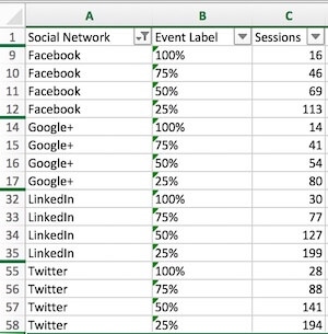
Next, let’s calculate a percentage of session for the scroll depths of each network.
- Insert a row under the last row of each social network, and do a calculation to sum the sessions for that network.
- Label column D “Pct Scrolled To” and format it as a Percentage number type.
- Calculate a percentage for each scroll depth by dividing its session count by the sum of session counts for that network. (For example, in cell D9 below I entered “=D9/244” without the quotation marks.)

The surprise for me here was that there was very little difference between the networks in the percentage of people that scrolled to each of the four sections of my pages. However, the raw numbers show that Twitter and LinkedIn far exceeded both Facebook and Google+ in the number of sessions generated where users scrolled down the page. So I might conclude that those two networks send me my best readers.
Scroll depth by campaign
If you UTM tag your social media links, you can perform a similar analysis using those tags. For example, we tag all our organically shared social media links with the medium tag “social-share,” our paid social links with “paid-social,” and the Social Warfare social plugin we use automatically tags anything shared with our social sharing buttons with “social-warfare.”
In Google Analytics, I go to Acquisition > All Traffic > Source/Medium and change the Primary Dimension to “Medium.” I then add the Secondary Dimension “Event Label,” export it as an Excel sheet, and using similar manipulation as I used in the section above, end up with a comparison of the scroll depths for our shared social media links:
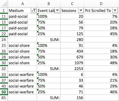
Here we can see that our paid social traffic performs slightly better than traffic from our organically shared links, with 7 percent of those who scrolled down reaching 100 percent of the page, compared to 4 percent for traffic from our own social media shares or from our social sharing buttons.
Getting more scrollable
Of course, merely scrolling down a page is no guarantee that a visitor actually read the page, but it does indicate they at least scanned it and were exposed to more of it. Those who scrolled further certainly got more from our content than those who shared it without viewing it at all!
How can you improve the scroll percentages of your content (with your real goal, of course, being more people reading/seeing more of your content)? Here are some tips to try:
- Make your content scannable. We’d all love to have every visitor read every word of our content, but the reality is that the majority of visitors will not read every word you’ve written, so you should try to maximize the chance that they will at least scan and thereby glean some benefit from the content. To make your content more scannable:
- Break it up with lots of headings, subheadings, bullet points and illustrations. All of these create diversity and more white space, which makes text look less intimidating.
- Vary the length of your paragraphs.
- For very long content, include a table of contents near the top, with links that jump down the page to each section.
- Use storytelling. Even data studies can have a kind of plot. Instead of giving everything away at the beginning, start with a plight (a problem or question that needs solving), move to how you solved it, and end with the solution. A plot helps motivate visitors to keep reading.
- Keep intros short. Avoid the temptation to go on for many paragraphs giving lots of background on your subject. Readers want to get right to the point of whatever your headline promised. If you go all around the barn, many will drop out.
- Promise treasures ahead. Occasionally include a “sub-problem” and let the reader know you will resolve it further on.
Add a scroll depth tool to your analytics arsenal and see if it tells you some new stories about the effectiveness of your content as you share it on you social media outlets.
Some opinions expressed in this article may be those of a guest author and not necessarily Marketing Land. Staff authors are listed here.
Marketing Land – Internet Marketing News, Strategies & Tips
(66)
Report Post