— September 8, 2017

TeroVesalainen / Pixabay
What is Adaptive Design?
Adaptive web design adapts to the browser environment, and may or may not take into account the browser’s size. I bet customers think that the mobile web is the new black as they find themselves spending at least a few hours a day surfing the web on a mobile device.
Users joyfully browse sites that are created to ensure a comfortable web journey no matter what device is used, and ignore sites that are not optimized for their smartphones or tablets.
The core of customer satisfaction or disappointment is a website’s design. If it is chosen properly according to customers’ needs, then users are likely to be pleased. So how do you make the right choice?
In this article, I’m going to reveal what a mobile strategy is, why it is crucial for a company’s online presence, and what web design to implement when building your website so that your visitors fall in love with it.
First, let’s learn about mobile strategy.
What is a Mobile-First Strategy?
Smart phones and tablets are quickly becoming people’s personal pocket computers. As a result, customers are using these devices everywhere, and that greatly influences how they evaluate companies’ websites, how they interact with the companies, and how they make decisions.
Unfortunately, many executives still underestimate mobile trends, although in reality, these trends can be huge, game-changing opportunities for most businesses.
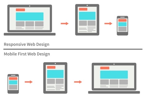
But what exactly is a Mobile-First strategy? A Mobile-First strategy is when a website is intentionally built so that customers and employees will interact with it from any device they have.
Implementing a mobile strategy may also be advantageous for search engine optimization (SEO) of the site. Not long ago Google finally made an official announcement that it is going to slap websites silly if they are not optimized for mobile.
The second reason to make a site mobile-optimized is statistics. Currently, 61% of users are unlikely to return to a mobile site they have trouble accessing it, and 40% will visit a competitor’s site instead.
Few people doubt the necessity of using a mobile-strategy. Most companies are wondering HOW to implement the strategy and what web design to use in order to make their website attractive for both desktop and mobile users.
Two of the most common types of web design that work for Mobile-First websites are Adaptive Design and Responsive Design.
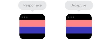
It consists of multiple interpretations of the same design – one for each size. Each version is assigned to specific ‘anchor points’ that tell a browser when to jump to the next layout.
A designer will usually create a different layout for each of the six most common viewport widths (320px, 480px, 760px, 960px, 1200px, and 1600px).
When to choose Adaptive Design?
- Adaptive Design is more advantageous for retrofitting existing websites than for building new ones, because it needs to be designed with layouts with a minimum of six widths.
- Adaptive websites work well when user intent with mobile differs from that of user intent on desktops. For example, on some websites, a user on a mobile device is likely more interested in booking a service appointment than looking at a catalog.
Why to choose it?
Adaptive web design allows you to take control of the design and focus development on specific, multiple viewports.
With an adaptive site, a company can measure which options are performing best and alter the design to maximize online traffic.
For example, if a site gets the majority of traffic via desktop use, then the company needs to make sure that it has removed constraints such as site speed, usability, load time, etc., that a user of the site on a desktop may experience.
It is important to note that a designer can add views for different types of mobile devices, but with Adaptive Design, the efforts can be focused on any specific priority.
Adaptive websites also excel in load time performance and overall user experience, because they work by transferring only the necessary assets for the specific device.
According to research, adaptive sites are often two to three times faster than responsive ones.
What is Responsive Design?
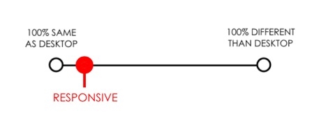
Responsive web design works without regard to the type of browser in use, because it responds to the size of a browser and then reflows the layout accordingly.
Jeffrey Veen said, “Day by day, the number of devices, platforms, and browsers that need to work with your site grows. Responsive web design represents a fundamental shift in how we’ll build websites for the decade to come.”
When to choose it Responsive Design?
- Most new sites use Responsive Design.
- Designers and developers who do not have a lot of experience consider Responsive Design easier to work with thanks to the availability of themes accessible through CMS systems such as Drupal and WordPress.
- Responsive websites generally work well for websites that have minor differences between mobile and desktop in user intent. Users want to see the same website options from both desktops and smartphones.
Why to choose it?
Responsive doesn’t offer as much control as adaptive, but takes much less time to build, implement, and maintain. Also, it is cheaper than adaptive, which requires dedicated mobile websites.
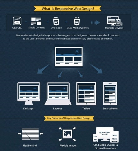
The website is able to adapt to the type of device that the user is using.
When United Way Bay Area (UWBA) and Morweb CMS teamed up to turn a simple website into an immersive user experience, the results were surprising.
By adopting Responsive Design, United Way of the Bay Area was able to increase their mobile sessions by over 34 percent, increase tablet sessions by 21.5 percent, and generate 28 percent growth in year-by-year online donations.
Responsive web design is also recommended and rewarded by Google. The search engine algorithms work so that sites with a growing number of mobile users rank higher than those that are not responsive.
Responsive design can help the Google ranking algorithm understand that your website provides an acceptable user experience whether it is viewed on a phone, tablet, or desktop.
What Design Should You Choose for Your Website So That Customers ?
Cannot Take Their Eyes Off It?
Before deciding on which design to implement, it is essential to spend plenty of time researching your company’s audience and their needs.
In particular, who is viewing the site? What kind of information do they want to see on it? Do they get it? What kind of device do visitors use most often when viewing the site?
Answers to these questions will help you to analyze and subsequently build a strategy for developing a new site or altering a current one.
This information can be found through Google Analytics or basic focus group testing. The most common problems with a website might be slow load time, not resizing to the customer’s screen size, and the lack of top-quality content.
This information will allow you to understand why a potential customer might leave your site.
The second thing to consider is whether to build a new site or work with the current one. Most new sites are built with the help of Responsive Design, which may increase mobile traffic.
As a rule, existing sites choose Adaptive Design.
If a company has a limited the budget, then responsive design might be a better choice.
If a company has a limited budget, then Responsive Design might be a better choice. If the goal of the site is to deliver a lot of content to users and doesn’t have much in the way of advanced functionality, then responsive is probably the best way to go.
Conclusions
The website of a company is usually the first contact that a customer has with a brand. If the user experience of a website’s visitors is poor, it will be hard to persuade them to interact with it in the future.
That is why it is crucial to consider a proper web design strategy as quickly as possible.
Knowing exactly who makes up a company’s audience is critical. Once it is understood who a company’s customers are and what devices they use to access the site, it will be possibly to develop a design that will satisfy customers and enhance their user experience.
Executives also need to decide if their company needs a new site or if they should continue working with the site already in use.
Responsive websites generally work well for websites that have minor differences in user intent between mobile users and desktop users. Adaptive websites work well when user intent on mobile differs greatly from that of desktop use.
In the end, Responsive Design is cheaper, because it allows a company to have a single website that fits the various screen sizes of the devices on which the site might be viewed. It’s a simple math — one website is obviously cheaper than two.
Digital & Social Articles on Business 2 Community
(90)
Report Post