All the essentials of mobile SEO covered in one step-by-step guide, from mobile-friendly code and navigation to Core Web Vitals and mobile-friendly testing. If you want to appear in mobile searches, make sure you tick them all off.
According to data from Statcounter, mobile accounts for 56.94% of all traffic as the world increasingly does most of its browsing on smartphones. The mobile experience is getting more important every year and this is reflected in Google’s shift to mobile-first indexing over the past few years.
In this article, we guide you through the essentials of optimising your website for mobile search, including the latest ranking signals introduced by Google.
The usual SEO essentials still apply
Before we get into the specifics of mobile SEO, let’s be clear that all of the usual SEO essentials still apply. We’ve already published an SEO checklist covering the following optimisations for all websites:
- URLs: How to optimise domain names and URLs across your website.
- Canonicalisation: Dealing with duplicate and similar content.
- Metadata: Optimising titles and meta descriptions for each page.
- Imagery: Optimising images for search and speed.
- Internal links: Building internal links between pages on your website.
- Schema & structured data: How to apply Schema markup and structured data to your pages.
- Responsive design: Building a responsive website for a consistent experience across every device.
- Broken links: Dealing with broken links.
- Page load speed: Optimising pages for faster loading times.
- NAP: Including business names, addresses and phone numbers on your website.
- Page experience: Optimising for the page experience ranking signal.
- Content: Optimising content for search engines and users.
- E-A-T & YMYL: Using Google’s quality guidelines to optimise pages.
- Keywords: Keywords research and optimisation.
Our SEO checklist also includes guidance for eCommerce websites but the list above covers the broad essentials for all website types.
When it comes to mobile SEO, you still need to cover all of the above but there are additional steps required to optimise your website, pages and UX for mobile. Some of the factors in this checklist are unique to mobile SEO but most of them apply to all websites, except they’re either more important or optimised differently for mobile experiences.
Mobile SEO checklist
In this checklist, we’ve got a 19-step workflow for optimising mobile pages for search engines and users:
- Mobile SEO goals: Know your goals and how they differ from other device types.
- Mobile analytics: Understand your mobile SEO opportunities and measure performance.
- Mobile UX: Optimise the user experience for mobile devices.
- Responsive design: Optimise one website for every device type.
- Goal completion: Optimise your pages for mobile conversion goals.
- Loading times: Optimise page speed to reduce loading times.
- Mobile-friendly code: Ensure your website is built with mobile-friendly code.
- Mobile navigation: Create an intuitive navigation system for mobile devices.
- Mobile content: Optimise your content for the mobile experience.
- Image optimisation: Optimise images for mobile (and mobile connection speeds).
- Mobile keywords: Identify the queries mobile users are searching.
- Voice search: Optimise your pages and content for voice search.
- Location: Optimise for the local emphasis of mobile search.
- Page experience: Optimise for the new (2021) page experience signal.
- Core Web Vitals: Hit the Core Web Vitals benchmarks on mobile pages.
- Mobile-first indexing: Check your pages are optimised for mobile-first indexing.
- Mobile-friendly test: Make sure your website meets Google’s minimum requirements for mobile-friendly.
- Page speed test: Make sure your website scores well in Google’s page speed test.
- Core Web Vitals report: Make sure your mobile site passes all Core Web Vitals benchmarks.
That gives you a summary of the mobile SEO process but many of these steps involve multiple signals or ranking factors that you need to optimise for. You’ve also got the broader disciplines of mobile UX and responsive design, which could have full checklists of their own.
#1: Know your mobile SEO goals
The first step of a mobile SEO strategy is to define your goals and you have to acknowledge the differences between user expectations on mobile compared to other devices. Smartphones allow people to search from anywhere and there are intrinsic benefits and limitations to browsing the web on mobile. Users engage with search and websites differently on a 6-inch display and there are built-in technologies you also need to optimise for: touchscreens, GPS, voice search, etc.
These differences open up new search opportunities and challenges that you have to overcome. For example, some conversion goals may be more difficult to complete on mobile than desktop so you’ll need to optimise the experience accordingly, such as developing a mobile-optimised checkout process to make purchases easier.
You might prioritise different goals entirely, such as focusing on lead generation strategies for mobile campaigns and nurturing prospects over to desktop if this is where the majority of purchases are taking place.
To define your mobile SEO goals effectively, look at the keywords your target audiences are using on mobile and monitor mobile session data to understand the role devices play across your funnel. Determine what mobile queries tell you about purchase intent, what device traffic share reveals about search opportunities and conversions per device type across the funnel says about the customer journey.
These are the insights that define the role of mobile in your funnel and the goals you should optimise for.
#2: Measure performance with mobile analytics
Expanding upon the points covered in step #1, you need a dedicated mobile analytics system to optimise for search and users. We talked about traffic share in the previous section (and the into) and this is the first metric you want to look at. The popular consensus is that mobile accounts for more than half of all traffic and, globally, this has been the case for many years now.
However, if we go back to the Statcounter data we linked to in the intro of this article and look at UK-specific data, we see that mobile accounts for 48.8% with both desktop and tablets generating traffic volumes above the global average.
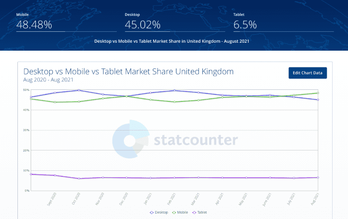
The danger is, headlines stating that the majority of traffic now comes from mobile may encourage you to prioritise the mobile experience when it’s not necessarily the most important experience for your users. If the majority of your traffic is coming from desktop and the majority of conversions also take place on desktop, you know where your priorities should lie.
Chances are you’re generating valuable traffic from all device types but you may notice different behaviours. Compare CTRs for the same keywords across device types, engagement metrics to see how users interact with the same page on mobile vs desktop and conversion goals to see where users are taking important actions. Don’t follow generic stats that tell you most traffic comes from mobile but most conversions take place on desktop because these may not be true for your business – they may not even represent the mean averages for the UK or your industry.
#3: Create an intuitive mobile UX
The biggest challenge in mobile SEO is building and optimising the mobile UX of your website. Mobile optimisation and UX has progressed a lot since the first iPhone launched in 2007 but there are still more problems to overcome than we’ve solved during this time.
Like everything in UX design, developing the best possible mobile experience for users is a process of compromise, which is why it’s so important to make data-driven decisions. You’re never going to please everyone but you can strive to please the largest volume of people visiting your site by testing and verifying changes with hard data.
Here are some of the most important considerations in optimising mobile UX:
- Screen size: Layouts and content are condensed to a narrow viewport on mobile devices reducing the relative width and increasing the relative height of everything on the page.
- Resolution: Mobile screens may be small but they pack a lot of pixels into high-resolution displays so you have to find the right balance between image quality and small file sizes.
- Text size: Use fluid sizing units for text (em, %) rather than absolute units (pt) so that text scales in relation to parent elements, including the size of the viewport (essentially making text larger and more readable on mobile).
- Touchscreens: Optimise pages for touch and avoid interactions that rely on keywords or a mouse without a suitable touch alternative (eg: mouse hover).
- Clickable elements: Make sure clickable elements are large enough and spaced out so users can complete actions with the first attempt.
- Scrolling: Narrow devices increase scrolling so consider this in your layouts and content.
- Contrast: Bright light (especially outdoors) makes low-contrast elements difficult to see on displays – so keep this in mind when designing mobile experiences.
- Layouts: Single-column layouts generally provide the best experience on mobile devices but they can push important elements further down the page in responsive designs – so consider this when you’re designing page architecture and layouts.
- Mobile connections: Many mobile users rely on data and mobile connections of varying quality, which can exacerbate slow loading times and eat into their data allowance.
- Popups: Popups on mobile are particularly intrusive and Google specifically looks out for them – so they will hurt your search ranking.
- Forms: Web forms are particularly frustrating to complete on mobile so take steps to reduce the number of clicks and amount of typing required to complete forms.
- Navigation: Navigation menus and UI elements are difficult to squeeze into a mobile design but you have to create an intuitive system that communicates functionality so visitors can instantly understand how to navigate your site.
Of course, we can’t cover everything in relation to mobile UX but this covers the essentials and we discuss several of them in more detail throughout the rest of this checklist.
#4: Cater for all devices with responsive design
Google recommends responsive design as the best solution for delivering experience across mobile, desktop and other device types. In fact, responsive design is widely considered the most effective approach for optimising one website for mobile, tablets and desktops – so Google isn’t the only one recommending this.
This doesn’t mean responsive design is perfect – it’s just the best overall compromise we’ve got.
Developing a responsive website is relatively easy but designing an intuitive responsive experience across multiple devices is far more difficult.
If you simply take a desktop design and try to squeeze it into a mobile layout, you’re not optimising the experience for mobile users at all. Important elements like CTAs will be pushed too far down the page and users will end up with arthritis before they reach the bottom of your page. Your message certainly isn’t going to have the same impact if the key points are lost in endless vertical scrolling.
This is the challenge with responsive design: how do you create one page that can adapt to deliver equally compelling experiences on mobile and desktop?

There are no perfect answers to this question and you have to find the compromise that works most effectively in the majority of scenarios. If your data shows that mobile experiences are most important for lead generation but desktop sessions are more important for conversion goals, make the appropriate compromises to prioritise lead capture on mobile sessions and conversion on desktop.
Let’s say the vast majority of traffic coming to your homepage arrives on mobile devices. Instead of scaling down a desktop design, it makes more sense to take a mobile-first approach and scale this up for the minority of desktop users viewing your homepage on larger displays.
Likewise, if most product purchases take place on desktop, you might prioritise the desktop experience on your product pages and, then, optimise the experience for mobile as best you can.
#5: Optimise for mobile goal completions
As we’ve mentioned several times already, you should know what your mobile goals are and, if you put the proper research in, you’ll probably find they’re different from the goals you need to target on other device types.
Google has a great resource that explains some examples on a Google Ads page, entitled Optimise your website for mobile.
Here are the mobile goal examples Google lists on the page above and the advice it provides for each one.
Increase online sales
- Simplify site navigation. Streamline your site menu and try to keep everything visible without having to zoom in to read.
- Make info accessible. Help people to explore before they commit to buy by using expandable product images.
- Help people make their purchase. Keep any directions or “Buy now” buttons front and centre. If you can, use existing account info to limit data entry for your customers.
- Allow people to resume from a desktop. Make it easy for people to come back to their shopping basket when they’re on their desktop computer, so they can finish their purchase.
Get more phone calls
- Use click-to-call buttons or links. Avoid making people memorise your number or zoom in to see it.
- Condense your menu options. Make sure that it’s clear that calls are the best way to get in contact with your business. Show a clickable phone number or button on every page of your site.
- Avoid distractions. Keep promotions and other directions to the sidelines so people can focus on how to reach you by phone.
Drive more online leads
- Simplify your forms. Make sure that people can access your forms easily, and that data entry is limited and easy to do with thumbs.
- Limit scrolling and zooming. Your form should only take up the space available on a mobile screen. Scrolling and zooming make it hard for people to avoid mistakes while entering their info.
- Choose your data fields wisely. Make sure that the information you’re requesting in your form is simple to access and easy to validate. Use validation to show errors for incomplete fields.
Encourage shop visits
- Encourage visits above all. Make it clear that it’s best for people to come to your physical shop. Show a map, location button or icon that links directly to your physical address and opening hours on every page of the site.
- Keep content limited. Streamline your site’s navigation to provide enough information to convince people to visit your shop.
- Avoid distractions. Promotions can help to convince people to visit your shop, but they shouldn’t make navigation more difficult.
Information and awareness
- Simplify navigation. Use a simple menu and larger text to help people research before they commit to purchase. Because a mobile screen is smaller, condense your menu options so that people don’t get overwhelmed.
- Keep consistency across devices. The longer it takes for a customer to commit to buy, the more likely they are to continue researching on multiple devices (desktop, tablet, phone) before completing the transaction. No matter what device they’re using, help them pick up where they left off by saving their selections.
- Provide a home page link. If someone has hit a dead end in their research, make sure that it’s easy for them to get back to the home page to start again.
#6: Optimise page loading times
We’ve seen plenty of studies on mobile loading times over the years – ranging from horrific, at worst, to underwhelming, at best. Google released a deep dive into loading times back in 2017, marking the average time for a mobile page to fully load at 22 seconds.

In 2019, Backlinko released its own study on website loading times and determined that mobile pages took 27.3 seconds, on average, to fully load.
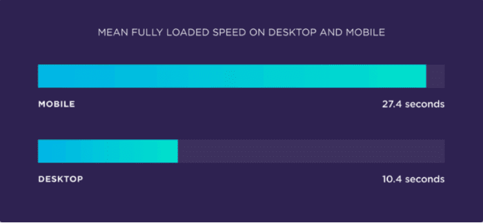
This compared to a still-unimpressive average of 10.4 seconds for desktop pages to load, meaning mobile pages took 87.84% longer to load than their desktop counterparts.
More recently, we’ve seen studies cite better numbers, including these 2021 figures from Littledata that put the average mobile loading time at 4.6 seconds. This still falls short of Google’s 2017 recommendation that all pages should fully load within 1-3 seconds to minimise bounce rates.
However, Google has changed the way it measures loading times with the introduction of Core Web Vitals (we discuss these in more detail later). For loading times, Google now uses a metric called Largest Contentful Paint (LCP) that measures the time it takes for the largest image or text block to load in the main viewport (visible section of the page upon load, aka: above the fold).
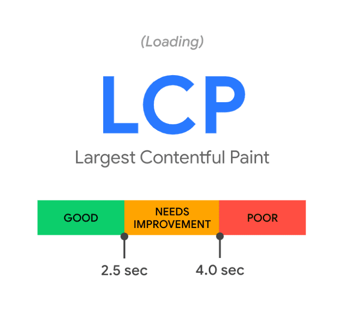
So, instead of measuring how long it takes for a mobile page to load in full or how long it takes for the first page element to load, Google uses LCP as a measure of perceived loading times on behalf of the user.
Google wants to see LCP scores of under 2.5 seconds for all pages so this is a good benchmark to aim for with mobile pages.
#7: Use mobile-friendly code
Responsive design requires more code than desktop and mobile-only websites and you have to be careful with performance and loading times – especially on mobile where connection speeds vary.
Here are some key steps you can follow to keep your code clean and minimise loading times on mobile devices:
- Follow mobile-first design principles
- Minimise server requests
- Avoid redirects where possible
- Minify (compress) your site files (HTML, CSS, JS, etc.)
- Compress images
- Defer the loading of non-essential elements (lazy loading)
- Use JavaScript sparingly
- Use a quality hosting service provider
- Enable caching for returning visitors
- Use a CDN for international visitors
- Place scripts (JS) in the footer of web pages
- Hire quality developers
You’ll find plenty of guidance on developing mobile experience on Google Search Central and you can start by taking a look at this page: Get started with mobile-friendliness.
#8: Develop an intuitive mobile navigation
Navigation is one of the most difficult aspects of designing mobile experiences and, as with all aspects of UX design, there’s no template that fits every website. Again, mobile navigation is all about compromise and finding the best balance for your users, given the complexity of your website and the architecture involved: website structure, the quantity of pages, subdirectories, etc.
If you’re working with a simple website structure, you might be able to integrate an on-page navigation system that remains visible in the viewport at all times.
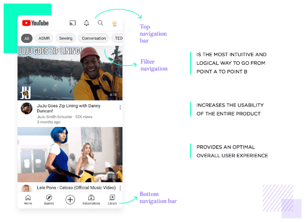
If you’ve got a more complex website structure, you’ll probably need to explore off-page navigation designs but understand that there are several issues with hiding navigation and UI functionality from users.
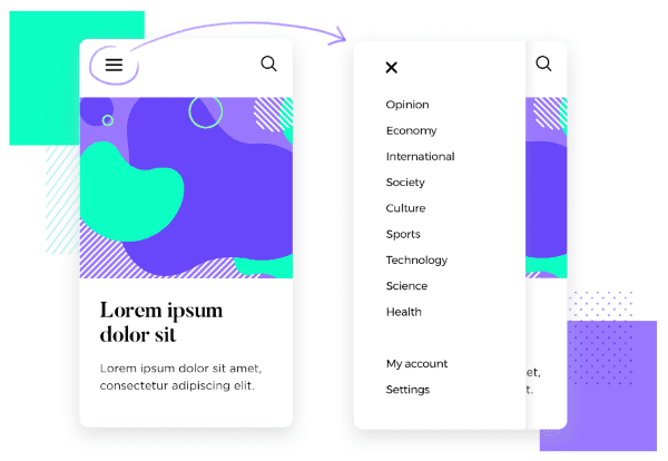
The hamburger solution (above) is problematic in several ways but it’s been used so widely for more than a decade that many of its intrinsic issues are solved by the passage of time – simply because many people have the experience to understand how they operate.
#9: Optimise content for mobile
The narrow display of smartphones squeezes content, stretching everything on the page vertically and forcing users to scroll significantly more than desktop users. People read entire eBooks on their phones so long-form content can engage mobile users but you have to create content that keeps them scrolling and format it to make long chunks of text more manageable.
We’ve covered the topic of optimising content for mobile before but here’s a summary of the key techniques:
- Write short paragraphs: Short paragraphs are more readable and take up less physical space on the screen.
- Be concise: Get to the point with precise language and stick to one key point in each section of the page.
- Use plenty of headings: Break sections up with compelling, descriptive headings and subheadings to help users scan the page and get an overview of the key points (this helps them decide whether the content is worth reading).
- Include lists: Use bullet point and numbered lists where relevant.
- Style text: Use bold and italics to highlight key points.
- Relevant images: Use relevant images in your content that support the point being made.
- Include data visualisations: Back up points with data visualisations where possible, to reinforce the points made in key sections.
- Use lots of whitespace: Leave plenty of space between sections of text.
- Use plenty of contrast: Especially on headings to make text stand out and improve readability in harsh lighting conditions.
- Avoid irrelevant interruptions: Avoid using popups or breaking up text with display ads that interrupt your content with irrelevant distractions.
- Create more video content: Video content is a mobile-friendly, immersive format by default.
- Podcasts: Demand for podcasts continues to rise with people looking for audio content to listen to on the go or hands-free while doing other things (driving, exercising, doing the dishes, etc.).
- Social content: Social platforms are designed for mobile so take advantage of these platforms by publishing content that fits seamlessly into the experience.
Mobile is a truly multimedia experience and creating a wide variety of content types (articles, social, videos, podcasts, etc.) gives you the best chance of catering to the needs of everyone in your target audiences. Some people simply prefer to listen to podcasts than watch videos during the commute to work while others prefer to read or benefit from text content for other purposes – eg: research, referencing, bookmarking, quoting, etc.
#10: Mobile image optimisation
Images are often the most demanding page elements on loading times and this leaves website owners with a problem. How do you create visually compelling pages for today’s HD mobile displays and keep loading times down?
- Start with high-quality images
- Resize images to reduce file size while retaining enough quality
- Use lossless compression to reduce sizes further without degrading quality
- Use the correct file formats (.jpg, .png, .webp, etc.)
- Use gifs sparingly
- Lazy load images
- Use a CDN for international visitors
- Use caching to speed up loading times for returning visitors
Don’t include images for the sake of it; use visuals that contribute to the experience and enhance the message delivered in your content.
#11: Mobile keyword research
Mobile search habits differ from desktop and, in many cases, you have to target different keywords to get the same page ranking in mobile SERPs. Location plays a big role in mobile search (more on this shortly) and this is reflected in search queries and the type of results Google Shows.
For example, “near me” searches are one of the biggest keyword trends in mobile search over the past decade and they continue to increase:
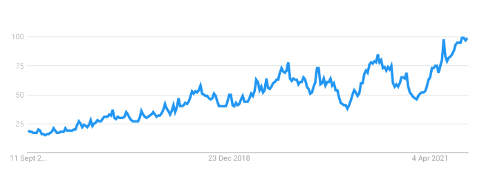
You also see higher volumes of searches for local businesses types, such as “restaurants” and mobile is the first device people turn to for general information – such as finding delivery services during lockdown or “when will hairdressers open?”
Mobile queries also tend to be more conversational and, often, shorter than the search terms typed into a desktop.
#12: Optimise for voice search
Speaking of conversational queries, voice search continues to play a bigger role in the mobile experience for users. Adoption has been gradual over the years with Google saying 27% of the global online population were using voice search in 2018 but more recent data from comScore suggests more than half of smartphone users were engaging with voice search in 2020.
That’s significant because the comScore stat specifies that smartphone users specifically are using voice search on their mobiles (ie: the data isn’t conflated with home hubs like Amazon Echo and Google Home).
This doesn’t necessarily mean you’re necessarily bringing in hordes of visitors through voice search but it does show that the technology is here to stay and will continue to play a larger role in the mobile search experience.
Again, voice search patterns are drastically different from desktop and they’re unique from other mobile habits, too. There tends to be even more emphasis on local search and informational queries that require short, concise answers. So you’re looking at different keywords and approaches to optimising content for this experience, once again.
- What does Google’s voice search transition mean for SEO?
- Four questions to ask before jumping into voice search
#13: Location and local search
Search habits on mobile have a stronger emphasis on location because people turn to their phones while looking for products, services and activities in their surrounding area. Phone technology also plays a role with GPS tracking allowing search engines to deliver relevant, local results for queries that suggest a local interest.
The obvious lesson from this is that mobile SEO plays a crucial role in local SEO but it also impacts the SERPs and results you’re competing against for certain queries.
For example, if a user types in a vague query like “Thai curry” on mobile, Google has to determine where this user is looking for recipes, thai restaurants, ready meals from a supermarket or simply after information about the dish.
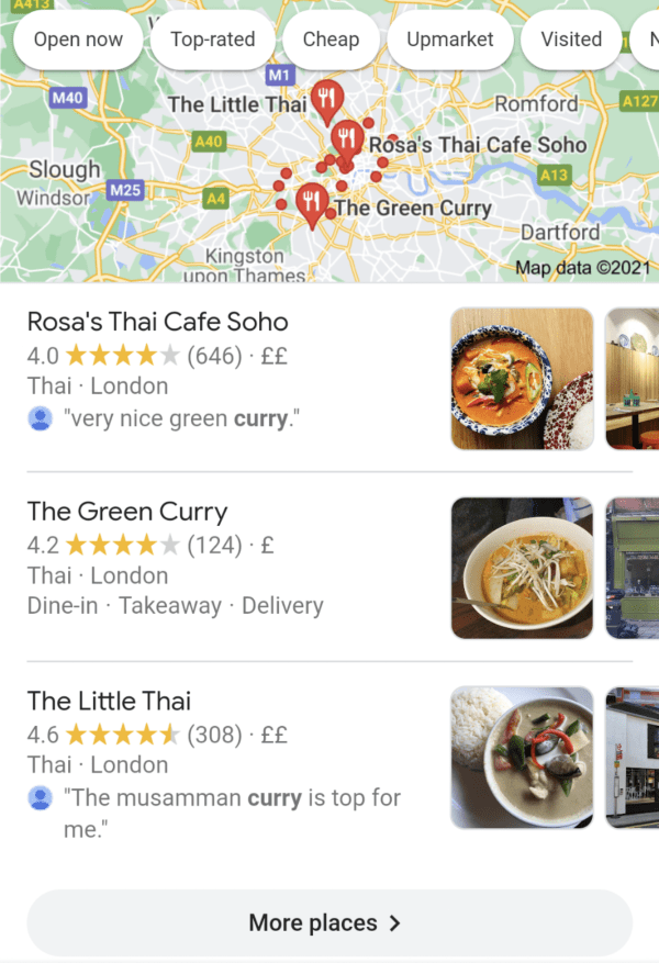
In this case, Google delivers a mix of rich recipe results, local results, deep links to food delivery apps, publisher articles and the traditional blue links to relevant web pages, as well as the “People also ask” and “People also search for” sections – all for one query.
As a result, competition is high for this query because there’s only space for a few results for each search intent (eg: finding a recipe vs booking a table at a Thai restaurant.
#14: Page experience
In May 2020, Google announced a new ranking signal called page experience that allows the search engine to create a single ranking factor for page UX. As we explain in our guide to page experience update, the new single actually combines six existing signals into a single ranking factor:

Essentially, page experience is a cumulative signal determined by your performance with Core Web Vitals and the three other signals: mobile-friendliness, HTTPS and having no intrusive interstitials/popups.
Obviously, the inclusion of mobile-friendliness in page experience makes this an important signal for mobile SEO and this is enhanced by the increased importance of loading times and not using popups on mobile pages.
#15: Core Web Vitals
Core Web Vitals are three performance signals that measure the performance of web pages. Google wants websites to achieve “good” statuses for all three signals, which are related to loading times, the responsiveness of interactive elements and the stability of page layouts.
Currently, there are three Core Web Vitals signals although Google says they could be changed or expanded over time:
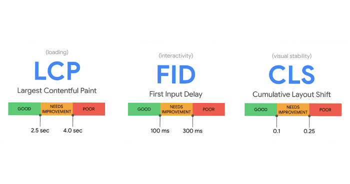
- Loading: This simply refers to loading times although Google is changing the way it measures this with a new standard called Largest Contentful Paint (LCP).
- Interactivity: Measures the responsiveness of interactive elements on your page (links, buttons, etc.) after users click them, using a new standard called First Input Delay (FID).
- Visual Stability: Detects the movement of elements after they’ve loaded on the page and any instability this causes, using a new standard called Cumulative Layout Shift (CLS).
These signals are particularly important for the mobile experience where loading times are typically strained, interactive elements are more commonplace and responsive designs can create layout instability.
#16: Mobile-first indexing
In March 2018, Google started rolling out mobile-first indexing, which prioritises the mobile version of pages over the desktop alternative in cases where separate versions are present. If your website uses responsive design to show one page for both device types, the shift to mobile-first indexing shouldn’t have had a significant impact, other than some minor changes in the SERPs.
On the other hand, if you’re running separate pages for mobile users, the shift could have more of an impact on rankings and how you need to optimise your content/pages. Likewise, if you have plans to build a new website, mobile-first indexing reinforces the benefits of creating responsive changes – or, at least, understanding the implications of having separate mobile pages.
Mobile-first indexing finished rolling out in March 2021 and you can find out everything you need to know in our updated guide.
#17: Take the mobile-friendly test
To check your website meets Google’s criteria for mobile optimisation, run it through the free Mobile-Friendly Test.

Type in the URL of your most important pages and, once the test has analysed your page, the results will hopefully tell you that your “page is mobile friendly”. If there any issues are detected, you may receive guidance on the following issues:
- Incompatible plugins
- Viewport not set
- Viewport not set to “device width”
- Content wider than screen
- Text too small to read
- Clickable elements too close together
If any of these issues are flagged up, you’ll receive guidance on how to fix them and resources to help you avoid similar problems in the future.
#18: Take the page speed test
You can also take the free PageSpeed Insights tool to test the loading times of important pages.
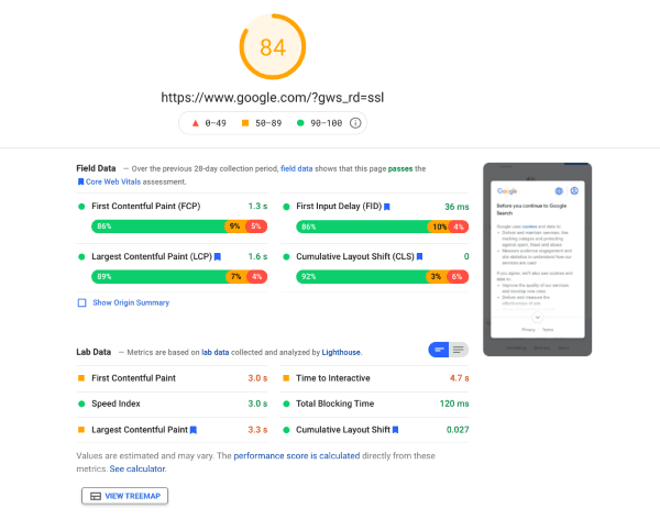
The report scores your loading times out of 100 and provides detailed insights into the performance of your page over the previous 28 days, including reports for Core Web Vitals.
#19: Run the Core Web Vitals and Page Experience reports
Google Search Console now includes a Core Web Vitals report and a Page Experience report for providing performance insights for relevant signals across your website.
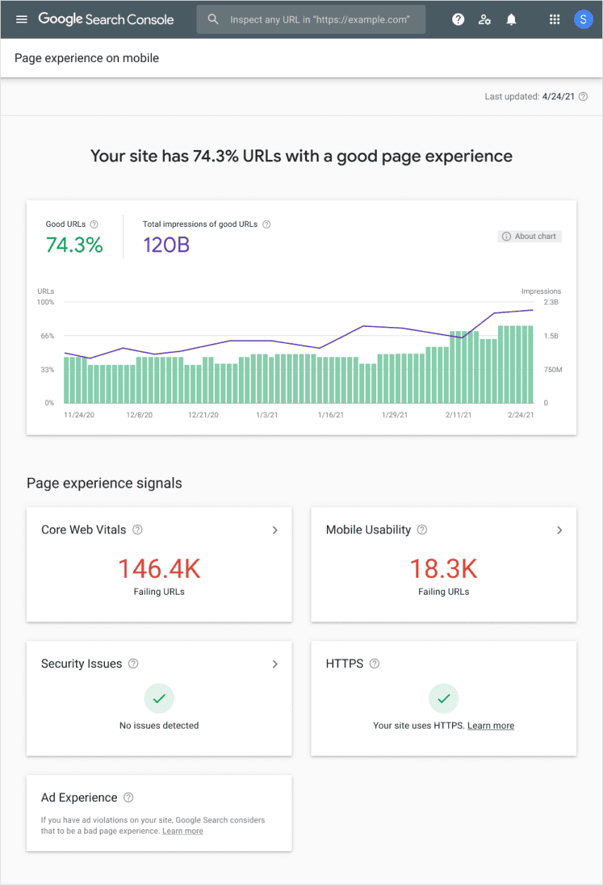
The great thing about these tools is you don’t have to manually type in URLs for every page you want to analyse. These tools provide all the information you need to optimise for Core Web Vitals and page experience to get the ranking boost from both of Google’s latest UX signals.
Digital & Social Articles on Business 2 Community
(24)
Report Post


