If you could create the perfect e-commerce website by combining elements from successful sites, which ones would you choose? Columnist Christian Sculthorp shares his picks.

I spend a lot of time browsing e-commerce sites.
While there are some websites that are doing e-commerce incredibly well (looking at you, Amazon), there are very few that cover all of the bases: SEO-optimized, easy to navigate, mobile-friendly and fast. Generally, e-commerce websites miss out on at least one key piece of the puzzle.
That being said, if you were to sew together elements from many different websites, you could create a powerful e-commerce Frankenstein. That’s the idea of this post. I’m going to show you my ideal home page, category page, product page, blog, mobile website and site based on speed.
Read on if you dare!
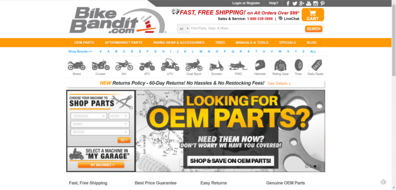
Homepage: BikeBandit

It may not be “pretty,” but I like what BikeBandit has going on with their homepage. They carry a ton of inventory, which can make it tough to navigate. They do a great job of structuring the homepage with a search bar in plain sight, and the icons make it easy to pick the right category.

They have four clear reasons why you should shop with them. If you have free shipping, it’s important that the customer knows, because it’s a big selling feature. People also want to know that the parts are genuine. Give people reasons to choose you over competitors.
Trust seals can also increase conversion rates, and BikeBandit includes two: Bizrate and BBB. Along with the payment options, this increases trust for shoppers and lets them know exactly how they can pay.

In terms of SEO, I like the fact that they include a text blurb at the bottom of the page. It makes it easier to rank for long-tail keywords when you include them in text on the homepage. Google can’t read your mind. If you don’t include keywords on pages, you most likely won’t rank for them.
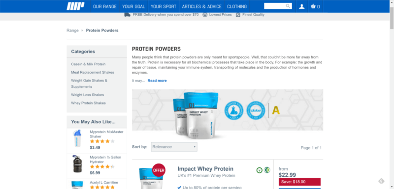
Category page: MyProtein.com

MyProtein has an ideal category page for usability and SEO. The sidebar allows you to narrow your category search by listing the sub-categories. The “You May Also Like” section lists complementary products which might interest the user as well.

The category content is descriptive, includes internal links to important pages, is broken up with subheadings and has references to real studies.

The product listings are super-informative and include most of the necessary information to make the sale right then and there:
- Customer reviews are in plain sight.
- Includes symbols to let you know whether the product is vegan or gluten-free.
- Key selling features are listed in checklist form.
- Coupon deals are included in the product listing.
- The price lets you know how much you save.
Product page: Rent The Runway

Rent The Runway has an ideal product page setup. A good product page sells the product and also includes the SEO basics; Rent The Runway goes beyond.
To start, their images are high-resolution in great quality. They also include actual people using their products in different sizes, which is a great user experience.

Their product descriptions provide everything you need to know. The stylist notes are useful, and the size and fit information is clearly written by a professional. This isn’t merely content put on the site to benefit their SEO.

The best thing about their product pages is the customer reviews. They’re incredibly in-depth and include information like height, age and so on, which makes it easier for potential buyers to relate.
Most reviews include pictures of the customer actually using the product, and the written reviews are very descriptive. Not to mention that all of these reviews are hard-coded onto the page, which turns a 200-word page into a 3,000+-word page. Think of all of the long-tail keywords!
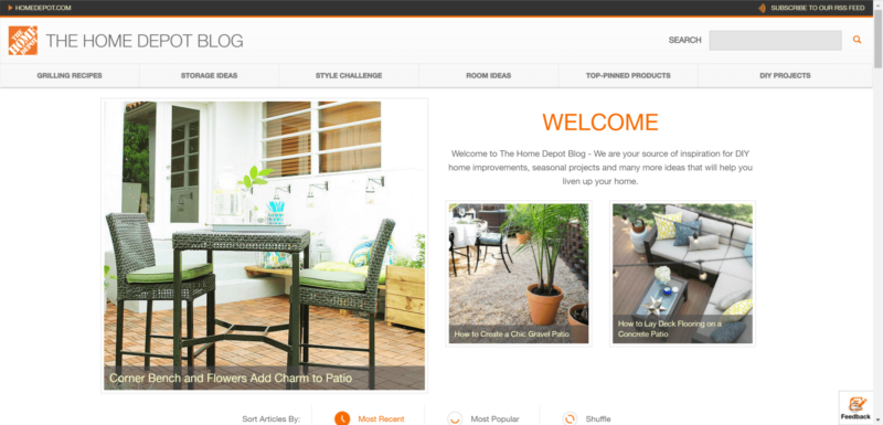
Blog: Home Depot

I love the way Home Depot is handling the blog on their e-commerce site. It’s simple, but effective, with a clear navigation at the top which lets users get around with ease.
The blog posts are well structured, pleasant to read and very shareable. They are clearly going after the Pinterest crowd, and all of the content on the blog is perfect to share, with the “Save” (formerly known as “Pin It”) buttons clearly visible.

They also welcome guest posters on to the website, which does two main things:
- It gets them free content from high-quality bloggers. Getting a spot on Home Depot is a big deal for most bloggers, so they’ll put a lot of effort into these posts. Home Depot can also pick and choose from a wide variety of applicants and select the best ones.
- It encourages these guest bloggers to share the post with their network. The people following these bloggers are going to be interested in DIY, recipes, home renovation and so on, and they are Home Depot’s target audience.
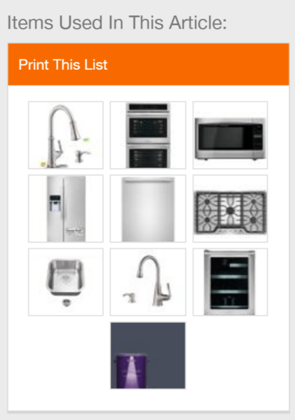
At the end of most blog posts, Home Depot also lists the products used in the project.

This is a fantastic way to drive sales directly through blog posts. If people want to do that project, they’ll need to buy some things from Home Depot. This also drives links to deep product and category pages of the commerce site.

They even have a widget on the side which lets you print the list of the items used in the blog post. Seeing as many people will prefer to just pop into a Home Depot location, this is genius.
Mobile: Hobbycraft

Hobbycraft is a UK-based hobby store that has a fantastic mobile interface. The menu is clearly laid out with a store search, user login, cart, search bar and hamburger menu. When you expand the menu, it’s simple to navigate to find what you need.
The homepage is user-friendly and allows you to find the category you’re looking for. It’s simple to add products to the cart, and checking out is a breeze. Hobbycraft has it going on for mobile e-commerce.
Site speed: Walgreens

Page speed is important for any website, but even more so for e-commerce sites. It can have a direct impact on your conversion rate, which has a direct impact on your revenue. Not to mention that it is a known ranking signal from Google and affects user signals like bounce rate and time on page. Having a fast-loading site is an all-around win for e-commerce websites.
Walgreens clocked in for me at 1.29 seconds, which is a fantastic load time for such a large website. Part of that is due to the small page size. With the average page size of the top million websites hitting over 2 MB, Walgreens comes in at under half that. My ideal e-commerce site would load instantly, but anything under two seconds is acceptable.
[Article on Search Engine Land.]
Some opinions expressed in this article may be those of a guest author and not necessarily Marketing Land. Staff authors are listed here.
Marketing Land – Internet Marketing News, Strategies & Tips
(64)
Report Post


