September 23, 2016
Just like in the fantasy movie ‘The Chronicles of Narnia’, Landing Pages are the crafty doorways to a parallel dimension for boosting email marketing campaigns.
A study indicated that 48% of marketers built a new landing page for each marketing campaign. This is just the beginning. These lead capturing pages, are a popular SEO marketing strategy and are designed with a single purpose in mind: to convert visitors into solid leads and buyers.
But to succeed, it calls for a fair understanding and implementation of the landing page best practices.
Talking solely about e-commerce email landing pages, a great design will lead to more conversions, more sales thus resulting in more profit. A majority of e-commerce email marketers aim for exclusive and interactive landing pages. However, marketers must keep an eye on the changing dynamics of the industry, follow the landing page design trends and incorporate them for your business. This includes high contrast CTAs, video testimonials & contextual imagery, opt-in forms, full-screen background images and videos, etc.
Landing page design & coding is an art and for a successful e-commerce email marketing campaign, it is essential to have a well-designed interactive landing page.
But first, let’s understand the essence of ‘e-commerce email templates and their landing pages’ with visual examples as the Monks would love to take you on a heavenly fantasy ride:
1. Brand: Mango
Email:
Mango’s email is all about the ‘off-shoulder’ trend. It gives a peep into the different styles and what’s trending. Once you click on the images on the email, it directly takes you to a broader autumn collection landing page.

Landing Page:
Mango’s landing page gives a retro feel along with a story like format. The excursion images give a free and inviting feeling to the subscriber. At the bottom of the Landing Page is their CTA – ‘Discover the Collection’. This is not only inviting but also generates a curiosity in the subscriber.

2. Brand: M.A.C.
Email:
M.A.C.’s GIF email is catchy and M.A.C.’s GIF email is catchy and lead generating. Its CTA is bold and exciting. It also gives a snapshot description of the collection for different skin tones inviting the subscriber to visit the page, generating leads.

Landing Page:
The landing page is even more colorful and exciting with tutorial videos, gif’s and enticing product images which are extremely appealing and a guarantee for lead generation.

3. Brand: Chanel
Email:
The email is simple with a special complimentary offer on their gift orders. Once you click on the CTA button it directs you to their gift set landing page.

Landing Page:
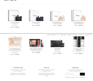
The landing page is simple and directs directly to the gift set range. It displays the products and price range giving the subscriber an open chance for a quick buy. The landing page defines a clear ROI and lead generation.

4. Brand: Gucci
Email:
The email is bright and festive. The CTA stands out and is not forceful, it’s rather inviting. The mail gives a glimpse of the collection and proposes the subscriber to see their collection.

Landing Page:
The landing page displays the product collection, along with the product name and a brief description of the material used in the product. This is informative for the subscriber and at the same subtly asks the subscriber to shop, thus generating leads.

5. Brand: Pottery Barn
Email:
The email is a splash of color with the products displaying the Halloween theme. The products displayed are catchy and the email has a bold and catchy CTA.

Landing Page:
After clicking on the CTA, the landing page not only displays the product with the discounted price but also gives other CTA links within the landing page. Thus generating more open and click rates.

Top Tips for a Good Ecommerce Landing Page:
• The design, copy and CTA should be consistent with the e-commerce marketing campaign. It should be to the point, creative and sales directed.
• Your CTA should stand out so that the subscriber can be easily attracted and directed. It is extremely important for the CTA button to be visible and attractive in an email as this will increase an opportunity for sales.
• The page should be structured in a way that it is easy for the subscriber to access information and make an informed decision. Also, the page should be compelling in itself (text and pictures). This will give the subscriber a positive and compulsive push towards sales.
• A/B Testing is a must for a flawless and successful end: CTA buttons, page layout, navigation, copy, checkout process, promotions and offers.
Key Takeaways:
• Get explicit with what you want your visitors to see, do and buy.
• Effective e-commerce landing page must have stunning imagery, bold headline, concise copy and a prominent call-to-action button.
• Your landing page should have the strength to capture leads for conversion.
• GIF’s and videos can be a great source for lead generation.
Digital & Social Articles on Business 2 Community(67)
