With very little fanfare, Netflix has sunset a UX feature that was half a decade in development. As the Wall Street Journal reports, the company’s Surprise Me feature, which played a randomized movie or show with the click of a button, has been discontinued due to low use.
At first glance, it’s a small bit of news: Netflix tried a thing that didn’t work. But the Surprise Me button was a tool that had been developed and tested for years at Netflix as a means to relieve people of the burden of choice. How many times have you loaded Netflix only to burn 25 minutes deciding what to watch? Surprise Me was supposed to be something of a super button, poised to alleviate one of the biggest pain points of using Netflix.
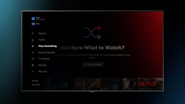
As early as 2019, the company introduced the capability into its Android app. In 2020, that button was dubbed “Shuffle Play” as Netflix began testing the capability on more of its platform globally. By Netflix’s 2020 Q4 quarterly report, Shuffle Play was validated, and investors saw it as an enticing reason to continue investing in the company. It wrote to shareholders: “As another exciting step in this effort, we’ve been testing a new feature that gives members the ability to choose to instantly watch a title chosen just for them versus browse. The response has been positive and we plan to roll it out globally in the first half of 2021.”
Roughly two years after that rollout, Surprise Me is dead on Netflix, even while platforms everywhere are still routinely serving up algorithmically determined content. Why? Nuance in design.
In truth, Surprise Me wasn’t all that novel of an idea when Netflix adopted it. Google has had its “I’m Feeling Lucky” button, which sits directly next to the “Google Search” button since some of the earliest days of the service. Instead of searching for a page of results, the button took you directly to Google’s top result. Sites like Wikipedia and Reddit offer similar tools, too.
The surprise button has always been a charming premise, like playing Russian roulette with hot sauce instead of bullets. We assume the system probably won’t get it right. Google calls your chances “lucky” at best! But that potential error is part of the fun. Google has even leaned into the gambling nature of it by transforming the experience into the spin of a slot machine. Still, it’s hard to argue that the button has ever been all that useful. Find one friend or family member who has ever used this button on a regular basis. If these systems could suggest the next perfect thing for us to look at, would we ever even need another option?

And yet, while the Surprise Me button has failed, “surprise me” is the fundamental sentiment driving the internet’s UX today. Instead of a singular button, however, “surprise me” has become the entire feed. Back in 2007, Facebook started transforming its feed from a reverse-chronological list of updates to an algorithmic list of suggestions, and that trend has only accelerated in recent years. Whether you’re on Tik Tok’s For You Page (FYP), or Instagram’s Reels, machines are offering you their best guess as to what you will want to watch next and then serving it to you instantly. These feeds aren’t always right, but they are designed to expedite the element of surprise.
Instead of tapping a button and waiting to see what happens next, these feeds build the Surprise Me button into every single flick of your thumb. With so little friction for the user, TikTok can attempt to “surprise me” dozens of times a minute, if nothing I see catches my fancy. (And furthermore, with each right or wrong guess, TikTok can use that data to hone its own suggestion algorithms, profiling me and targeting content.) Maybe you like TikTok or maybe you don’t, but you can’t argue with the remarkable success of this permutation of the Surprise Me button. By comparison to this automatic waterfall of media, a button you have to physically press on a webpage every time you want new content seems quaint.
Allowing people to flick through Netflix’s movies and shows, not as a pile of thumbnails but as full-screen channel-surfing media, would enable just the sort of discovery that Netflix is after, and at the addictive pace of TikTok. Ironically, Netflix was one of the great disruptors of the cable TV business. And yet, if it really wanted to surprise me, it would do better by copying the designs of the FYP, Instagram Reels, and yes, even old-fashioned cable television itself.
(12)

