— August 17, 2017
We’ve all seen them, those ads that are small and sometimes inconspicuous. I’m talking about the ads that show up on mobile websites in banners or small sidebars. They may be trying to tell you something, but sometimes can be confusing. Often, this is the result of the focus shifting to what they look like, rather than what they’re intended for. This can be a problem on your ads objective.
There are many studies that show how to create online ads in order to entice potential customers to click on them. Sometimes these practices may feel wrong or just not look as pretty. To be truthful, that’s ok. I’m not advocating for a bad design. However, I am talking about optimizing your advertising for conversion.
One tool to use to create online ads is Photoshop. I say that because I happen to have a creative cloud account and I’m a little biased. I know there are many other apps out there and third party services. But if you’re paying $ 50 a month for creative cloud I’d go with Photoshop.
Create a Photoshop template (PSD). There your template contains all the ad sizes you need. In the template, each layer is a shape that is the exact size of that ad. And is a smart object. Within that smart object, it will open up a new file (PSB). There you make your ad. See below screenshots of Photoshop or click here for tutorial:
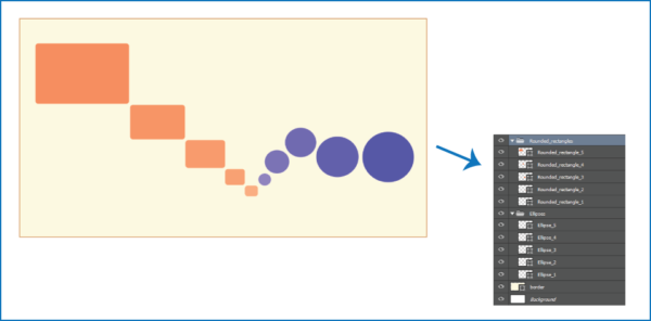

I know that sounds complicated. But I’ll supply a link below to Adobe and you can see how this works, and it’s fantastic. Adobe layers will accept file extensions (layer1.jpg). And by using the “image processor” output that file the folder. There is no more need to save each individual layer out or to save out the entire file as a JPEG or file you require.
https://helpx.adobe.com/photoshop/using/generate-assets-layers.html
The other obstacle is to create more than one ad. Often we think we make one set of ads to the different sizes we need. For the devices, we will place them on (placement). But that’s not the end of the ad creation.
Ad sets
In an ad set there are up to 2 to 4 different types of ads. All at the sizes required for the placements that you need for your campaign. In the campaign can be multiple ad sets. To have only one set of ads limits your ability to see how effective your ads are in your overall campaigns effectiveness.
So that is how ads are made. However, the main reason of this post is why we make ads the way we make them.
Click Thrus
I sure you’ve heard the term “click through rate” (CTR). While it may sound like a fancy marketing term it actually is a very simple term describing what users do when they click on ad and land on a destination.
Ads must be enticing and they must grab attention. Moreover, be very clear as to what they are about and the destination you’re taking the user to. This is not easy to do in a space smaller than your finger. That said, you can see why being concerned about what an ad looks like versus how an ad will perform can sometimes be a personal struggle.
Different Types of Ads
There are different file types we typically generate for online ad creation. The first type is a simple JPG. This type is a simple image. Just as you would take with a camera. The next is a GIF. Pronounced as “Jiff,” like the peanut butter, but there is debate that it is also pronounced GIF with a hard “g.” This file type allows for simple animation. Remember, more animation equals more layers, thus larger the file (NOT good). The final file type is HTML5, but that’s for another post.
In creating a JPG of an ad it’s important to remember 3 important things to go into that ad.
1) Make the focal point something recognizable that has to do with the campaign.
If you are advertising a wedding, then you should show wedding rings or preferably a bride. This is because it’s a person with a face. I would personally opt for the bride because people like faces. It attracts more to the eye in order to get the ad to be clicked.
2) Next is a very clear message on what the ad is.
Ads must be done with as few words as possible. Again, you are creating something that is no bigger than your finger. I know that a pretty ad is what seems best. It creates delight in the user and interest, but there is a negative to this. If you’re not careful, delightful details can hurt the usability of your product. It can go as far as the user being too distracted, and thus your ad is now useless to get those coveted click thrus. Also, delight detailed design doesn’t scale because of your audience, but more on that in another blog post on UX Design.
3) Finally, the call to action (CTA)
To be effective, this has be clear. Hopefully, the message on it is more inviting than “click here.” If you take a look at the email marketing service MailChimp, they’ve got calls to action down. Words like “onward” or “rock on” are pervasive in their service. These terms are a part of UX Design to evoke emotional response to their brand. These kinds of CTA words reflect your brands tone, but also these calls to action words create a feel that a real human is behind the ad.
5 Ad Design styles that work
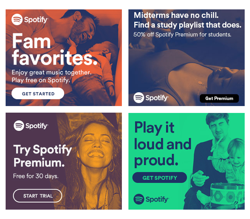
1) Doutone
Duotone is a halftone reproduction of an image that brings out its middle tones and highlights.
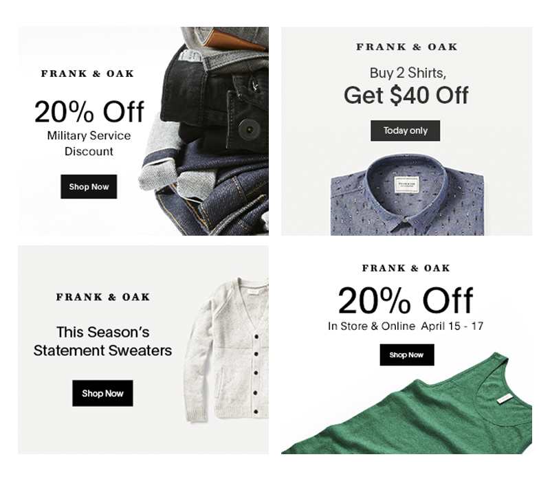
2) Minimalistic
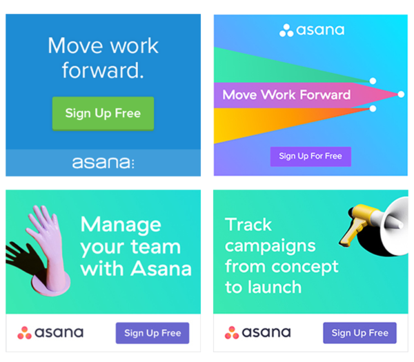
In a overcrowded Internet where everybody wants to get noticed, this is another design style that can help your banner ad stand out on the internet and also make the user click.
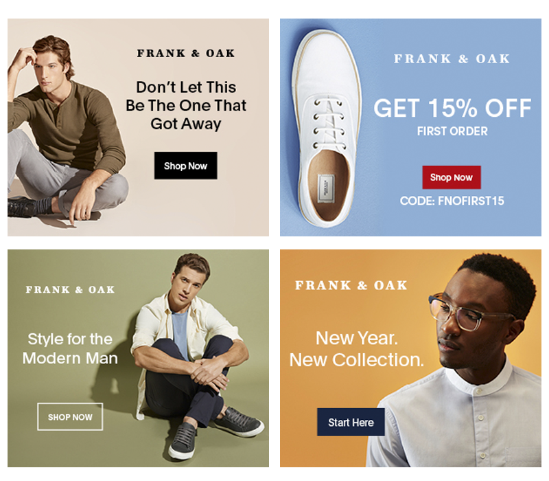
3) Pastels
They are also described as “soothing”, “soft”, “neutral”, “washed out” or “desaturated”, lacking strong chromatic content.
4) Vivid Colors
Vivid is an adjective that describes an adventurous and bright color, a powerful feeling, or an image in your mind that is so clear you can almost touch it.
The word “vivid” comes from the Latin “vivere” which means “to live”.
So, to make it more clear – vivid is something intense. These are ads with intense color.
5) Simply Native Photos
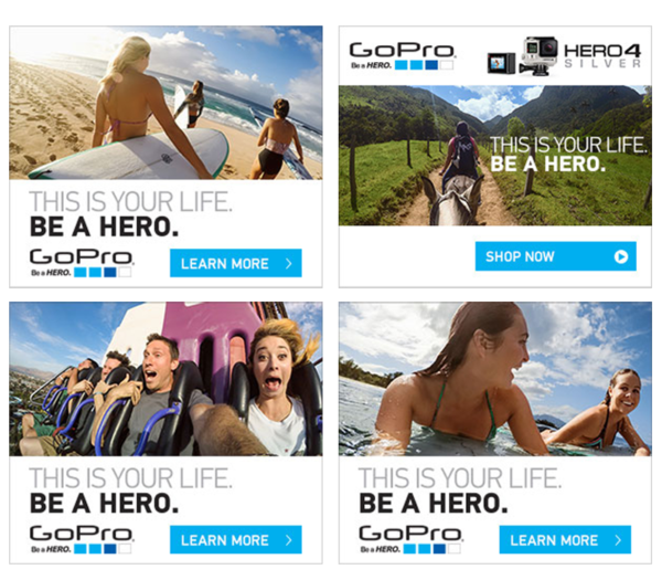
My favorite because as I stated earlier, people like to look at faces. But take note “how” the photos are taken and shown. Perspective shots draw the eye, and the users are more likely to take interest and click. I bet the ad in the lower corner had you looking over to what the surfer girl was looking at. Models in photos can help draw attention to products or part of the ad by the direct they are looking at.
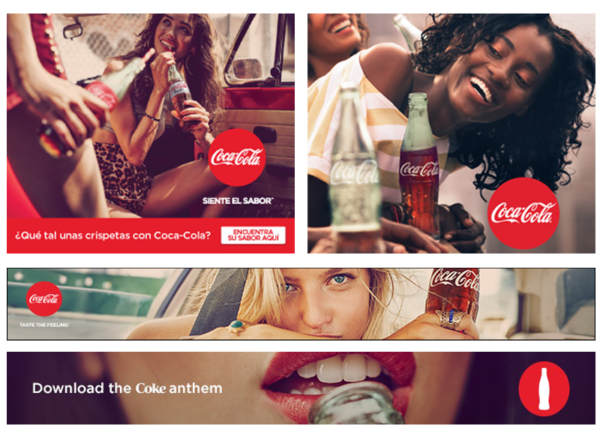
Coca-Cola is another great example of how to use Native Photos in your banner ads.
Conclusion
As the online adverting space becomes more crowded with messaging, we want to make sure that your message remains clear and can be heard above the noise. Hopefully, after reading this you have some better ideas on how to make sure your message is clear and your customers know exactly what you offer, and most importantly, how to contact you.
What do you think of our article, was it helpful? Did we miss anything? Let us know in the comments below.
Digital & Social Articles on Business 2 Community
(138)
Report Post
