— December 12, 2018
Done right, optimized mobile forms can deliver more than an increased conversion rate: They can become a competitive advantage—a reason users choose to fill out a form on your site.
It’s not hyperbole. Consider the number of interactions it takes to book a room on Hotel Tonight compared to its competitors, something Luke Wroblewski highlighted in his talk on mobile design:
 “Booking a hotel happens in 3 taps and a swipe. This is a competitive advantage,” claimed Sam Shank, the CEO of Hotel Tonight.
For Hotel Tonight, the solution to mobile-form optimization was to “ruthlessly edit. Even when you have the slimmest funnel, cut again.”
Reducing form fields usually works, but, like every “best practice,” it’s not a guarantee. (Indeed, there may be times when increasing form fields boosts conversion rates.)
What follows is a mobile-specific framework for form optimization:
- Key differences between the mobile and desktop UI
- Form-wide considerations
- Field-specific considerations
- Tools to measure form performance
(If you’re new to form optimization, start here. If you really want to get into the weeds, consider Tom New’s course at CXL Institute.)
1. Key differences between the mobile and desktop UI
Three key UI differences create challenges for mobile-form design:
1. Aspect ratio. About 80–90% of smartphone use occurs in portrait orientation, which makes width a precious commodity: There’s more vertical space, and vertical scrolling is more intuitive.
In addition, of course, the screen size is smaller compared to tablets and desktops, making it less likely that your entire form will fit on the screen without scrolling.
2. Touchscreen navigation. There’s no mouse, and smartphone users with a stylus are in the minority. A touchscreen places added demands on the size and spacing of elements. It also means that there’s no hover state in which to add helpful information.
3. Limited keyboard. Smartphones have a limited keyboard—and an inconsistent one. Those factors justify careful consideration of which keyboard to show for which field and whether to enable (or disable) automated functions, like auto-capitalize.
These UI differences add to existing challenges—mobile users already represent a hurried, less-tolerant segment of users. Mobile conversion rates still lag behind those on desktop devices, though the conversion gap continues to close on segments of traffic, like email.
2. Form-wide considerations
Single-column design
In a previous research study, we found that single-column forms enabled faster completion compared to multi-column ones:
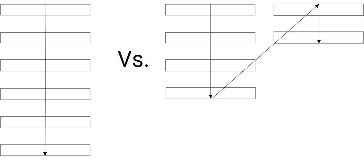
In our internal study, survey participants completed the linear, single-column form an average of 15.4 seconds faster than the multi-column form.
That gap in time-to-completion is almost certainly greater on mobile devices, which prioritize vertical scrolling.
Multi-step forms
Multi-step forms have the potential to eliminate scrolling entirely by fitting each form section within the smartphone window. They have added benefits for long forms:
- Information can be saved after each step, making follow-up easier for form-abandoners and avoiding potential user frustration from a total loss of input caused by an accidental click or loss of connectivity.
- They chunk segments of the form to reduce the cognitive load. For long forms, this can make the process seem less intimidating.
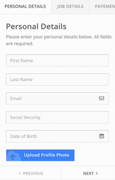
Multi-step forms come at a cost, however: Every step requires another page load—and load times may lag if your visitor doesn’t have a great connection (whether they live on a farm or pass through a subway tunnel).
Font size
A 16px font size is standard for body copy on mobile devices. Smaller (or larger) font sizes may cause issues, especially for those with visual impairments.
An NNGroup report on sizes, based on research from MIT, offers caveats for text elements that require only a brief “glance”—one to two words in isolation, like “Phone number” or “Street address.”
The MIT study, which measured reading speed, compared two font sizes (10px and 8px) as well as different cases and letter widths. Their findings offer baseline recommendations for smaller-than-average text:
- Don’t use a font size below 10px.
- Use all caps.
- Maintain standard lettering width.

An MIT study on font sizes found that all-caps, standard-width letters were easier to read. (Image source)
Touch-target size
Small buttons risk imprecision on the part of the user or the device. Touch-targets for mobile devices have minimum size recommendations. Per Steven Hoober, the minimum size grows larger as the target moves away from the center of the screen, where user taps are most accurate:
- 7 mm in the center of the screen.
- 9 mm along the edges.
- 12 mm in the corners.
Material Design Accessibility guidelines offer a similar recommendation: 7–10mm for touch targets. (Convert to other units here.)
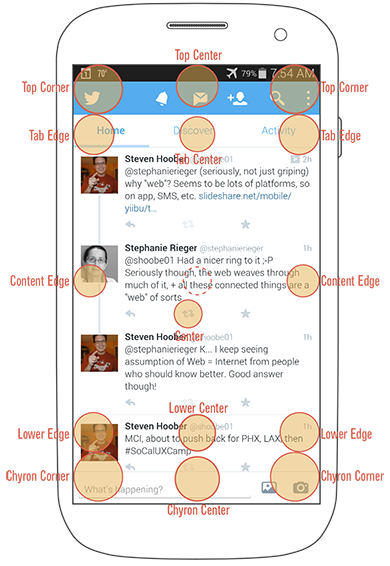
Touch-target sizes should increase with the button’s distance from the center of the screen. (Image source)
Notably, visible buttons or icons may be smaller than the touch targets, but the size of the touch targets should cover the minimum area, even if the icon or button doesn’t fill the space.
As far as padding between touch targets—again, not the visible buttons but the invisible touch targets surrounding them—Material Design guidelines recommend a minimum of 1.3 mm.
Total form fields
As noted earlier, conventional form wisdom suggests that fewer form fields yield more conversions because each field increases friction.
Since filling out a form is less convenient on a mobile device—keyboards are smaller and partial, touch is less precise than a mouse click—the reasons that removing form fields usually works on any device are, presumably, more true for smartphones. (That logic won’t bail you out of testing.)
Some pre-conversion form fields can be moved rather removed:
Account creation. Account creation is a common source of friction that is unnecessary for purchase. “Thank you” pages can help solve that challenge by:
- Moving form fields from a checkout process to a post-purchase phase.
- Asking only past purchasers to create an account that eases repeat purchasing.
- Prepopulating fields with information from the just-completed sale.
CAPTCHA. Consider replacing a CAPTCHA with email confirmation; the semi-scrutable lettering may be wholly inscrutable on mobile, and an email confirmation may be equally effective at ignoring spam entries.
Form deployment
In 2017, Google began demoting “pages where content is not easily accessible to a user on the transition from the mobile search results.” These pages blocked their “main” content with pop-ups, or interstitials, which are often lead-generation forms:

Google defines three acceptable types of interstitials:
- Those that inform users of cookie usage.
- Those that require age verification.
- Those that use “a reasonable amount of screen space.”
Any form optimization effort that ignores Google’s guidelines risks cutting off a supply of users to fill those forms, irrespective of their conversion rate.
3. Field-specific considerations
Automation
The automated features of smartphones offer risk and reward. HTML tags toggle automated features on and off based on the input field:
![]()
- Autocorrect. Autocorrect may mistakenly correct information in fields with proper nouns (e.g. name, address).
- Auto-capitalize. Auto-capitalize saves users effort for name and address fields but should be disabled for password fields.
- Autocomplete or autofill. Autocomplete may be useful for finishing a known email address, but it may erroneously try to complete an order number with a phone number, or vice versa. You can offer hints in the code (e.g. autocomplete=”address-line1?) to increase the accuracy of autofill. (A zip code can also autofill the city and state—as long as users retain the ability to edit the occasional error.)
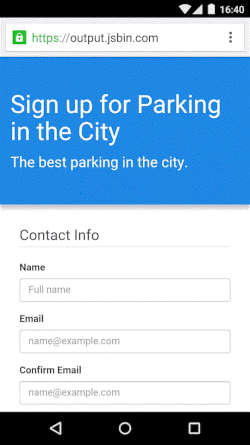
Autofill can save users time if deployed correctly. (Image source)
- Autodetection. Asking for the credit card type is unnecessary; autodetection identifies the credit card based on the first four numbers, requiring form fillers to complete one less task.
- Location detection. Location detection can identify the user’s country (at a minimum) or, using Google’s Places API or another geolocation API, a more specific place, like the nearest airport. Time your request for location information carefully—if you request access before users see the relevance, they may decline.

An option to use the current location or enter information manually offers users choice. (Image source)
Drop-downs
Luke Wroblewski refers to dropdowns as a “UI of last resort;” research shows that mobile forms with dropdowns take longer to complete. That’s because mobile dropdowns:
- Require more interactions.
- Obscure user choices.
There are other options:
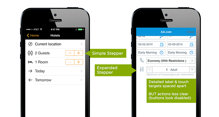
Steppers. A +/– set of controls can be grouped together or separated by the element label. Steppers work well for quantities that have a reasonable upper bound, like hotel or airline reservations. (Site visitors rarely book rooms or flights for more than a few people.)
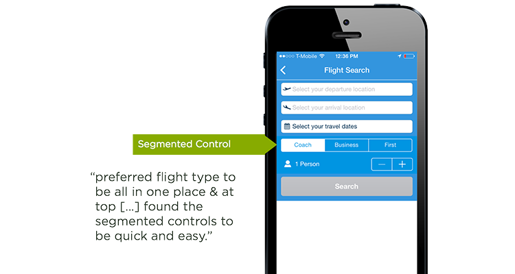
Segments. When the options are limited, a segmented control allows a user to see all available choices at once:
Sliders. Sliders can be used for large ranges or those with a Min-Max variable:

Date pickers. A calendar picker, rather than a drop-down list of days, months, and years, can reduce the total number of taps. (Unless you’re asking for a date of birth—clicking back decades in a calendar would be an ordeal.)
The same research study that found that dropdowns slowed form completion also found that a single date picker—despite requiring fewer total interactions—slowed form completion, too. Two separate date pickers (for start and end dates) resulted in faster task completion:
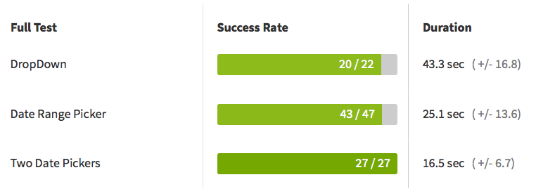
Notably, Luke Wroblewski’s study found the opposite effect—a single date picker worked better. (Takeaways: Not all date pickers are created equal; users vary; a single study is not immutable truth; the better option is the one that wins a test on your site.)
For added post-selection clarity, consider displaying the total time and days of the week the user has selected:

For large ranges that are a bad fit for the aforementioned alternatives—like a U.S. user’s state—predictive input fields (a form of autocomplete) can quickly narrow down a long list after a user enters the first letter or two.
Field masks
Field masks can help reduce errors and speed up form completion by displaying the proper format for a response that could have many formats, like a telephone or credit card number:
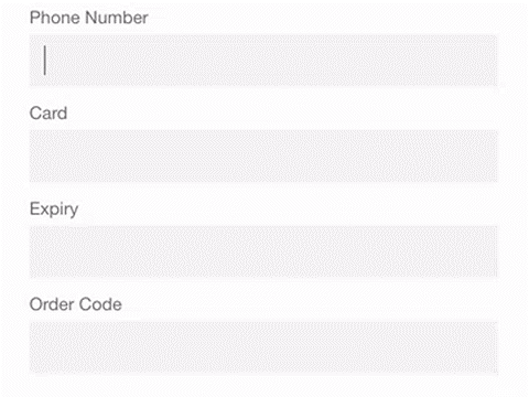
The field mask displays the proper format as soon as the user enters the field. (Image source)
Masks can also ignore invalid inputs (e.g. a slash in a credit-card number) and reduce the urge to split fields for the sake of data validation (e.g. making a phone number three separate fields). Moving between fields, especially ones with small touch targets, is cumbersome on mobile devices.
As Luke Wroblewski argues, masks should also:
- Be visible from the start. If the mask reveals gradually, users are still guessing from input to input if they’re on the right track.
- Not include placeholder text. Doing so may cause users to skip over a field because it appears pre-filled. An outline of the expected input, such as “( ) – ” can set expectations while also clearly looking incomplete. If you use placeholder text, an obviously incorrect response “(XXX) XXX-XXXX” may cause fewer users to skip over it.
Placeholder text is not a replacement for a form label since it disappears once a user starts typing, forcing them to rely on their short-term memory for form-field identification, which becomes more challenging if the field later returns an error.
Field labels
The condensed space on a mobile device makes easy-to-read field labels essential. The aspect ratio alone (portrait instead of landscape) effectively mandates labels above rather than beside form fields. Otherwise, almost any entry would require horizontal scrolling to see the label and entry field at the same time.
One solution is a floating label, implemented via CSS or JavaScript. The form label initially appears inside the field in larger type (increasing readability while saving space), then migrates above the field (in smaller type) as soon as the user taps it:
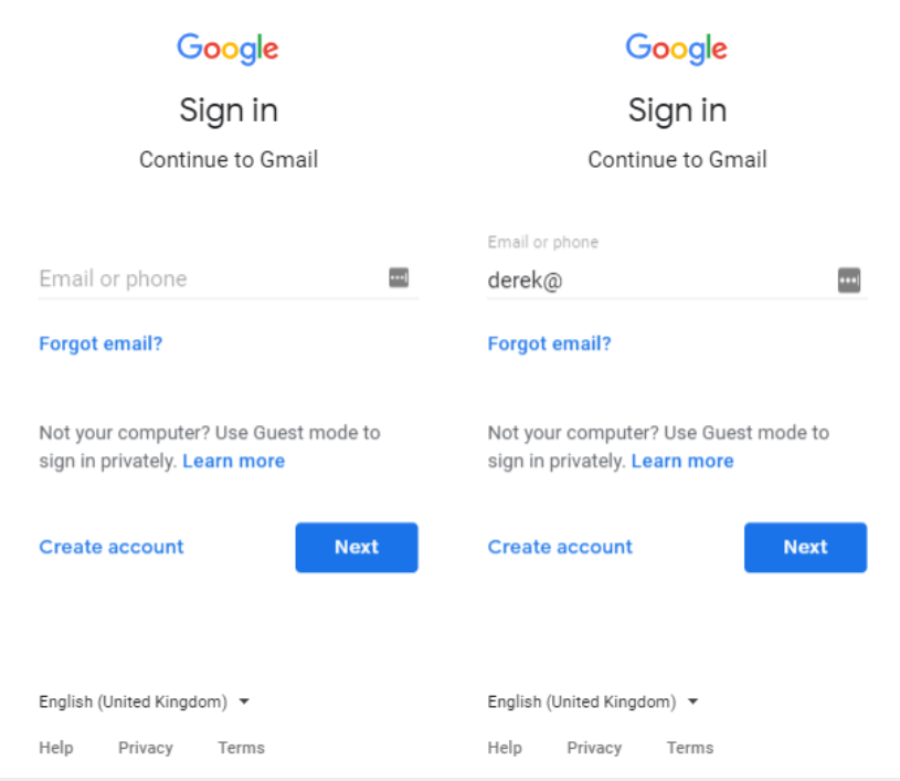
The solution preserves screen space while also maintaining a persistent field label.
Field-specific keyboards
Since its release in 2014, HTML5 has allowed developers to define the input type (e.g. “email,” “tel,” “datetime,” etc.) to return an appropriate mobile keyboard when a user taps into the field.
Keyboard types offer obvious (a number pad for phone numbers) and subtle (the inclusion of the “@” symbol for email addresses) conveniences.
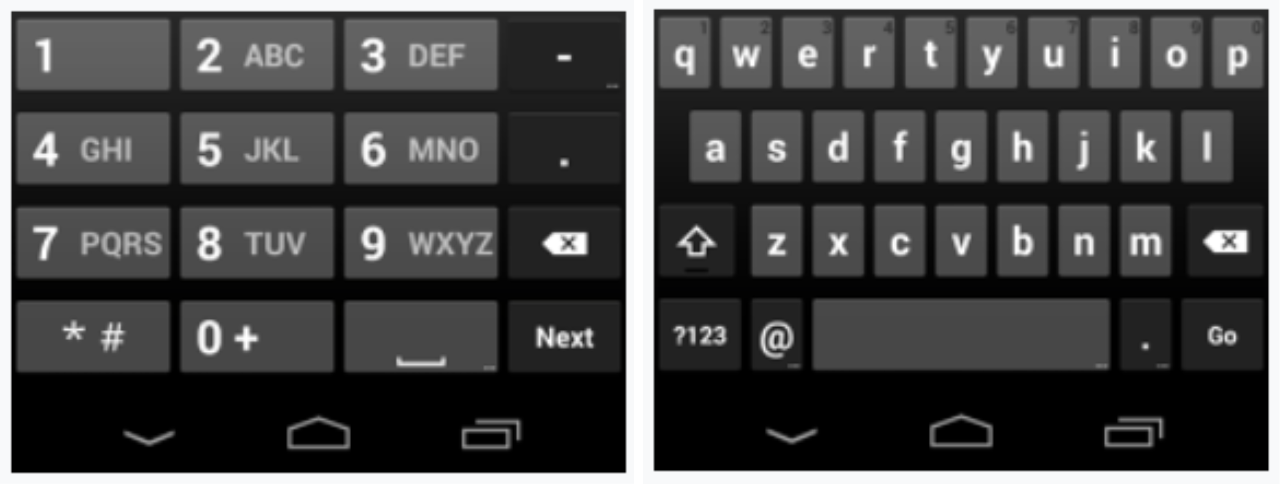
Default keyboard types for “tel” and “email” inputs, respectively. Note the inclusion of the “@” symbol for email inputs.
In-line validation
On most mobile forms, users can’t see the entire form; vertical scrolling is necessary to see all fields. That makes real-time, in-line validation—a best practice for forms on any device—more important.
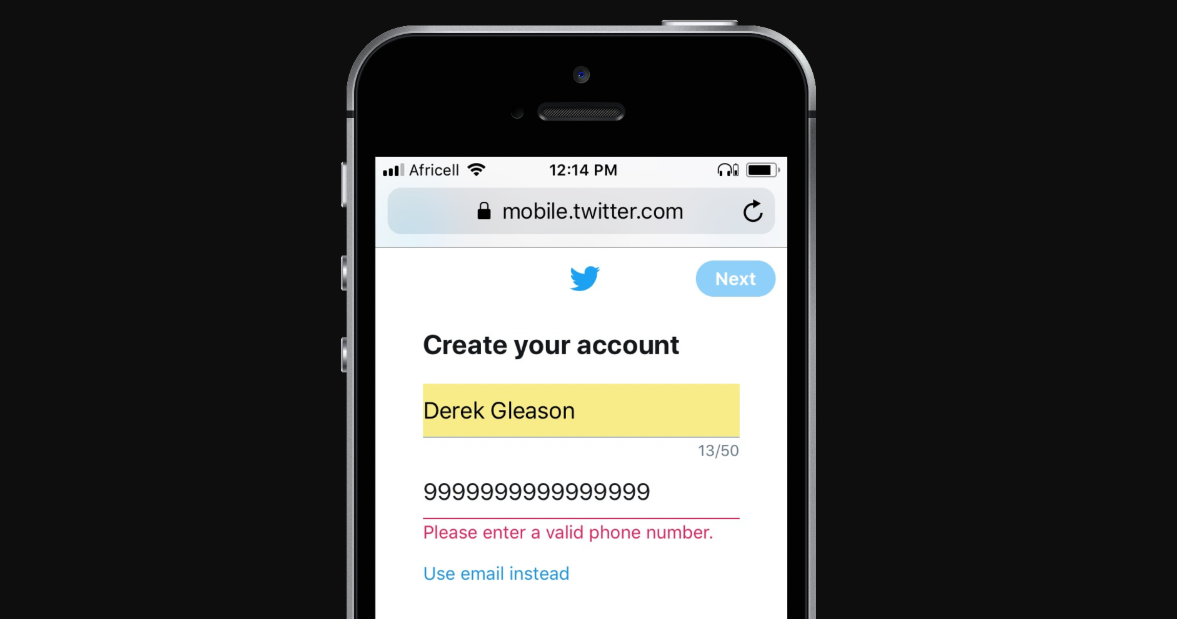
Descriptive text—instead of simple green or red highlighting—helps users correct the error quickly and ensures accessibility for visually impaired users.
If users need to scroll to the top of the form to see errors, then scroll back down to the specific field, they may get lost or frustrated and give up.
Other optimizations
Form autofocus. Autofocus, another HTML5 attribute, highlights the current input field, making it easier for users to see which field they’re working in.
Suggestive field sizing. Sizing fields relative to the length of the anticipated input (e.g. a longer field for a street address compared to a zip code) offers a subtle reminder to users about input expectations.
Disabling the submit button. After a user taps to submit a form or complete a purchase, disabling buttons prevents an accidental click that may cause resubmission or navigate the user offsite before the conversion completes.
4. Tools to measure form performance
Granular measurement helps identify trouble spots within forms:
- Which parts of the form take users the longest to complete?
- At which point do users most often abandon the form?
Those trouble spots, in turn, allow for smarter testing. Google Tag Manager (GTM) is capable of tracking many aspects of form submissions through six built-in form variables:
- Form Classes: gtm.elementClasses
- Form Element: gtm.element
- Form ID: gtm.elementId
- Form Target: gtm.elementTarget
- Form Text: gtm.elementText
Simo Ahava has published several guides on how to track form submissions through GTM, including:
- User input entries for radio buttons, drop-down selections, checkboxes, etc.
- Time to completion for an entire form or on a field-by-field basis.
- Form abandonment.
During a recent (statistically insignificant) discussion on form analytics in our Facebook group, Formisimo was the preferred paid option, with an entry point of around $ 500 per month. Formisimo also has a higher-priced enterprise counterpart, Zuko.
Additional tools that track a more limited set of form analytics include Clicktale and Hotjar, among others.
Conclusion
Mobile forms restrict user interactions—there’s no mouse, an incomplete keyword, and a smaller, vertical screen. Those limitations make an intuitive and efficient user experience more important and, at times, more challenging to deliver.
But they also make some choices easier; not every form “optimization” needs to be tested. Delivering the appropriate keyboard for the appropriate field is a clear win. So, too, is a reasonably sized touch target or the use of a field mask to reject invalid inputs. Those UX improvements are an immediate opportunity for all sites, not just high-traffic ones.
Like all online efforts, form optimization is not a static discipline. Newer features like Touch ID, facial recognition, or photo scans of credit cards promise streamlined interactions at a critical juncture that, every year, occurs more frequently on mobile devices.
Digital & Social Articles on Business 2 Community
(99)
Report Post