Is your value proposition working? Columnist Brian Massey explains how to test and narrow your options to ensure you’ve got a strong value proposition that will optimize your marketing efforts.

When optimizing a website, one of the best places to start is the value proposition. This is the combination of words and images that tell your visitors why they are in the right place and why they should continue exploring on your site.
The value proposition changes depending on the kind of page you’re working on. For a home page, the value proposition will include:
- What you offer. What products or services do you offer the visitor? What category are you in?
- How you position your offering. Are you low-cost or high-value? Do you specialize in any way? How are you different?
- Your selling proposition. This may include return policies, guarantees and shipping policies.
- Your brand attitude. How do you use words and images to show your swagger, reassure prospects and build credibility?
The value proposition for a landing page is all about the promise made by an ad, email or social media post. The value proposition should include these elements:
- Repeat the promise. Assure the visitor that you are going keep the ad’s promise. This is why home pages can be bad landing pages.
- Build out the offer. What happens if I take advantage of the promise?
- Provide proof. What evidence is there that I will be glad I took advantage of the offer?
- Build trust. Can you really deliver on the offer?
- Bring them to make a choice. Make it clear that you’re asking them to take action and persuade them to do so.
A lot of designers fancy having your web pages contain a bold image at the top of the page, or the “hero shot.” This technique is used in a knee-jerk way, but it has roots in direct mail marketing. Direct marketer Frank Johnson was able to increase response rates by adding a box at the top of a mailer — now called the Johnson Box — that stated summarized content at the top of the page.
Nonetheless, the hero shot element is now a part of the value proposition of most pages.
When we seek to find the right combination of offer, headline, copy, images, proof and trust, we can get wrapped around the axle. Should we use long-form or short-form content? What should be first, at the top? What content should be above the fold? Which images support the value proposition? Should we lead with features or benefits? Be logical or emotional?
The number of combinations defies our ability to test. We need to narrow our choices.
Narrowing your test choices
When testing creative, we want to identify variations that are most different. For example, let’s assume we have 10 headlines that we like for a landing page.
Assume we are the US Mint, and we’re selling dollar bills for 50 percent off. That’s a great offer. But even with an offer like this, the mint would still need to work to convert visitors.
We have eight headlines that keep the promise of the offer:
- Get US Dollars 50% Off — Mentions the US for credibility
- Double Your Money Instantly — Benefit-oriented
- Give Us Fifty Cents, We’ll Give You A Dollar — Personal
- Save On Half-price Dollars — Emphasizes the savings
- Get 50% Off Direct From The Mint — Mentions the Mint for credibility
- 50% Off US Dollars For A Limited Time — Adds time scarcity
- Trade In Your Tens For Twenties — Uses imagery
- Time Is Running Out. Half-Priced Dollars — Adds urgency
- The IRS Says, “Sorry.” Sells Half-Priced Dollar Bills — Whimsical
- Help Us Increase Dollars In Circulation With 50% Off — Provides a motive
All of these keep the promise, but they will convert at very different rates. Which is most effective? We can’t test all 10. That test would just take too long to run. Our goal is to test the three or four most different selections.
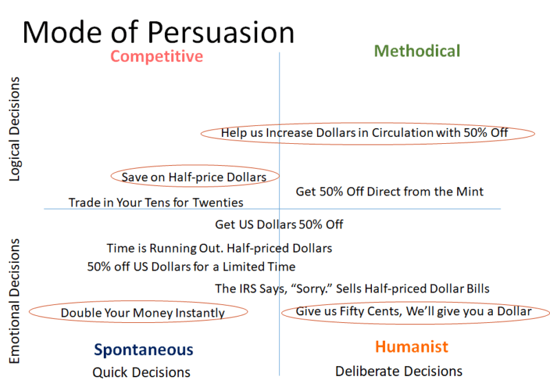
To help us choose, we use the four-quadrant Modes of Persuasion defined by Bryan and Jeffrey Eisenberg in their book, “Waiting for Your Cat to Bark?” It looks like this:
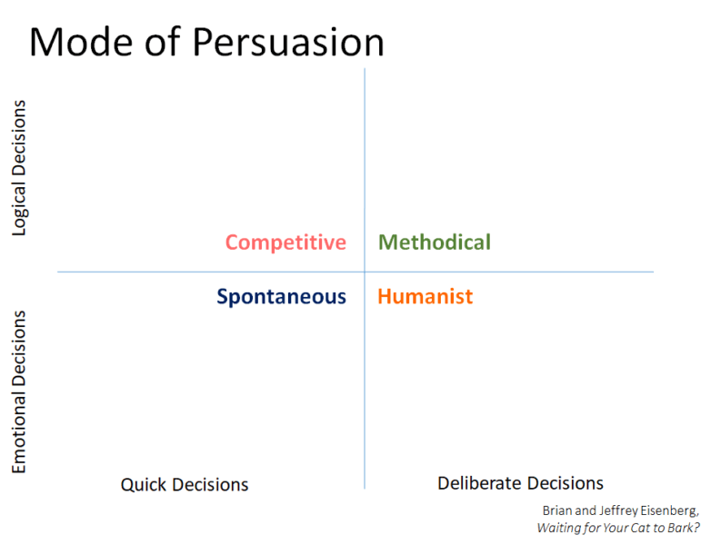
Visitors coming in a Spontaneous mode make decisions quickly and emotionally. They are quick to pull the trigger and are just looking for an excuse to take action. Example: “I’ve made my decision, and I’m here to buy.”
Visitors with a Competitive bent are looking for ways to make themselves better. They will spend money easily on the things that make them feel and look good. Example: “I pay a lot for shoes, but only for the right brand.”
Those visiting in a Methodical mode need to understand the way things work. They will not take action until they already have the answers. Example: “How does your solution differ from the others I’ve seen?”
Humanist visitors need to understand how they will feel if they complete the action. They want to know who they are dealing with and if they can trust them. Example: “I like to buy from companies that earn my trust.”
If you know the primary modes that your visitors are coming in, you can focus just on those quadrants. This is easier for a landing page than for a home page, which serves all kinds of visitors.
For our purposes, we’ll seek to classify each of our headlines according the the kind of visitor they may appeal to. We can lay these out on the map according to our sense of their levels.
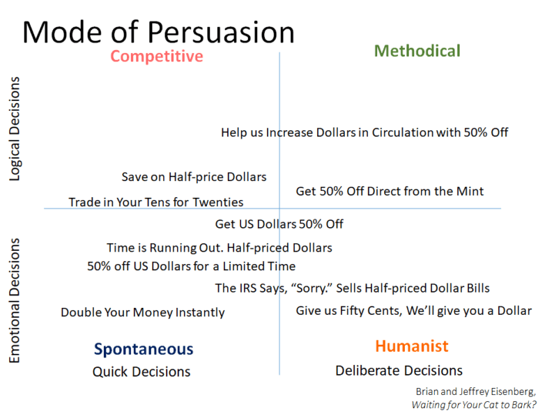
We have a lot of headlines that lean toward Spontaneous and Humanist. Our goal is to test the most extreme examples of each. We could select one from each category or only from those that represent our visitors.
This same approach can be used for images, copy options and much more.
Expert tip: Content that appeals to quick decision-makers should be listed closer to the top of the page, list and so on. Quick decision-makers are less likely to scroll.
This process is quite subjective, but it’s better than one person in a room deciding which they like and testing those. It also gives you a “process” that can limit the effect of an executive’s opinion.
Once we have used this process to narrow our options, we’ll employ user research or A/B testing to deliver the quantitative data that drives our final decision. Try it on the decision you’re trying to make right now.
Some opinions expressed in this article may be those of a guest author and not necessarily Marketing Land. Staff authors are listed here.
Marketing Land – Internet Marketing News, Strategies & Tips
(88)
Report Post

