Facebook ads are a great way to attract new customers to your business and stay fresh in the minds of people who already know your brand. But in a time where everyone is fighting for customers’ attention, you need to make sure your ad creative will make them stop scrolling and pay attention to what you have to say.
In a previous blog post, we talked about how Canva can be your ally when it comes to creating an ad. It is a tool we use a lot here at Curve, since you can choose to either design from scratch or take advantage of their templates–the latter option of course being an even easier and faster path towards great-looking ad creative. But even if you choose the template route, there are a few tips and tricks you should keep in mind when it comes to designing Facebook ads:
Before reading any further, remember that the purpose of your ad is to make people stop scrolling through their feed, so you need to create an image or video that will stand out!
1. Consider the basics first
- Like we mentioned here, if you’re adding text to your design, make sure it doesn’t exceed 20% of the image;
- Before choosing the colours, images and fonts, consider your brand identity. Being consistent with your colours and style helps customers recognize you more easily.
2. Choose the right format
- Single image: the most basic (which doesn’t mean boring!) and easiest-to-create option. Go with a square design of 1200×1200 pixels.
- Video: best option for when you want to tell a history or give a demo of a product or service.
- Carousel: perfect for showcasing multiple products! You can have up to 10 images or videos and each image can have its own link.
3. Find an image
- If you don’t have or don’t want to use one of your photos, you can use stock images. We’ve created a list of the best websites out there to source great pictures and graphics for free!
- Only use high quality photos! A 1200×1200 pixels image is perfect for Facebook.
4. Pick your colour scheme
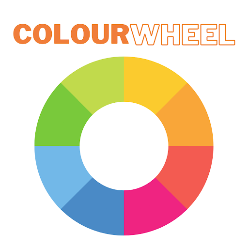
- Take a few minutes to read about the psychology of colours. Knowing what the different colours represent is important so you can match your design to the message you want to send.
- Because your goal is to catch people’s attention, choose bright colours with high contrast!
- Stay away from shades of blue – blue is Facebook’s colour and using it will make your ad blend in. If your brand identity happens to be blue, choose complementary colours, like oranges and yellows. Use a colour wheel to help you.
5. Play with text
- Readability comes first! Stay away from cursive or ornate fonts – you have seconds to catch someone’s attention and you don’t want to make it difficult for them to read.
- If your image has a lot of detail and the text doesn’t stand out, use elements to create a background; it doesn’t have to be a solid block of colour– just play with the transparency!
6. Use templates
- As mentioned before, you can use Canva templates to create single images, carousels and even some animation.
- If you’re creating a video, try out some of the Vimeo templates!
Pro-tip: Always create more than one design. Simply change the images and the placement of your elements. Sometimes the image you loved is not going to appeal to your prospects as much as you would’ve imagined. So set up two or three variations and let Facebook deliver the most successful one.
Digital & Social Articles on Business 2 Community
(60)
Report Post