I recently hosted a webinar on BizSugar talking about what I consider to be the essentials of any small business website. Consider this a comprehensive cheat sheet for your next web redesign project.
I’m not a designer nor am I a developer. I am a digital marketer with 20+ years of managing web design projects. I’ve seen it all and, trust me, I’m here to help!
Most website projects start from the standpoint of design. I’m here to tell you that this should be one of the last things you discuss. What you really need to focus on is your target audience and the goals you’d like to achieve.
Website Redesign RFPs
But first, let’s talk about one of the most unpopular acronyms in our industry… R.F.P.
Did a cold shiver just run down your spine? Yeah, I felt it too. People hate RFPs because they are usually horrible and they remove all of what makes for a successful website project… meaningful conversations with digital marketing experts during the planning phase.
If you must do an RFP, make it a useful document that helps everyone involved. Create an RFP that actually serves a purpose…
- Simple Project Narrative – tell the story of who this website is for and what it needs to do for them.
- Straightforward Project Specs – don’t get lost in jargon. Instead, use plain language to outline what this website needs to be, and do so that all stakeholders can understand and agree upon the desired outcome.
- Agreed Upon and Measurable Goals – make sure you clearly define what success looks like and have everyone agree to those benchmarks or KPIs.
- Realistic Timelines and Milestones – now is the time for honesty. Plan for anything and everything that could go wrong. Don’t set yourself up for failure by setting unrealistically aggressive timelines.
- Real and Realistic Budget – a quality website is not cheap, even a theme. The old adage is true here, you get what you pay for. Ask around, ask colleagues, partner companies, and trusted vendors what a realistic budget is for what you’re looking to build.
The RFP is a tool, not the goal. A better website is the goal! Moreover, your RFP can be useful if you put some time into it. Actually, it can become the scope of work for your vendors to follow.
OK, now that we have that out of the way, let’s talk about some of the key elements that make a website effective.
Realistic and Attainable Website Goals
Each website is unique with a unique audience and a varied set of goals. Sure, there are lots of similar websites targeting similar groups with a similar set of targeted goals, but the unique ones are generally more successful.
Why? Because you’ve taken the time to identify a target audience (more on this in a bit), understand their needs against your goals, and develop a website that is built with those things in mind.
This might seem obvious but you might be surprised at how many websites are built primarily to satisfy the desires of the powers that be. Who, as is most often the case, ARE NOT YOUR TARGET AUDIENCE!
Sorry, it’s a major pet peeve of mine. Anyway, if you identify realistic and attainable goals, the rest should fall into place nicely.
How will the success of this website be judged?
- Is it traffic? How much? What should happen next?
- Do you want more conversions? Is there a specific dollar amount per goal?
- Are you looking for a demographical or geographical reach? How is that obtained and tracked?
- Do you want more customers, subscribers, or users? What are the target numbers for this?
- It is brand awareness? Are you sure? What does that get you in the long run?
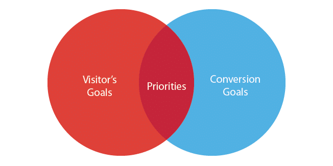
Set goals you can realistically achieve or you might find yourself out of a job or company. Certainly, all project stakeholders need to agree on this list of goals. Heck, make them sign something.

Focus on User and User Experience
A user is someone you want to attract, a new client or subscriber, for example. A successful website is one built with a specific user in mind and built in a way that makes it easy to use and drives them towards action.
You cannot have a quality user experience without first knowing your audience.
Know Your Audience
Who is your ideal user? Paint a picture. Or, better yet, try building out real buyer personas. For more on buyer personas, check out our interview with Adele Revella, founder of the Buyer Persona Institute.
At a minimum, you want to outline the following…
- Goals – What do they expect to accomplish while using your website?
- Expectations – How do they envision the journey (called the user journey) in a perfect world scenario?
- Motivations – What problem do they expect you to solve (Google E-A-T people!)? Is it answering a question, providing a product, bringing them joy, and so on?
- Behavior – How will they use your website, and where are they when they’re using it? What’s their state of mind? Are they in a hurry, frustrated, concerned, bored, etc?
UX and the User Journey
Your website is a story, the story of a user’s journey from an unknown entity to a rabid fan and/or lifelong client. The problem is that a user can start their journey on what could be considered chapter 3.
Map out their journey factoring in multiple entry and exit points, in other words, be prepared for any and all user journey scenarios. By doing this, you will avoid user confusion and be better at mapping and building a user-friendly website geared towards targeted user action.
If you’re in my generation, Gen X, you might remember those “choose your own adventure” books. Each chapter ends with a choice for the user to make, and, depending on that choice, the story could play out in many different ways.

The author has mapped out all of these different paths and developed a storyline for each possible choice and resulting scenario. What story are you telling?
- Each landing page is a possible chapter in this story.
- Is there a beginning and an end on each page?
- Does it all tie together?
A client can land on any page from a Google or voice search…
- Are they confused when they get there?
- Does each page contain something useful?
- Is there a meaningful and logical call to action?
Get inside their head, understand and align with their journey. The easiest way to build a user journey is visually using a combination of journey maps and wireframes.

There are lots of free and paid tools for this. Here’s a useful list from Zapier of wireframing UI (user interface) tools. At a minimum, use a whiteboard or sketch paper and simply map it out with boxes, arrows, and whatever you need to show how the user will navigate and interact with your website.
Content Planning and Content Management Systems (CMS)
Nothing kills a website project quite like the content. It amazes me how many times I’ve seen content be an afterthought. Why is this?
It could be that writing scares people. I don’t know. Regardless, we all how important your website content is. After all, it’s what Google uses to assess the value of your website, and it’s what users consume as they follow the path to conversion.
Content Planning
We’ve written posts about getting your content seen, on how to do a content audit, and what it takes to create content with authority. Definitely check those out. For this post, I will make these recommendations…
- Create a sitemap using the targeted keywords that make sense and make things easy for your target audience. Try SEMRush or Ahrefs.
- Inventory the content you will need at launch and in the next 3-6 months. Who will create and edit this content? Do you need a writer?
- Plan all images and graphics you will need. What about videos? What tells your story best? Who will produce these materials for you?
Content can make or break a website, have a plan and team to implement it!
Utility Content
Create utility content. Utility content is the rocket fuel for your website. In other words, this is the content your audience devours, such as…
- How-to videos
- Thought-provoking posts
- Tools, references, studies
- Problem-solving content
- Timely and up-to-date content
Your content should be for your target audience to use! Don’t make it about you, make it about them and for them. Make them the hero of your story by creating content that solves their problems and helps them to win the day!
Content Management Systems (CMS)
This seems like a silly thing to say these days but it’s still important enough to mention. Not only do you need a content management system, like WordPress or similar, but you also need to have complete control of all of your content.
You need to be able to easily keep your website fresh! Like I said, complete control, over…
- Navigation
- Calls to action
- Image, videos
- Forms
Your site’s design is only as good as the content it contains. Make sure you can control that content to keep the site fresh. It matters to your users and it matters to Google.
Speaking of Google…
Google Page Experience
Google is always concerned about user experience. They want to make sure that when a user clicks on a link from their search results, that they are taken to a quality website that has a good user experience.
They call this Page Experience. Recently, there’s been lots of talk about Google Core Web Vitals.
Google Core Web Vitals
What are Core Web Vitals? Google is telling us that websites should be optimized for the following…
- Loading – the website is optimized for speed and running on a fast-hosting platform.
- Interactivity – the user can quickly get to work finding what they need.
- Visual stability – your site loads completely and doesn’t constantly shift layouts because of ads or pop-ups that force the layout and content to shift.
In addition to these so-called “core web vitals,” they’re also very adamant that websites are built with the following in mind…
- Mobile-friendly – you’re using responsive design to ensure a quality experience on mobile devices, serving the same content as the desktop version.
- Safe browser – your site is free of viruses and malware.
- HTTPS – the communication to and from your website is encrypted.
- No intrusive interstitials – you know these, those annoying ads and pop-ups that overtake the page you’re on forcing you to click an X to go back to the page. Google hates these.
Mobile-Friendly
Google is now a “mobile-first” index, meaning that they prioritize the mobile user experience over all others. Even if your core audience isn’t on a mobile device, you cannot and should not ignore the mobile user experience.
How do you meet the needs of your mobile audience?
- Responsive Design – a website theme that works well on multiple device types
- Responsive Content – content that a mobile user can scan for important points.
Make sure your site works for all devices, especially mobile. And once your website is built, don’t forget about these SEO essentials…
Onsite Optimization
Great content is not enough. You need to optimize the code of your website for maximum search engine crawlability and ranking power. This should always include…
- Page titles that contain keywords but still make sense to the user.
- Heading tags and keywords in headings for every 300 words.
- Meta description optimized to entice the user to click from the SERP listing.
- Schema markup is sitewide. You can do this with a plugin, but an SEO professional will likely do a much better job.
- No unused plugins and minify code if possible.
- Optimized images and video.
- Track the users the right way, think about marketing automation.
Make sure the entire website is optimized for search engine visibility.
Your Website Is Important, Always Deliver!
Change your mindset. Everything you give them should…
- Offer them value
- Be easy to understand and actionable
- Be shareable
- Use language they understand
- Be authentically you
And never forget about the real purpose of your website…
- Create a scope of work and agree on goals.
- Focus on the user and user experience.
- Map it out.
- Have a content plan and an easy CMS to manage it.
- Google Page Experience could mean the difference.
- Optimize onsite for better visibility.
A well-built website starts with a plan and a team focused on real achievable goals. But, more important, a good website is about the user and making the user the hero of their journey as they navigate through it.
For more, check out the slides from my recent presentation.
Digital & Social Articles on Business 2 Community
(20)
Report Post
