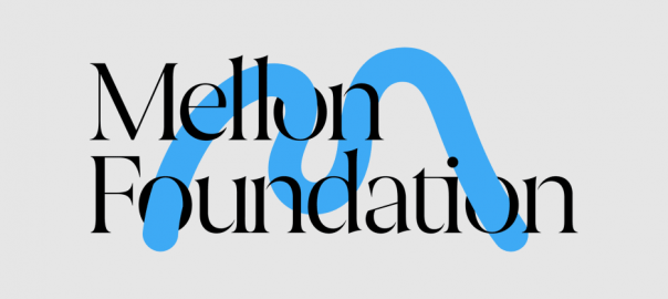
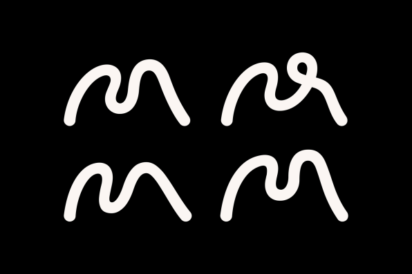
Eddie Opara, a partner at the celebrated design firm Pentagram, has long specialized in technologically sophisticated graphics. But for the new identity of the 53-year-old Mellon Foundation, he and his design team tried something decidedly different: They modeled the logo out of clay.
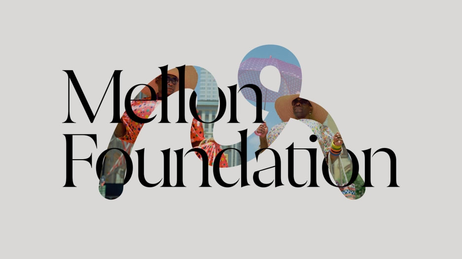
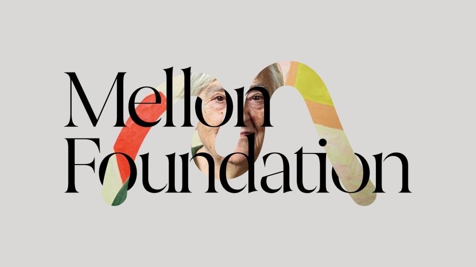
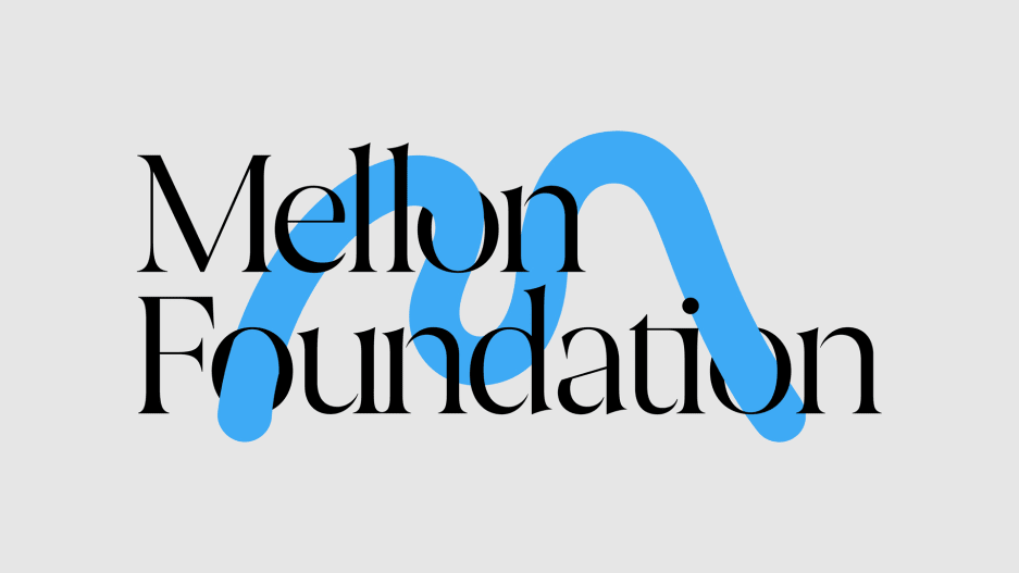
The resulting symbol, a sculptural “M” that can adopt different sizes, colors, and patterns to suit everything from formal grant documents to ads, neatly echoes the foundation’s role as the largest funder of the arts and humanities in the United States. It pairs with a refined serif word mark and an audio signature inspired by the Black composer Florence Price (and designed by Opara’s colleague Yuri Suzuki). Altogether, this forms one of the most memorable identities of any organization, let alone a philanthropy, in recent memory.
Why does a philanthropic foundation need sleek branding? After all, the Mellon Foundation exists to give away the vast fortune of 19th-century industrialist Andrew W. Mellon, an endowment that tops $9 billion. The foundation doesn’t face the market pressures that prompt many public-facing companies to invest in branding.
But there are compelling reasons to apply a shiny new coat of paint. In the summer of 2020, as racial justice protests spread across the United States, the Mellon Foundation updated its mission to prioritize social justice in all its grantmaking. It has committed $250 million to rethinking exclusionary monuments and funds a host of initiatives aimed at increasing diversity in higher education. The old logo, a generic red and black wordmark, had no connection to the foundation’s new direction.
The new identity nods to the communities meant to benefit from the foundation’s grants. The typeface of “Mellon Foundation” (abbreviated from the former name Andrew W. Mellon Foundation) is Joane by the Chilean design studio W Type Foundry. The typeface for other branded media (such as in signage and on the foundation’s website) is Halyard, a sharp sans serif designed by the most prominent Black type designer in the United States, Joshua Darden. And the logo’s shapeshifting “M” acts as a vessel to highlight the organization’s grantees; it can be bent to resemble the limber forms of a dancer, texturized to evoke a landscape design, or filled in with a photographer’s image. The art defines the brand in the most literal way.

More generally, Mellon Foundation President Elizabeth Alexander believes philanthropic organizations must do more to communicate their ideals at a time of major upheaval in American society. “The way of the foundation had been to quietly fund the grantees and do the talking by example. But we [as an organization]… have something to say as well,” she says. “With the war on truth and all of the societal struggles we are in the midst of, we want to be identifiable. We are carrying meaning, we are carrying values, and we want them noticed.”
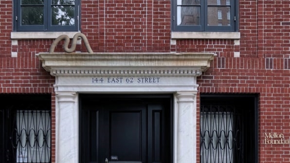
In this sense, Pentagram’s branding plants a flag in the ground. “The arts and the humanities help foster empathy in a divided country,” says Opara. “We need the arts and humanities to be integrated into the idea of the future or we’re going to lose ourselves.”


(85)
Report Post