— July 4, 2018
Are you looking to grow your email list, generate more leads, get more people to download your content, or enroll more blog subscribers? Us too.
While the marketing world is quite divided on the use of pop-up opt-in forms, we happen to use them for ourselves and for our clients. The caveat being–it’s all in how you use them. Use them wrong and you’ll annoy your visitors. Use them right and you’ll capture the email leads you need to grow.
Here are some basics and best practices for using opt-in forms on your website.
![]()
Why Do Marketers Use Email Opt-In Forms?
Email opt-in forms are an easy, inexpensive way to capture leads. They typically consist of form fields asking for basic information about the person downloading your content or subscribing to your blog. Sometimes these forms are found on a landing page, but for the purposes of this post, we’ll be talking about forms that are triggered to ‘pop up’ as a result of visitor behavior on your website.
Types of Pop-Up Opt-In Forms and How They’re Triggered
Email opt-in form examples or types include:
- Welcome mats: Full screen pop-ups that slide above page content
- Overlay modals: Center screen pop-ups that appear on top of page content
- Top banners: Small banners at the very top of the page (Sometimes called Hello bars)

- Slide-in boxes: Small boxes that slide in from the side/bottom of the page (we use Leadflow)

Triggers that cause a lead capture form to pop up:
- Page entrance: Visitor first gets to the page
- Page scroll: Visitor scrolls to a certain point on the page
- Element interaction: Visitor clicks on or hovers over a specific element
- Time on page: Visitor has been on the page for a specific amount of time
- Exit intent: Visitor scrolls towards the top of the page to leave
Bonus Tip: No matter which you choose, or how it’s triggered, think through what you’re promising to send in return for the contact information and what you will and won’t do with the email addresses. Make it clear to anyone filling out the form that you’ll be respectful with their information (ie won’t sell it).
Do Pop-Ups Really Work?
Yes! But you have to place them correctly, style them appropriately, make them contextually relevant, and offer something of value! Here are two recent success stories from our own website.
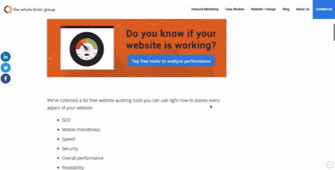
The pop up featured below was for a free website audit and was carefully placed on pages that made sense (pages about website performance). The trigger was a 50% scroll and the form asked for first name, email website URL and company name. It resulted in over 700 views, 13 new contacts, 5 deals and more than $ 200k in business in about 7 months.

The one featured below was used last fall to promote a new piece of content. Again, careful placement and contextual relevance lead to quick results. It generated 93 new contacts, and lead to 2 new deals in 1 month. The new contacts generated from this pop up continue to visit our website and interact with our other content.

Bonus Tip: Ask for as little information as possible on your ‘C’ content offers — like just an email address. Reserve the multiple questions for your B+ and A content offers. Keep your form fields as simple as possible.
Pop-Up Email Opt-in Form Best Practices
Design, copy, trigger and placement for your pop-ups should balance user experience with your goals.
Here are the keys to success:
- Make them contextually relevant
- Offer something of value
- Don’t have them fly in or pop up right away – use a timed approach
- Write a clear headline
- Create excitement: Be fun or even provocative!
- Match the CTA to the offer
- If using an exit intent pop up, bring your content A-game -offer your best stuff!
Bonus Tip: Don’t forget to think through your follow up strategy. Create automated thank you emails and nurturing workflows to onboard your contacts and welcome them, and don’t be afraid to customize the content by segmenting your list based on their data.
Using Pop-up opt-in forms is still one of the least expensive ways to promote your content, and provides you with lots of options to customize the experience for the best possible results. You just need to remember that user experience is your #1 driver.
Need help promoting your content, setting up opt-in forms and automating follow up email campaigns? That’s what we do!
Digital & Social Articles on Business 2 Community
(120)
Report Post


