— December 14, 2018

We build lots of custom websites sites. Each of these starts with a lot of planning and a major part of this planning is the sitemap. The organizational structure and navigation system of your website can mean the difference between success and failure.
A website sitemap is a written list of pages, posts, and other assets which make up the website’s structure. It can be as simple as…
- About
- Services
- Service One
- Service Two
- Products
- Product One
- Product Two
- Contact
But, I think we can all agree that websites are way more complex than what you see in the list above. Websites today are made up of pages, blog posts, downloads, dynamic content, video, etc. Mapping this out in a linear fashion is almost impossible.
Some marketers can get overwhelmed once they’ve done a thorough audit of their website content and assets. What we propose is that you tackle this with a three-step process:
- Top Level Sitemap
- Asset Audit and Planning
- Website Content and Asset Organization
Let’s review each one.
Step One: Top Level Sitemap
Main Website Navigation
All websites have a main navigation, i.e. a set of links that allow the user to get to the main sections of the website. These usually appear along the top of a website like this from our friends at Exponent Philanthropy…

We call this the main navigation or top level navigation. These are like the departments in a store. There are lots of products in each department but shoppers will look for the department first, and then the product.
When organizing your website, it’s helpful to organize your content and assets into “departments” or main navigation links. These would be things like Products, Services, Resources, etc.
Quick Website Organization Exercise:
- Write your main navigation links across the top of a whiteboard.
- Have your website team then list out all types of information a user would be looking for under each appropriate link listed at the top.
- You might want to use post-it notes so you can move things around.
- Don’t get lost in the details, just focus on general descriptions of the types of info like white papers, product pages, blog posts, profile pages, etc.
- When no one can think of anything else, survey your board. Is everything there? Are the post-its under the right links? Does anything feel out of place?
- Also, pay attention to the post-its that didn’t seem to have a natural home. Is there a main navigation link missing? These could be outlier links. Set them aside for now, I’ll explain in a bit.
The point of the exercise above is not to identify all of your website assets or content pieces, it is to make sure you have a place for everything once the website is built.
This is important for a few reasons…
- Most importantly, your users need to be able to quickly find the information they’re looking for. The organization needs to be intuitive. More on this in a bit.
- Your web designer/developer needs this to setup the UI and database structure of the website.
- You or your writer need this to make sure you don’t forget anything when it comes to finding, creating, editing content.
- Once the team has agreed on the main navigation, you can move forward without anyone second guessing the structure. (this one is crucial, trust me!)
Subpages
It’s not as important to map out the internal pages too much up front. Yes, you need to know what these will be once you start organizing your content and assets (more on this in step three), but a website’s design and development does not have to be put on hold for subpages, at least before the content phase.
After going through the post-it exercise, you will have a good idea of what the pages will be under each main heading. And it’s a good idea to note those in your final written sitemap (at least to the secondary and maybe tertiary levels).
Just remember that these page names, ordering, and even their existence may change over time.
For example, you decide early on that you want to have a company history page and it needs to live under the About Us section. Then, as you work through the content, you realize that history doesn’t need a page of its own and can go on the About Us page, proper.
It’s better to have an idea of how deep your navigational structure needs to go than to write out all the pages in the beginning. For example, you know that you will need the following navigation designed and developed…
- Services
- Service Detail
- Service Past Performance
- Service Detail
Or it can be as simple as…
- Services
- Second Level
- Third Level
- Second Level
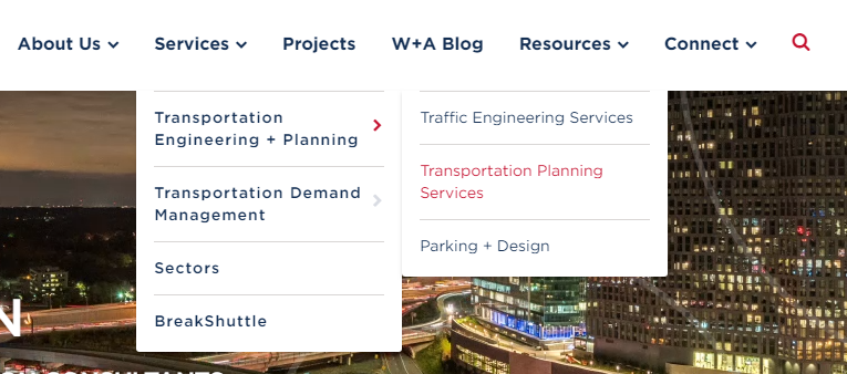
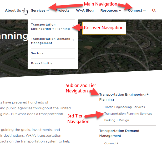
Point being that your designer/developer needs to know how many main, secondary, and tertiary menus they’ll need to create. You can see in the samples below how the different levels of navigation can factor into the design…
Rollover Navigation

Not all websites use rollover navigation. It’s one of those things that people either love or hate, but, done well, they can be an effective way for users to find areas of your website quickly.
Website Navigation Levels

As you can see above, each level of navigation must be considered in both the design and the structure of the website.
Finalizing the words in the links is not as important as identifying the number of levels needed. It’s better to know up front than try to shoehorn a solution in later.
Calls to Action or Callouts
The exercise above should also make clear which areas of your website are most important. These are the areas that you want your audience to visit. These are also the places that your audience needs to find.
They will make sense as sublinks under a main navigation link but they cannot just live there. You need to call attention to these things.
A call to action or callout is literally a link on your website that has been given extra attention to make it more noticeable. On the Exponent Philanthropy website, it is the member directory callout in the header…

Calls to action can be used for product sales, service offerings, blog posts, press releases, member highlights, and so forth. Even though these links can be accessed through your main navigation, they may need a little extra design or a more prominent placement to get them noticed.
This information will also be key when setting up wireframes.
Top Website Navigation
The term “top navigation” means something different than “top level navigation,” I’ll explain. Every page of the website will not fit into your main navigation areas.
If we continue with the store analogy, you have additional areas of the store that need to be accessed, like the checkout line and the bathrooms. On a website these could be things like “login” or “contact.”
Looking at the Exponent Philanthropy website again, you can see the links that make up their “top navigation” below…

These are all important links but don’t fit naturally into their main navigation links. They need to be accessed quickly and easily from any page.
Sometimes we will place the “About Us” link in the top navigation for an organization that wants to lead with something other than their mission, bios, etc.
There are no rules for these links. It all depends on your user’s needs and your marketing and website goals. And don’t feel like you need to copy someone else’s navigation either.
While it can be helpful to look at other websites for ideas, it’s important that you remain true to your organization goals and user needs.
Step Two: Website Asset Audit and Planning
This is where the short attention span kicks into high gear. No one enjoys inventory, that I know of at least. But, someone’s gotta do it!
A website asset can be many things…
- Images
- Whitepapers
- eBooks
- Downloadable tools and widgets
- PDFs (other than eBooks and White Papers)
We’re talking about everything that is neither a page or post. These are all of the digital files that will live somewhere on your website. Now, I can feel your eyes glazing over. But, trust me, this is important.
Too many companies wait until the last minute to start organizing these things. Here’s where that’s no bueno…
- Images – you realize two weeks before launch that you need to hire a photographer and get your team scheduled for a photo shoot. Good luck.
- White Papers, eBooks, PDFs – you have great pieces that are horribly out of date. You realize this a week before launch and now have to edit 10 multi-page documents at home, at night, while your kids are screaming and your significant other feels ignored… “we never talk anymore.”
- Downloadable tools and widgets – they don’t work anymore! No one tested them until the week before launch and the developer is snowboarding.
Knowing what you have, what needs work, and what you don’t have can often be the difference between launching on time and researching your a new employer on GlassDoor.com.
Step Three: Website Content and Asset Organization
OK, so now you’ve organized your main sections, callouts, and top level links. You should also have a good understanding of what content and assets you have and what you need to edit or create.
You’re so close!
Now it’s time to put it all together. Some people prefer doing this in a spreadsheet. Some people will create folders for content and assets based on the top level site map.
It doesn’t matter how you do this. What matters is that you can deliver a guide along with your content and assets that you staff or web developer can follow when adding those content and assets into the website.
Website Organization Spreadsheet
If Excel is fun for you, you are very weird. For the rest of us it serves its purpose and that’s about it. That said, Excel is a great tool to use for organizing your content and assets.
You can setup the site organization in the rows and columns using links to your existing website or links you wish the new pages to have. That second piece will certainly depend on your SEO goals and the URL structure you want to rank.
In the columns next to the page link, you can then list out the content links or doc filenames/location or both as well as any images you wish to use on these pages. You may even want to include the target keywords you wish to use on each page.
Here’s a great article on using free vs. paid keyword research tools. We use SEMRush at Wood Street. It’s great for keywords and a lot more (not getting paid to say this).
The goal of this spreadsheet is to create an inventory checklist of all content and assets needed for each page. Someone should be able to open this spreadsheet and easily figure out where to find content and assets for a specific page.
Website Organization in Folders with Inventory Document
Another option for pulling all your materials together is to setup an inventory list that references all assets in folders. The idea here is that you use your sitemap as a checklist as you place files in folders to provide to your content publishing team or web developer.
Using a simple outline like the one used at the beginning of this article, I’ll show you what I mean. Look at the section below in italics and you can see how I reference the content file and image for the Member Benefits page…
- About
- Our Members
- Member Benefits
- Website-Assets\Our Members\Member Benefits\Member Benefits.docx
- Website-Assets\Our Members\Member Benefits\Images\image.jpg
- Member Discounts
- Member Benefits
Once you have all of the files accounted for you can zip them into one folder and send, along with the inventory checklist, that zipped folder to your content team.
While these things may seem tedious, it’s a lot better than scrambling at the last minute to gather content to meet a hard launch date deadline. We’ve seen it all too often. Taking some time up front will save you tons of time and sanity in the long run… maybe even your job.
Keep Your Eyes on the Website Prize!
I hope I’ve made sitemaps and website organization seem more manageable. These tasks are super important whenever redesigning or reorganizing a website.
You do not have to do everything just like I’ve outlined here. That was not my goal. My goal was for you to understand the importance of sitemaps and inventory and have the understanding such that you can create a system that works for you.
Be creative and remember there is only one goal… a timely completion and launch of a successful website. Good luck!
Digital & Social Articles on Business 2 Community
(84)
Report Post


