— July 5, 2019
Survey reporting isn’t a prescribed formula. You need a way to present your findings in a meaningful way that caters to the audience at hand. To do so, many marketers create a presentation and a report.
A presentation can provide need-to-know insights in a quick, informative way. Meanwhile, a report can provide a deep-dive of statistics, methodology, and executable actions. In this article, we’ll give you some tips to create both a presentation and a report.
How to create a survey presentation
Your survey presentation should deliver need-to-know information in an engaging and informative way. Think of your presentation as the CliffsNotes version of your report. To accomplish this, here are some tips:
Start with a headline
After conducting a survey, it’s easy to get wrapped up in data sets and percentages. However, the purpose of survey reporting via a presentation is to get to the point, fast.
What’s the most important piece of information you want people to know about your survey findings? That’s where you start. Now, trim that statement down into a newspaper-like headline so it’s short and succinct.
You may have several headline-worthy points to make, and that’s OK, just prioritize them. Each headline represents its own slide, which you’ll add data and visuals to.
Present insights, not data
People listening to your presentation are less interested in statistics and more interested in what the statistics mean.
Let’s say, for example, a Customer Satisfaction Score (CSAT) survey shows 72% of customers love the new coat your company created, but supporting data shows customers also think it’s overpriced compared to similar coats on the market. You investigate pricing and see most comparable products are $ 10 less than yours, but your coat keeps customers warmer in lower temperatures.
Rather than presenting the statistics and research data, focus on the insight instead. In this case, your presentation explains a new marketing initiative that focuses on the coat’s ability to keep customers warmer, which differentiates it from competitors and justifies the additional cost to customers. That’s the insight that stemmed from the survey results.
You can use supporting data, but the punchline should be the action resulting from the data.
Get visual
While insights are the main course of the meal, data are still an important side dish.
A presentation full of numbers and charts is a snoozefest, so share the insight and provide supporting data visually. Yes, a bar graph is technically visual, but consider taking it up a notch by adding motion to your graphs and charts. Maybe each bar rises as you talk about it, for example.
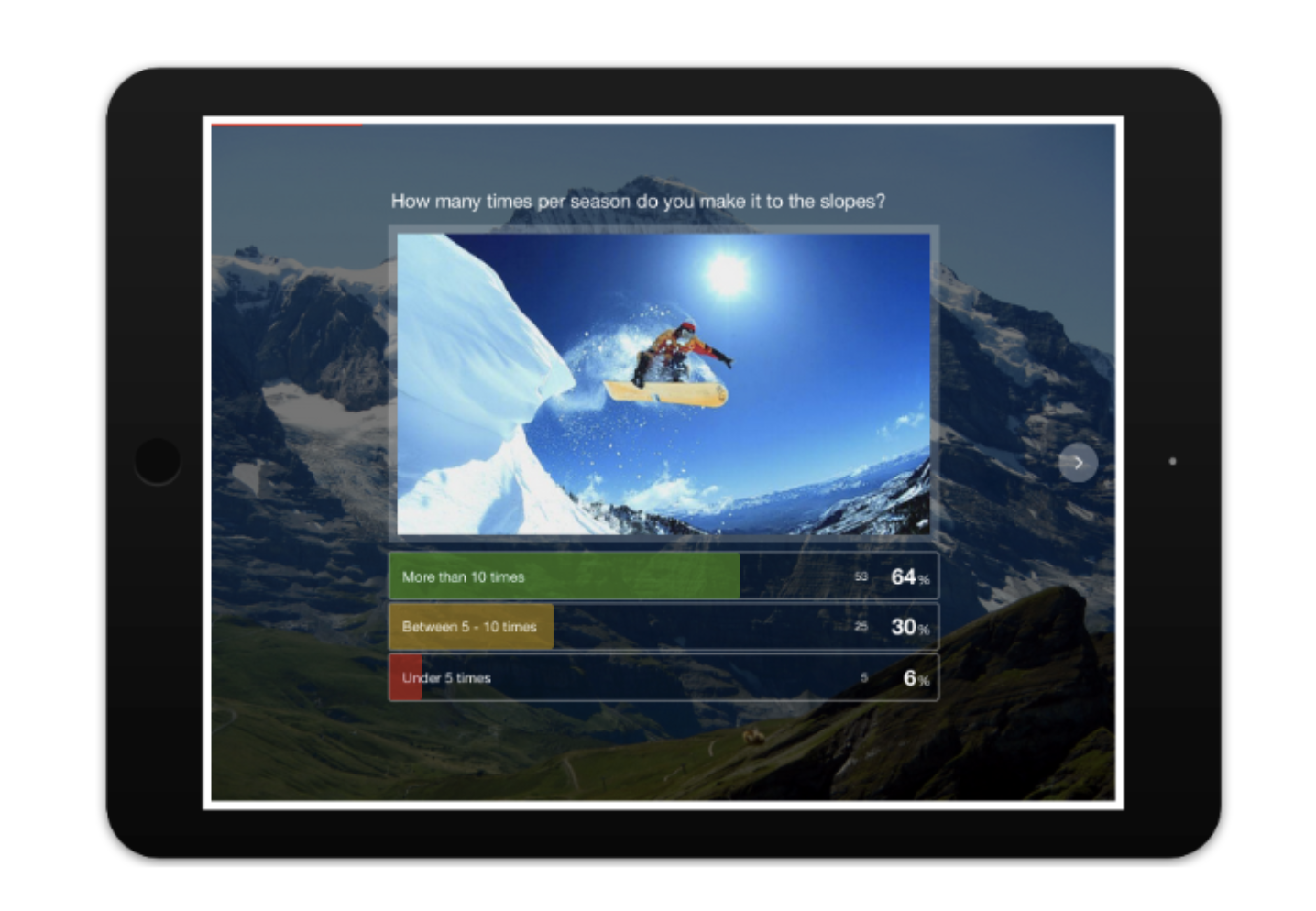
You can also use product images, infographics, memes, short videos—you name it. If you’re using a survey tool, the survey results are presented with visuals, like the one below, so you can easily borrow them for your presentation.

Keep it short
Informative yet quick—that’s solid survey reporting. Presentations help showcase results but remember to focus on the most important insights and takeaways. Your report will provide more in-depth information.
Tips to create a survey report
For the most effective survey reporting, you need to present your findings in a more official, detailed way. Your colleagues will reference the report after your presentation to get a better handle on data collected, methodology, and resulting actions. Here are some tips to create a must-read report:
Start with a structured plan
Survey reporting can be cumbersome, but it’s your job to break it down into useable pieces of information. To start, figure out how you’ll structure your report.
Many reports follow this structure:
- Title page: Provide the survey title, date, and quick description.
- Table of contents: Give a list of everything that’s in the report.
- Executive summary: Summarize the report and its findings. Make sure it’s polished. Some people only read the summary.
- Background: Explain why you launched the survey and what you plan to do with results.
- Survey method: Explain who was included in the study, target audience, contact method, etc.
- Survey results: This is the main body, which provides important statistics and actions that should be taken.
- Appendices: Provides supporting material including the actual survey and glossary of terms.
Prioritize and visualize
Your report will include a lot of statistics, but it’s important to prioritize them. You want the most important ones listed first.
Once you have a ranked list of findings, you need a way to visualize them. If you created a presentation, you can likely reuse some of the visuals from it in your report. However, since your report presents more data, you’ll likely create more visuals to keep your audience engaged.
Create visuals with delivery in mind. In other words, if the report is being delivered digitally, you can include interactive graphs and or short videos. If the report is being printed, stick with charts and graphs.
Provide actionable intel for each department
While your presentation provides an overview of actions inspired by the survey results, your report should include specific actions for specific departments.
For example, if the survey examined customer satisfaction with ticket resolutions, the results could impact customer service, marketing, and IT. Let’s say the results encouraged the company to launch a live chat feature on their website. The change requires training for customer service representatives, customer education via the marketing department, and website integration assistance from the IT department.
If survey results impact a certain department, spell it out in the results section.
Proofread and tighten
A survey report is beefy. Before you release it, make sure you proof it. Check it for grammar and punctuation, and have at least two other people proof it too.
In addition to reviewing the report for basic errors, look for places where you can tighten up the language. It’s easy to get wordy when survey reporting. Don’t use five words when three will do. Go through the report and make sure each data set and explanation is as succinct as possible.
Closing the loop on survey reporting
Surveys provide a wealth of decision-making information, but the results must be presented to the right people in the right format. Survey reporting is meant to arm your company with actionable intel that improves the customer experience, and ultimately, drives revenue. The tips above will help any company organize their survey results, present them professionally, and provide direction for improvement.
Learn how GetFeedback can help you exceed customers’ expectations—start your free trial today.
Business & Finance Articles on Business 2 Community
(66)
Report Post


