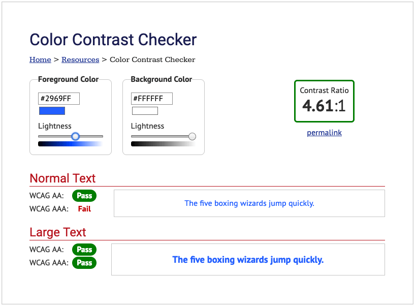
Brent Morrison — March 20, 2019 — March 20, 2019 Imagine trying to browse the internet but you can’t read anything. You squint and look closer. You adjust your screen. You try everything but nothing seems work. Unfortunately, this is a reality for many people who suffer from vision deficiencies, including those with colour deficiencies, … Continue reading Poor Colour Contrast Can Impact Your Website
Tag Archives: Contrast
Design Principles You Should Test: Color Contrast
Shana RusonisOctober 26, 2015 You’ve taken on the mission to increase conversions while delivering a more delightful experience to every visitor. How do you do it without breaking the rules of your design team’s style guide? The notion that conversion and design have competing priorities is a false dichotomy. Design and A/B testing are actually … Continue reading Design Principles You Should Test: Color Contrast


