Target’s new budget brand deserves better branding
Target has a reputation for making affordably priced products look expensive. So why does its latest brand look so cheap?
A key to Target’s success has been to make affordably priced products feel expensive.
The retailer, which generated $107.4 billion in revenue last year, has a portfolio of affordably priced in-house brands that look like much more expensive brands on the market. Consider its home goods brand Opalhouse home goods or its JoyLab activewear and Auden lingerie. In the realm of grocery, it’s Good & Gather pantry and Smartly cleaning products, feel premium. Creating private labels with luxurious labeling has been good for business, generating upwards of $30 billion.
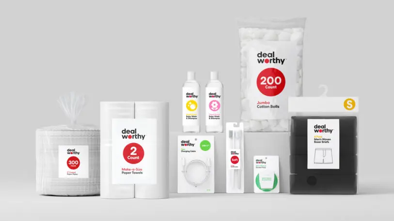
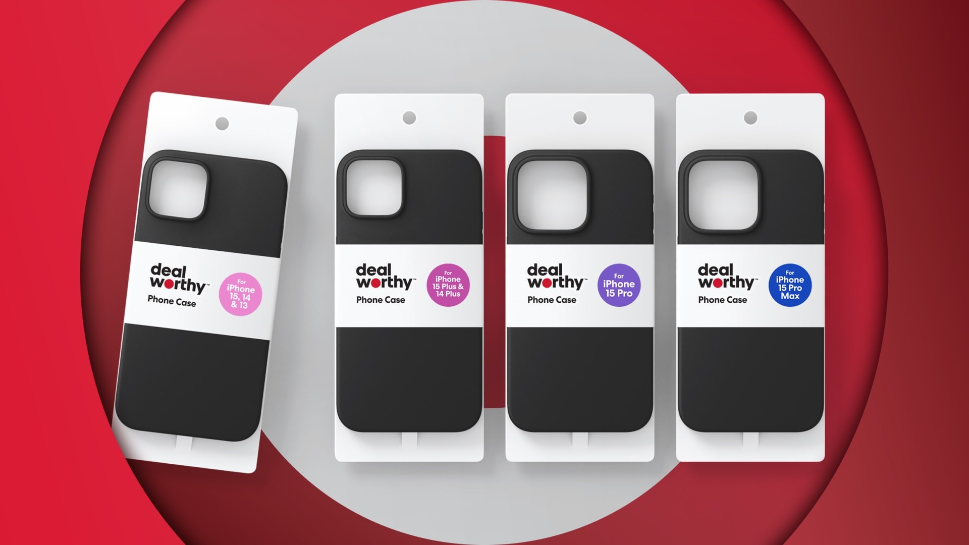
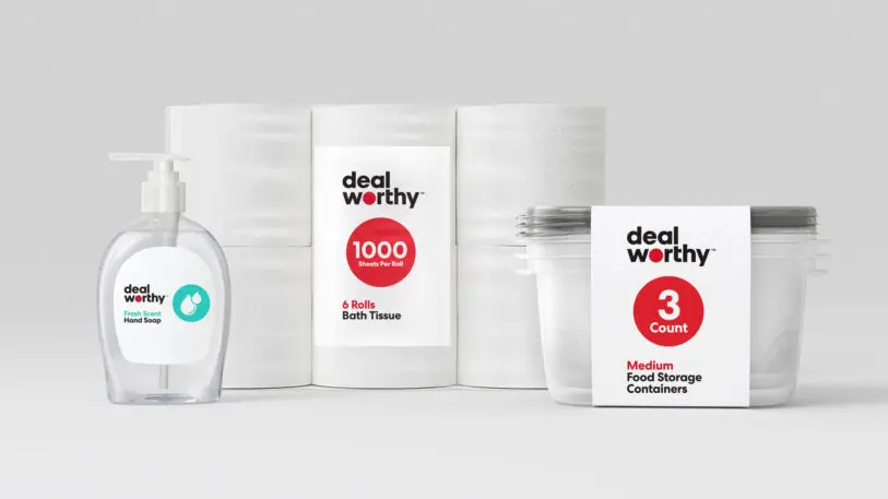
That’s why it’s latest brand, Dealworthy, feels like a departure. The brand launched last month with a line of 400 products, ranging from toothbrushes to cotton balls to underwear. Like Up & Up, Target’s other private label line of basics, Dealworthy’s prices are cheap—most items cost under $10. Yet, its branding feels distinctly low-frills. With a white background, flat graphics, and a plain black sans serif wordmark, the branding seems to be intentionally less sophisticated than Target’s other private label offerings.
“There’s nothing subtle about Target’s messaging here,” says Adam Alter, professor of marketing and psychology at NYU Stern School of Business. “[It] separates this particular store brand from others that try to minimize their “cheapness.””
It clearly telegraphs that it’s a budget line of basics for price-conscious shoppers. And while there’s nothing wrong with offering cheap essentials, the branding strategy around Dealworthy is curious, given Target’s trajectory of private label branding over the last few decades.
There was a time when retailers paid little attention to the design and branding of their private labels, says Debbie Millman, a branding expert and the host of the Design Matters podcast. Packaging often featured one or two colors, and flat graphics, partly because this made it cheaper to produce.
But according to Millman, in the late 1980s, the grocery store chain A&P created President’s Choice, an in-house brand that had more elegant design. Target quickly followed with a range of in-house brands with thoughtfully-designed packaging. “Target wasn’t the first to do it, but it did it better than anyone had before,” Millman says. “They elevated the design to the point where it was impossible to decipher whether or not it was a private label brand.”
In the decades that followed, other retailers have also tried to develop better looking private labels, with custom typography and prominent branding. Walgreens has a premium-looking label called “Nice!” that has a fun cursive font and colorful graphics on the packaging. The British grocer Waitrose has a selection of private label brands that look downright luxurious with simple all-caps fonts against gorgeous food photography.
In contrast, Dealworthy looks like a sale sticker slapped on to products that have been marked down. There are other retailers that have taken a similar approach to its budget lines. Amazon Basics, for instance, has a no-frills, flat logo, while Walmart has its “Great Value” line that features a round blue icon that appears next to the name of the product. The naming of these brands seems designed to convey that the products are cheap.
To Millman, Target’s decision to go with such no-frills branding seems like an about-face. “It shouts lower quality,” she says. “It seems like an anomaly, like they’re going back 40 years. It makes me wonder whether they have knowledge that we don’t about why this might be the right move for them.”
We reached out to Target for comment, but they declined to provide a spokesperson.
It’s unclear why Target would move towards more generic, basic branding. Some have suggested it’s a sign of our times, when many consumers feel cash-strapped because of inflation. Dieline, a packaging design blog, argues that Dealworthy is intentionally designed to signal that it is more cost-effective than other brands. Business Insider describes Dealworthy as a “dollar-store-style budget brand.”
Alter suggests that Dealworthy may be trying to compete more effectively with the budget lines of other big box stores. But perhaps more interestingly, it might suggest to Target customers that they have more options in the store. This is particularly important at a time when grocery prices seem stubbornly high to many consumers. “People process pricing and quality information comparatively, to a large extent,” Alter says. “So anchoring people at the low end with a set of products that are inexpensive and modest in quality might create the sense that pricier products are significantly higher in quality. ”

Alter argues that Dealworthy’s packaging cuts through some of the artifice of using branding to make inexpensive produces feel price. There’s something direct and nonsense about Dealworthy’s approach. “Leaning into the cheapness and perhaps the modest quality of the products removes the element of pretending that cheap products are just as good as expensive alternatives,” he says.
Millman, for her part, isn’t sure that it’s the right direction for Target. She points out that company has built its reputation on democratizing design and making beautifully packaged products available to all of their customers, regardless of how much they can afford to spend. And she believes that customers appreciate the care and attention to detail that retailers spend on packaging.
“Ultimately, every consumer wants to feel respected and they want products that they feel some pride in owning,” Millman says “They don’t want to feel punished for opting for the cheaper brand that comes in the really ugly packages. They don’t want to feel embarrassed to own these products because they telegraph to anybody in their homes that it is cheaper.”
ABOUT THE AUTHOR
(15)
Report Post


