Google believes that “as more people have access to data, better decisions will be made.”
And, in typical Google fashion, they’ve put their money where their mouth is. In the form of Google Data Studio, a free-to-use (for individuals and small teams) suite of data collaboration and visualization tools. So let’s take a closer look at and see what Google Data Studio can do for you and your business.

The 3 Objectives of Google Data Studio
Let’s begin with the three over-arching objectives that Google Data Studio aims to achieve:
- Connect multiple users to the same data sources to facilitate collaboration
- Represent that data in an easy-to-understand manner (via data visualization)
- Enable users to create engaging and actionable reports
To accomplish these objectives, Google Data Studio offers a large array of tools. Below are a few of our favorite features:
Easy and Versatile Integration
Google Data Studio enables you to easily connect any CSV file as well as data from other popular Google resources. Such as:
- Google Analytics
- Google AdWords
- Google Sheets
- Google BigQuery
The integration with other familiar Google products is certainly no surprise (and is probably a large part of what drove Google Data Studio’s creation). But it’s worth noting that, if like us, you’ve been using Google Analytics for years, you’ll probably be as pleased as we were to finally be able to see that raw data in a more aesthetically pleasing and instantly intuitive form.
We are Live!
The way you create reports on Google Data Studio is staggeringly easy. Essentially, you begin with a blank canvas that looks like graph paper:

You drag the type of chart/feature you’d like to add:

And then, voila:

Since the graph is linked directly to your data source, it updates live in real-time.
The Heatmap (and other forms of Data Visualization)
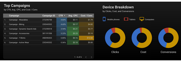
Google Data Studio offers lots of ways to visualize your center. Our favorite, probably because it’s the most instantly intuitive of all, is heatmap tool. Which looks like this:

In the example above, we see clicks, cost and conversions split by color between mobile phones, tablet and computers.
Tell Stories with Your Data
Every great story requites a compelling narrative, which is something that you, the user, will still be responsible for structuring. But Google Data Studio arms you with several tools and resources to help with that endeavor and, in our opinion, is well worth checking out.
To learn more, visit Google Data Studio’s landing page.
Questions? Comments? Contact IdeaBlog@idearocketanimation.com
Digital & Social Articles on Business 2 Community(59)
Report Post


