— November 2, 2018
James reads his emails on the slick new iPhone. Sarah uses Gmail and loves her ageing Android too much to say goodbye. Bob’s at work, using Outlook on a desktop PC. We’re about to send all of them a message.
And we know it’s going to look fantastic. Not just for these individuals but on the countless device and email client combinations out there. That’s because the mailing has been carefully developed from planning to execution with responsive design in mind.
Nearly 70% of companies send responsive emails these days. But how many of them are doing so as effectively as they could be? Take a look at these ten rules to find out how your responsive emails stack up.
Thou shalt plan for mobile in advance
There are various approaches to responsive email design but in my experience they can be broadly lumped into one of two categories.
The first is the Now What method. It goes like this:
- Produce a stunning design in your creative application of choice. The only constraint is your imagination.
- Hit a stumbling block when it becomes apparent that there’s no good way to adapt the design for mobile. This is the “now what?” part.
- Spend time revising the design or press ahead and resort to bad practice at the email development stage.

Pretty background. Pity it breaks the design when stacked on mobile.
The second approach is the Plan Ahead method:
- Produce a stunning design while considering how its constituent parts will be rearranged into a mobile-friendly form.
- Develop an elegantly coded HTML email which renders flawlessly on all devices.

Problem solved.
With around half of all email opens taking place on mobile, it’s important to get responsive design right. Treat it as an integral part of the creative stage rather than an afterthought and email production becomes a far more streamlined experience.
Thou shalt understand CSS support
Email is not the web. It’s the web’s finnicky cousin.
While web developers can capitalise on the latest HTML and CSS advancements, email developers live in a world of patchy support. That’s not to say it’s impossible to build mailings which work perfectly on all popular devices. It just takes some know-how. A significant part of that is understanding the ins-and-outs of CSS support.

Campaign Monitor undertook the ambitious project of testing and recording compatibility for every specific CSS property by email client. The outcome is their Ultimate Guide to CSS: a valuable reference for anyone involved in email design or production. Familiarity with CSS support makes it easier to craft email-friendly responsive designs from the ground up.
It’s fair to say that email designers face some major restrictions which are not present on the web. Not all of the code works. There’s a limited surface area. There’s a ceiling on file size. Surely these factors place a handicap on creativity? I don’t think so. On the contrary, I believe the limitations can boost creative innovation.
What I’m about to say is going to sound completely random but bear with me. There’s an experimental ambient album in my music collection in which soundscapes are composed entirely of manipulated audio samples recorded from a broken heater. Hidden in the liner notes is a message: “working with finite sound sources reinforces concepts of liberation through limitation”.
This theory resonated with me. Presented with a vast array of tools, one might feel the need to use each of them in the prescribed manner and that can be stifling. When options are limited, we’re compelled to experiment and that drives ingenuity.
Dodgy radiators as musical instruments is an extreme example but we can apply the same thinking to email. Despite being unable to take advantage of all the latest web technologies, email marketers continually conjure up fresh designs and content. I am regularly inspired by just how inventive the results can be.
Thou shalt control thy columns
It’s common practice in responsive design to collapse from a multi-column layout on desktop to a single column on mobile. Such a composition makes the most of the available screen space.
The left column is normally stacked above the right when the blocks are rejigged for mobile. While that often makes sense, there are times when it’s appropriate to reverse the order instead. CSS makes it possible to set either stacking sequence by means of some succinct and reliable code.
Piling up items which previously sat side-by-side brings with it a few new considerations. Is the bottom of one section going to run into the top of the next? Let’s add some vertical spacing. Is text going to touch the sides of the screen on mobile? Better apply some padding.
Images which have padding or thick borders on desktop will have more impact on mobile when rendered at full screen width. Sometimes there’s extraneous detail which can be cropped out. By cutting images into three parts, you can drop the left and right slices on mobile and focus on the important part of an image. That’s a mobile-optimised picture without squandering data on alternate images.

Mistakes during the design stage can lead to delays when it comes time to code the email. Inconsistent sizing, misaligned items and unwanted anti-aliasing are common defects which may need attention.
The objective is pixel-perfect design. Achieve that and you’re on the right track for a flawless responsive email.
Thou shalt render legible typography
Columns and images are probably the first things which come to mind when constructing a responsive email but let’s not forget about the text. It’s a little too easy to set up a perfect reading experience for desktop and tablet users, only for it to fall apart on mobile.
As columns change size to accommodate screens of various widths, line breaks fall in different places. There’s an element of unpredictability which can lead to brand names being split over two lines or orphaned words sitting at the end of paragraphs. Fortunately, we can use non-breaking spaces and hyphens to group words and surmount these readability obstacles.
Despite the mixed support, I’m an advocate of web fonts in email. They allow for live text in many scenarios where we would otherwise have opted for an image of text, thus achieving on-brand typography and adhering to best practice. Since web fonts don’t work in all email clients, it’s important to check that the fallback typeface doesn’t mean a sub-par email for those affected.
As much as I love web fonts, I must concede that there are times when an image really is the best option. Maybe there’s too big a gulf between your ornate web font and its pedestrian fallback. Perhaps a big segment of your mailing list is using Outlook where such technology is a no go. Or it’s possible that your typography is tied in to a piece of graphic design beyond the scope of live text.
And this is where the biggest pitfalls lie. It’s not uncommon to see body copy incorporated in an image which looks fine on desktop but shrinks to miniscule lettering on mobile. That’s annoying for someone with 20/20 vision and downright indecipherable for sight-impaired customers.

Email on Acid’s informative Email Accessibility Best Practices recommends a minimum font size of 14 pixels. If your copy ends up titchy on mobile, the obvious fix is to increase the original font size until it looks good on small screens. Depending on the design, that won’t always be convenient. A less obvious solution is to use the aforementioned image-cropping technique, thus reducing shrinkage on mobile. The adventurous could try placing web fonts over background images and proportionately scaling the text with viewport-width units.
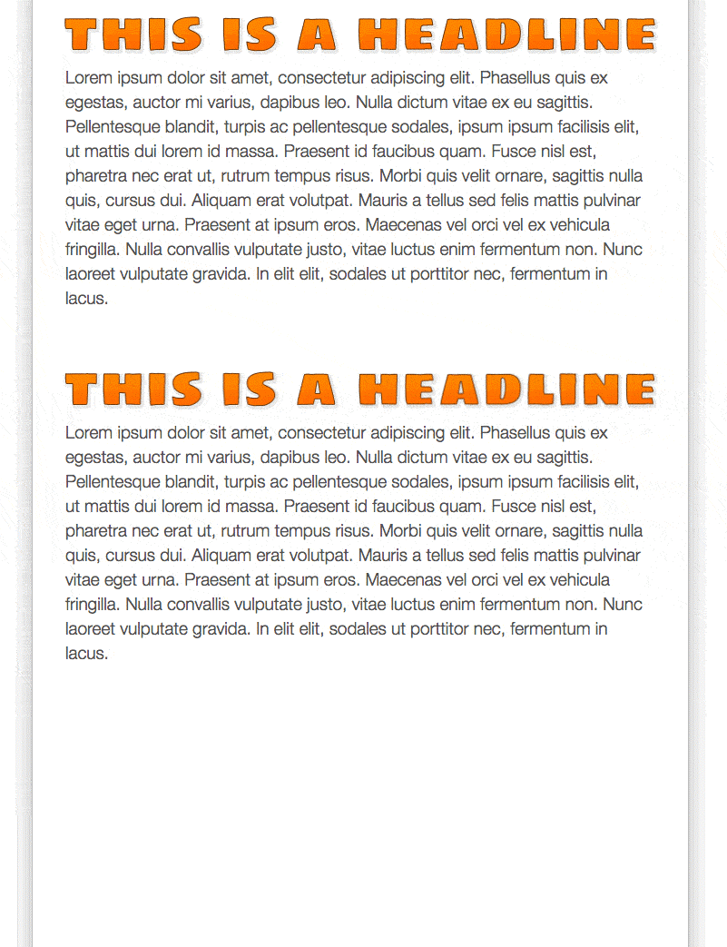
It’s not unusual to see image-based headlines paired with text-based body copy. This comes with its own unique dangers. The wider the headline, the more dramatically it’ll be scaled down on mobile, yet the text below remains at its desktop size. This often leads to an odd visual mismatch whereby the headline is barely larger – or potentially even smaller – than the paragraph it precedes. By means of some clever image slicing, that headline could be stacked on mobile instead.

Next up: terms and conditions rendered at the base of an image. Hard enough to read on desktop and nothing more than a meaningless smudge on mobile. That’s an accessibility nightmare and raises the question if the terms and conditions are even legally binding. The solution for this one is simple: don’t do it. A live text-based footer is the sensible place for terms and conditions.
Readability always deserves to take precedence over pretty graphics. Revising a design can be a pain but if the end product is an email which looks great and can be understood by everyone, it’s worth it.
Thou shalt consider high density displays
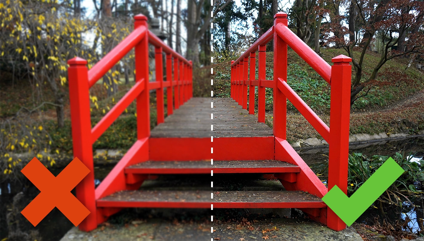
High density displays grant us crystal-clear screens and sharp imagery. They’ve been around for a while, so it’s no secret that high density-friendly images need to measure double the dimensions at which they’ll be displayed. Graphics saved at actual size are noticeably blurry on a high density device.

Catering for such screens seems straightforward. Simply produce the entire artwork at twice its desktop size and call it job done, right? Actually, there’s more to it.
Just because mobile phones are smaller than desktop monitors, that doesn’t necessarily mean all images will be reduced in size. Let’s say you have an image in a two column desktop layout which is expanded to full width on mobile. That picture might be 300 pixels wide on desktop but it’s about to expand to 414 on an iPhone Plus or Max. If your file is saved at less than 828 pixels, it’s not going to look as crisp as it could. For truly high density imagery, figure out the largest dimensions at which each picture will be displayed and size the image file accordingly.
Higher resolution images mean bigger file sizes of course. To prevent the kilobytes from ballooning out of control, it’s important to optimise images effectively. Significant savings can be made by running files through a bespoke image compressor.
Judging by what I see in my inbox, a lot of companies could benefit from some template maintenance. While the images throughout the body of the email are sharp, there are low-resolution logos and icons in the header and footer. These are probably components which pre-date widespread use of high density displays and nobody ever got around to updating them. The contrast of image quality is jarring and a blurry brand logo isn’t a promising way to begin an email. If I’ve just described your mailing templates, it’s worth setting aside some time to modernise these portions.
Thou shalt be fair to fingertips
A mouse is precise and instinctive. It’s second nature to sweep through a page, using the pointer to identify and interact with on-screen elements.
A human fingertip jabbing at a touchscreen isn’t quite so accurate. Frustration ensues when links are small and clustered.

Want to visit our Twitter page? Too bad, you might end up on Instagram instead.
As a literal rule of thumb, links need to be easily pressed when a phone is operated with one hand. Coordinate your design so that buttons are clear, well-spaced and unambiguous.

Better.
Linked phrases set within paragraphs need to be of a sufficient font size so as to be pressed with ease. Avoid splitting such copy over two lines lest a single link be mistaken for multiple.
Buttons on mobile are at their user-friendliest when full width with generous padding. Their active area needs to cover the entire width and height, not just the text in the middle. Who’s to say if a customer will try again if they hit the dead zone on a badly coded button and nothing happens? Best not to take that chance.

Thou shalt not overdo the breakpoints
A breakpoint is a preset screen value – usually width – at which different CSS rules are triggered. That’s how we establish alternative layouts for desktop and mobile. Let’s call it the backbone of responsive email.
There’s no limit as to how many breakpoints are present. It’s possible to target desktop, tablet and even specific models of phone based on their precise horizontal and vertical resolution. You could even set up a custom layout for any customers who fancy checking out your email in landscape mode.
One word: overkill. And now some more words: while multiple breakpoints are useful in web development, one is sufficient in most email development scenarios. Emails are usually no more than 700 pixels wide. An iPhone 4 has a logical horizontal resolution of 320 pixels. That’s a pretty narrow range of widths, so we don’t need a slew of breakpoints.
A size limit on style sheets is another reason to avoid multiple breakpoints in email. Some email clients will reject the style sheet once it reaches a certain number of kilobytes, scuppering the responsive code.
Fixed sizes on desktop and tablet, switching to fluid widths on mobile is a tried-and-tested setup. Simple, flexible, future-proof and powered by a single breakpoint.

Thou shalt not sacrifice content
There was a time when I would immediately seek out the ‘View Desktop Site’ link when accessing a website via my phone. Why? I knew that the default mobile experience would probably mean limitations on content and function. Zooming and scrolling around the desktop layout on a pocket-sized viewport may have been unwieldy but it was preferable to browsing a diluted website.
Those were the early days of the mobile internet revolution and fortunately things have improved significantly since then. That doesn’t mean we’re quite there yet. Just recently, I visited the website of a multinational corporation with the intention of subscribing to their email newsletter. No sign-up box was anywhere to be seen. It wasn’t until I pressed the miniscule ‘Full Site’ link buried in the footer that I found what I was looking for.
Not only is the company in question missing out on a considerable chunk of potential subscribers but the very choice of words, “Full Site”, betrays the misguided thinking behind their mobile strategy. Small screens present a challenge but the solution is not to penalise visitors for their choice of device. Optimise the presentation instead.
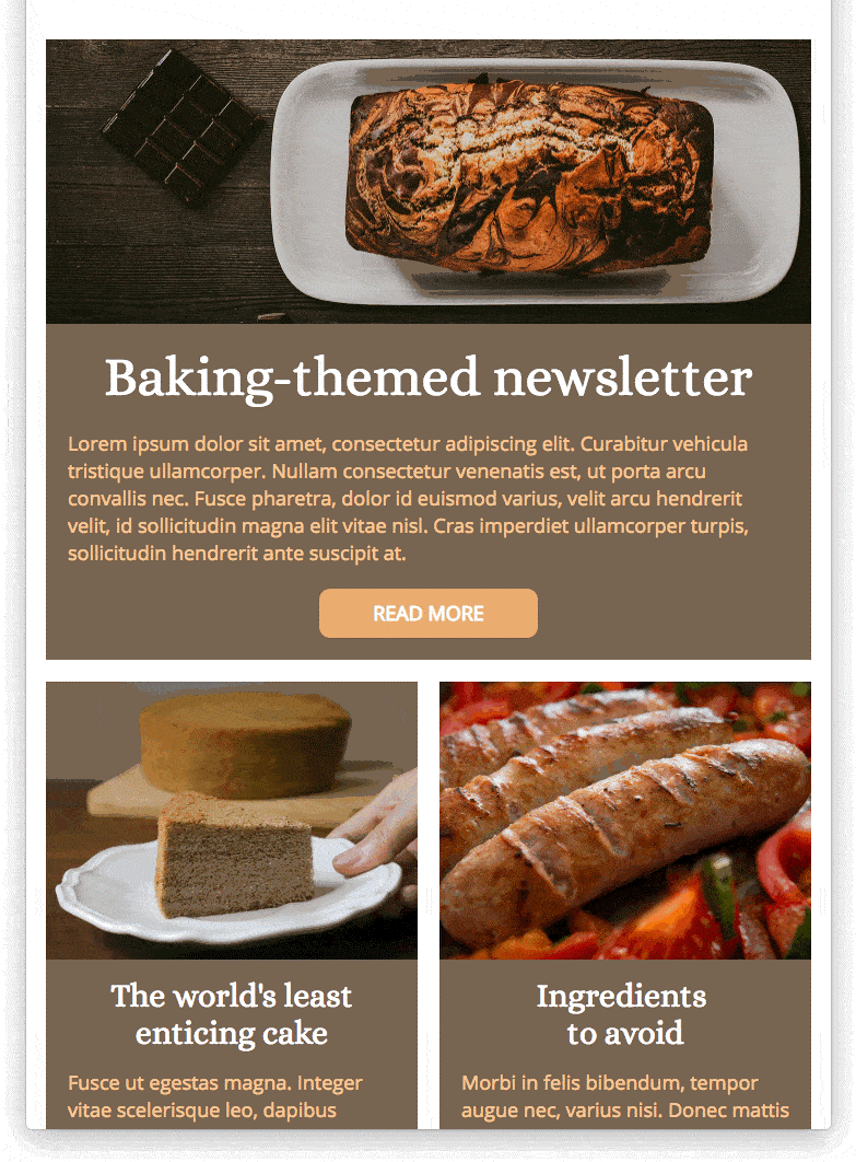
The same principle applies to email. There’s a design concept known as progressive disclosure whereby only essential information is shown up front and further details are revealed upon user interaction. It allows for clutter-free interfaces and prevents confusion. We can apply this idea to our responsive emails through features such as menus, tabs and expandable content groups. Put your customer in control by letting them choose what they’d like to see.

Of course, not all email clients support such interactivity. That’s not a problem. For those that don’t – most notably Gmail for now – it’s still possible to tailor the design while retaining content. Are those department links taking up too much room at the top of the email? Don’t scrap them. Stack them neatly at the end instead. Is the design too elaborate to scale down in a sensible fashion? Simplify the creative aspect and focus on information.
Thou shalt not code separate desktop and mobile versions
Going back a few years, I was in a position where our team sometimes worked with pre-coded mailings supplied by assorted digital marketing agencies. Some of these were first-rate. In fact, I have one of these agencies to thank for my first ventures into responsive email development.
At the other end of the spectrum was a hodgepodge of bad code and bad practice. I’d like to focus on a particular example: double-coded emails. We coined this term to describe mailings which included entirely separate desktop and mobile versions crammed into a single file. Rather than reshaping the content, everything was doubled up. We greeted double-coded emails with a dismayed groan.
I still see companies sending emails which are constructed in this manner. Sometimes there’s a misguided logic behind it – usually when the Now What approach has been taken. But often the decision to double-code is inexplicable. Responsive-friendly designs which could be have been efficiently developed are instead split into two sets of code.
Strictly speaking, double-coded mailings do behave as intended. Desktop email clients successfully hide the mobile content and vice versa. The problem isn’t so much about whether it works as how it gets there. Consider these drawbacks:
- Code-heavy emails are truncated in Gmail and more likely to upset junk mail triggers
- Updating content takes twice as long
- Any spam-like phrases contained in the copy are duplicated
- Alternative sets of images result in bigger downloads and slower load time
- It’s the antithesis of refined responsive code
The word version needs to be scrubbed from the responsive design vocabulary. Desktop and mobile ought not to be treated as distinct entities. A well-coded email includes a single set of content which responds to the screen on which it is viewed.

Of course, there are circumstances where device or client-specific blocks of content are necessary. You might want to hide the ‘Download on the App Store’ button on desktop for instance. If you’re running animated or interactive content, you’ll need a static fallback for the less capable email clients. These are merely components of your mailing and can still be housed in a neat, responsive framework.
CSS gives us the power to completely transform an email when it’s viewed on mobile. Some designs are trickier to adapt than others but it’s altogether more rewarding to solve the problem with good code than it is to cheat.
Thou shalt test, test and test again
Testing is surely the golden rule of HTML email. Browser previews are great for checking a responsive design during the build phase but they don’t emulate the peculiarities of real inboxes.
Whether you’re sending an all-new email design or an old faithful template, you need to be sure that it’ll display as intended on the myriad devices and email clients out there.
This is where online previewing services come in handy. Build, preview, adjust as required and repeat until happy.
For absolute peace of mind, a final check on actual devices is always a good idea.
Conclusion
Designing and developing a professional-looking responsive email takes some planning. Follow the ten commandments and it’s easy to pre-empt potential problems along the way. That leaves more time to concentrate on the really important things like captivating copy and dazzling design.
So we’re not going to panic when James buys a tablet, Sarah finally upgrades her handset and Bob’s company jumps ship to Mac. We’ve thought ahead and can relax in the knowledge that our emails look great on any gadget.
Digital & Social Articles on Business 2 Community
(106)
Report Post


