Software as a Service (SaaS) brings a lot of benefits to businesses everywhere — it’s usually lower in cost than traditional software, it saves time since there’s no installation required, and it makes it a lot easier for teams to collaborate, regardless of where in the world they’re working.
While they have changed the tech landscape for modern businesses, they have to do a lot more than deliver the promised service. Saas companies have to ensure that every single touchpoint with a prospect is easy and provides an extraordinary customer experience. And all this starts with their website.
What Makes SaaS Websites Unique?
Since SaaS companies are selling a good user experience (UX), their website is their presentation card. It should be intuitive, secure, and have a responsive design — meaning that it loads fast and works well regardless of the device the web visitor is using.
While all of these elements should be a given for any vendor who’s following search engine optimization (SEO) best practices, the nature of SaaS makes it even more crucial.
SaaS websites also have simple, minimalist designs. Your target audience is there to see your value proposition, learn about the features, and whether they solve their pain points. And since the shorter the copy, the more difficult it becomes to communicate effectively, SaaS websites also require plenty of A/B testing.
By the same token, SaaS purchasing decisions aren’t simply transactional. Your clients are spending significant amounts of time comparing what you have to offer with what competitors are doing. So it’s crucial to identify what makes you the better option and highlight it every step of the way of the buyer’s journey.
SaaS Website Best Practices
While every business has its own idiosyncrasies, there are certain elements that should be present in every effective SaaS website. Make sure to always:
1. Use HTTPS
Traditionally, websites have used hypertext transfer protocol (HTTP) to communicate between servers. However, communications transmitted through HTTP could be vulnerable to third-party attacks by cybercriminals. Enter Hypertext Transfer Protocol Secure (HTTPS), which encrypts communications while in transit.
HTTPS is what makes it possible to send sensitive information, such as credit card and social security numbers through online spaces. It also provides mutual authentication, making it less likely for either party to be exposed to phishing attacks. And if you’re selling software as a service, you want to provide your prospects with the peace of mind that comes from knowing that their sensitive data is secure.
2. Ensure a Responsive Design
While most people work from desktop and laptop computers, electronic tablets and smartphones have become an extension of the office. So you want to ensure that your website loads fast — and is just as functional — regardless of screen size.
You also want to keep in mind that while it’s common to turn a smaller screen sideways to consume content from a smaller screen, not everyone does so. Therefore, your website should display without any issues regardless of the orientation of the device.
It might even be necessary to completely hide several features (such as a video on the hero banner) to ensure loading times and functionality. This may be harder to accomplish if you’re offering complex data. If such is the case, you’ll want to consider creating a custom website over using templates.
3. Clear Above-the-Fold Value Proposition
Your value proposition is an even more succinct version of your elevator pitch. Tell me what you offer in one sentence. Also, make it all about the benefit to your audience; not about how special you are. You can expand on it by including a subheadline; but by all means, make it stand out as soon as a visitor lands on your homepage.
Since SaaS companies can offer a wide array of services, you may find it daunting to get this right. Focus on what you do best. If it’s more than one thing, you can try separate ones with A/B testing to see which one entices more prospects to reach out to you.
4. Live Chat Feature
While frequently asked questions are certainly helpful, they still require finding them on your website, then scrolling down to see if a particular query is included on the list. Then there are also people who have unique questions that would never appear in a FAQ section.
By offering a live chat on your homepage, you meet your needs immediately. You also let them know upon their first impression that you prioritize their user experience. This can help them decide to choose you over another SaaS company — especially if a competitor is making them wait a few days to receive an email response.
5. List all Features and Price Points
Since there isn’t a one-size-fits-all approach to providing software as a service, it’s standard to offer tiered pricing. It’s also common to name each tier (think of HubSpots’ Starter, Professional, and Enterprise offerings).
However, you want to do a lot more than simply name them and ask prospects to schedule a call. As previously mentioned, every website visitor is at a different stage of their buyer’s journey, and someone who’s simply doing preliminary research will want to have all relevant factors before narrowing down their choices.
So include every single feature that’s available in each tear. You can simplify this process by including a chart listing them side by side.
6. Product Videos
Text is great, but videos show prospects how to use your products in a more user-friendly and effective way. It’s why people prefer to go to YouTube to learn how to use something instead of reading instructional manuals.
Including videos also means that users will spend more time on your website, interact with it, and have an easier time showcasing your product to the decision makers at their own company.
Creating videos also makes it a lot easier to promote your products on social media to attract more people to your website.
7. Offer Free Trials or Demos
Think of all the streaming platforms that offer a library of video content — Netflix, Disney+, Hulu, HBO Max, to name a few. This enables prospects to try out different SaaS providers before deciding which one best serves their needs.
Give people the option to try out your service for several weeks for free. Resist the temptation to ask for their credit card information, since this is a no-strings attached approach. This will provide them with firsthand experience of how you really are a panacea for what they’re looking for. And once they become a client and you start the onboarding process, you can refer to the features they’ve tried out as starting points.
8. Compelling Calls to Action
Incorporate calls to action buttons above the fold and at the end of the page. Use action-oriented words that tell the reader exactly what will happen when they click on it. This could be to learn more about your products or services, start a free trial, read case studies, download useful content, or make a purchase.
And yes, you need to include them at every point on your website where you want the reader to take a desired action — even if it’s to guide them through the sales funnel before they’re ready to make a purchase. This is crucial to optimize your conversion rates.
9. Client Testimonials
Social proof is an essential component of effective marketing. Prospects are aware that you’re trying to sell a product. So clearly you’re going to highlight everything you do well. But the $ 64,000 question is, will it work well for them?
By incorporating testimonials into your homepage (especially within a B2B context), you let prospects read about the results experienced by a business who’s in a similar position as them. Did they manage to streamline their project management process? Provide a better customer service experience? Decrease their time training new hires due to your wonderful onboarding software? Whatever it is, it provides them with something else to include on the pros list for hiring you over someone else.
10. Incorporate Targeted Landing Pages
Landing pages significantly help increase conversions by taking away all distractors and encouraging them to take a specific action: Request a free demo, enroll in a webinar, download a content offer, schedule a call.
To make this more effective, you can create smart content so that users reach landing pages that are relevant to their specific circumstances, such as sales cycle stage, referral source, or whether they reached your website after clicking on an ad.
11. Include a Blog
Incorporating a blog into your website serves several purposes: Each new entry creates a new indexed page on search engines. This increases the likelihood of being found by prospects when they start researching what you have to offer. In addition, they provide free valuable information readers can implement immediately. Third, they enable you to establish yourself as an industry expert — especially when you start getting backlinks to your page as other websites use you as a source of information.
12. Make It Easy to Contact You
Nobody has the time or the desire to go on a scavenger hunt for your contact information. Include it in your Contact Us page, as well as in the footer of each web page. Bonus points if you offer multiple ways to do so: Live chat, phone call, landing page comment box.
Examples of Effective SaaS Websites
Ok. So now that you know how to do this in theory, let’s look at some real-life examples of Saas websites that have gotten it right:
HubSpot
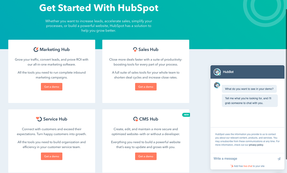
HubSpot’s website is minimalistic. It’s a single page showing you their hubs: Marketing, sales, service, and CMS. That’s it. No bells and whistles. But it does include calls to action in each of them prompting you to request a demo. It also offers live chat. And their value proposition is right there at the top of the page: Increase sales, accelerate sales, simplify your processes, or build a powerful website. And when you click on their CTAs, you’re directed to targeted landing pages.

Inspiration for your own website:
- Keep it simple.
- Tell readers exactly what they’ll get.
- Be ready to offer answers in real time.
MailChimp
From the moment you land on MailChimp’s homepage, you know that their value proposition is that they will help you grow your business by boosting sales. Their site also compares each tier side-by-side and lists all features. They offer guides, tutorials, and case studies to help visitors throughout their research process. And notice how they also offer live chat.
Inspiration for your own website:
- Use plenty of white space.
- Include calls to action above the fold.
- Add resources to educate web visitors on your services.
DropBox
Dropbox keeps your business organized and accessible from one centralized location — regardless of where your team is working from and of the device they’re using. How do we know? Because it’s right there, larger than life as soon as you reach their homepage. You don’t even have to scroll down if you don’t want to. The “Find the plan for you” CTA does most of the homework for you. They also have customer stories, list plans and pricing, and offer blogs and video content to show you how their products make remote work a lot more efficient.
Inspiration for your own website:
- Make things easy to find.
- Offer different ways to consume content.
- List applications your product integrates with.
Slack
Slack breaks down their process in three simple steps: Sign up. Invite your coworkers. Try it out. As if that weren’t simple enough, they have a pretty comprehensive blog about how to optimize communications, and they let you try out their software for free. But first, watch a video about how to use their features!
Inspiration for your own website:
- Include a Try For Free CTA right under your value proposition.
- Add logos of big name companies that use your product.
- Include short videos on how to use popular features.
Asana
Effective project management is essential to stay organized and meet deadlines. Asana’s website showcases how their product does exactly that even in the current reality of a remote workforce. They get cute with it too: “It turns out, when we’re hitting our goals, nobody cares if we’re wearing pants. We just need the right tools so our team stays a team.”
Inspiration for your own website:
- Dare to incorporate personality and humor.
- Acknowledge current events that affect your target audience.
- Use a minimalist design.
SaaS companies make work life infinitely better. We love them. We look forward to seeing what comes next. Make sure you stand out from the crowd so that your own business ends up being used as an example of some of the best SaaS websites.
Digital & Social Articles on Business 2 Community
(75)
Report Post


