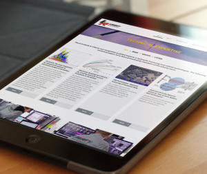
Spend a little time surfing the web and one quickly observes enormous variances in quality level from one website to the next. The author’s firm prizes high quality website generation. Here’s how to reach that goal:
1. Discovery/Planning
A thorough discovery process needs to beundertaken and a firm well structured plan to be generated. Knowing what you are building is vital. Onsite processes, page titles, and brand message need to be established before entering any design and build effort. It’s key to know exactly what you are making, and why. Creation of a sitemap (a site skeleton diagram), and page wireframes is very important in this phase, which the site stakeholder should sign off on before design begins.

2. Design
Design will always come before development, and the home page should always be the first page tackled, as it does in effect define the website look, feel, and message.Well thought out usage of font and color is of course super important. But the key to designing the ultimate website is seeing the big picture- the overall user experience. Your audience will gauge the quality of your home page in a fraction of a second- this seemingly unlikely fact has been confirmed by numerous studies. Clean, inviting, professional, engaging, sharp, modern, responsive- these are just some of the descriptors commonly applied to what website owners and their audiences want to experience.
3. File Preparation
Designing for the web responsively means always thinking about how the end result will look on different device types, and adjusting accordingly. This also segways into slicing in Photoshop, which is a key component of any website build that is unlikely to be a process understood by non-web developers. So what does slicing in this context mean exactly? Slicing is the process of preparing photoshop source files (.psds) for front end web development., which involves breaking larger files into smaller, codeable components. To perform the procedure optimally for maximal compatibility across all device types, use of a responsive CSS framework is highly encouraged. Elements will be repositioned to fit the screen without horizontal scrolling required, while fonts and buttons may get larger or smaller for a better overall user experience.
4. Front End Development
The next step is moving on to front end development. The front end relates to what users can see and interact with, for example an image they can view or a button they can click. The fundamental code components of the front end of a website are HTML, CSS, and Javascript. HTML is the core building block of any web page. CSS overlays other elements and defines style, colors, and how the page will respond to different devices. Javascript is used to define how the on page elements move, along with interactive elements such as navigation dropdowns. Movement is an often overlooked yet critical aspect of successful design for the web. Fluid transitions that are subtle yet classy will drive your website up to the next level.
5. Back End Development
Then there is back end development, which relates to what the user does not see, yet controls the website much like the brain controls the body. It covers any action the user performs such as filling in a contact form or adding items to a shopping cart, that gets transmitted to the web server and returns results. A server-side scripting language such as PHP is used to query the web server and return results to the user via modified front end code- so they will see an additional item in their shopping cart for example. It goes without saying this aspect of the web build needs to perform flawlessly. A solid framework and excellent use of code by an experienced developer is absolutely necessary.
If you’ve covered all the points above to perfection, its now time to test and launch your website- best of luck!
Digital & Social Articles on Business 2 Community(80)
Report Post


