There’s an old adage that goes, “if you want better answers, ask better questions”.
With so many tools and programs at our disposal, often times we can get so busy building that we forget to sit back and think about what we are trying to achieve.
Landing pages and marketing automation are only as good as the people behind them.
Mimicking the results of another company’s A/B test or landing page design might work in the short run, but if it’s done with a lack of understanding as to why these tests and layouts were successful for that specific audience, then I’m afraid you’re just shooting wildly in the dark.
If all this has you wondering, “then how will I know what’s right for me?” then I have good news for you.
Seek and you shall find, young Jedi.
In this article I’ll outline 6 questions you need to ask yourself that will set the groundwork for a high-converting landing page.
Landing Page Optimization Question #1 – Who am I talking to?
Before you run off to find a new catchy headline or sleek landing page design, first ask yourself “who am I talking to?”.
By asking this question, you can start to drill down on who your users are, what their goals are, and how you can help them achieve those aims.
One strategy used to achieve this is called persona building.
Persona building is the process of developing a hypothetical user profile which all marketing decisions are tied to.
When developing a persona, take into account:
- Age
- Education level
- Occupation
- Location
- Goals and challenges
Once you have information for all of these variables, you can start to build a landing page that caters to the specific preferences of this persona.
That can include images of similar people on the page, phrases unique to their generation, or references to their geographical location.
Landing Page Optimization Question #2 – What am I offering?
At the core of all landing pages is an exchange of value.
This usually comes in the form of contact information in return for some sort of promotion or a piece of educational material.
Next to who you’re talking to, what you’re offering is the most important thing you’ll need to consider when building a landing page.
There are an unlimited number of offers you can make on a landing page. Whether you choose to give away an ebook, webinar, or some sort of free trial or discount code doesn’t matter. The most important thing is to offer something that’s useful to your users, since that’s what will have them coming back for more.
Once you’re clear on what you’ll be giving away, it’s time to make it clear to your users.
Think about the specific features of your offer and how it’ll benefit them. The best way to convey this type of information is usually in a list format with a clear headline describing how your offer can positively impact their life.
Take a look at this example of a landing page from Vonigo. Notice how they succinctly describe their service and core benefits in bullet points below the headline.

Landing Page Optimization Question #3 – What do users need to know?
Your landing page is designed to serve one goal: to get conversions. So don’t muddy up your page with extra information that doesn’t push toward that main objective.
That being said, the more you ask from your users, the more information you’ll need to provide them with in order to persuade them to convert.
For example, a free ebook that only requires an email address might only need a headline, a couple bullet points, and a brief description of the book. A consultation request, which requires an email, name, phone number, and a brief message might need a longer form page with descriptions of the company’s history, testimonials, and a map of the business location.
Long story short, always consider the magnitude of what you’re asking for in relation to the amount of information presented on your page. If in doubt and you find yourself tempted to add a ton of information just to be safe, remember that there is a point of diminishing returns in terms of the amount of content on a page. More doesn’t always convert better, and sometimes more actually converts worse.
Take a look at this example from AssesmentDay. They found by eliminating either the FAQ section or the screenshot section they were able to increase conversions by 50-60%.

What’s interesting is that when both sections were deleted together, conversion rates actually dropped by around 3%.
What does this tell us?
It’s a fine a balance between not providing enough information and providing too much. Always be asking yourself, what does a user NEED to know in order to convert?
And when doubt, nothing beats a good old fashioned A/B test.
Landing Page Optimization Question #4 – Does my page pass the 5 Second Test?
There’s a general rule of thumb in web design that says you need to be able to determine what a page is about in 5 seconds or less, otherwise the page is either overcrowded or unfocused.
The nature of the internet is that there are always a ton of other options out there and the difference between a view and a conversion is just a back click away.
To ensure your page isn’t lacking clarity, ask someone you know if your page can pass the 5 second test. What that means is that in 5 seconds or less can they tell you what the page is about, what your offer is, and what’s in it for them?
If they can get a general sense of what you are trying to convey in 5 seconds, your page passes the 5 second test. If not, it’s time to start thinking about ways you can make your headline more clear, list your benefits more succinctly, and clearly explain your offer in a simple way.
If no one’s around to give you a hand (and since you’ll be biased from designing the page), you can try an online tool like the 5 Second Test online.
Landing Page Optimization Question #5 – Is my headline congruent?
If you’re using paid traffic to drive traffic to your landing page, don’t make the cardinal error of not matching your landing page headline to your ad copy.
The reason that people clicked on your ad in the first place was so that they could find out more about what you promised them in your ad headline and description text.
Once they did that though, one of the worst user experiences you could give someone is to bring them to a page that has nothing to do with what they just indicated they were interested in.
This might mean that you need to create separate landing pages for different ad campaigns, but it will allow you to create a better user experience and keep your messaging consistent.
Take a look at this example of a winning Facebook ad and landing page combination to get a sense of what I’m referring to:


Landing Page Optimization Question #6 – What happens after someone converts?
The post entry page is one of the most overlooked and underappreciated parts of the lead gen process. After a user takes you up on your offer, what are you going to do? Are you redirecting them to your homepage? Did you design a post entry page for them to land on? Is there a message that you want to leave people with?
Generally speaking, if someone converts, it’s likely that they’re a much better fit for your business then someone who didn’t convert. It means they clicked on your ad, read your landing page copy, and decided to take advantage of your offer.
Smart marketers can use this information in a post entry page to push them towards another conversion goal.
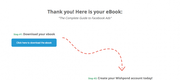
Take a look at this example on a Wishpond ebook page. Once a user converts they’re sent to a post entry page with their ebook download as well as a secondary CTA to sign up for a free Wishpond account.

They also receive an automated email with their ebook file as well as an option to sign up for a VIP demo.

The lesson? Don’t forget about your post conversion nurturing strategy!
Getting people to convert is only half the battle.
Conclusion
There you have it, 6 questions to get you going on the right track for creating a high converting landing page.
I hope you found that useful especially when designing your next landing page.
Are there any questions that we missed? Feel free to comment below.
Digital & Social Articles on Business 2 Community(94)
Report Post


