Product photos are one of the most important elements on any ecommerce website. If customers land on a product page with a grainy image, little else about your site design or navigation will matter. There’s little chance they’re going to purchase that product.
There are hundreds of ways you can design your site to showcase products in imaginative and engaging ways. But for a growing brand, it’s imperative that you get the essentials right before tackling more advanced methods such as 3D spinning or virtual fitting rooms.
The following information may be a bit basic, but it’s always good to have a solid foundation under you before you begin to solidify processes and scale your operations. Here are the ABCs of showcasing product images in your online store.
A: All About the Angles
When a customer views a product in a store or showroom, they’re able to pick it up, spin it around, set it down and step back a few feet to view that product from various different angles and perspectives.
To recreate this experience as best as possible on your website, you must show the product from several different angles. Use photos of the front, back, top, sides and bottom. If applicable, show the product in various stages of being open or closed with accompanying products or accessories. Show it in use so that customers can get a sense of size and scale as well.
You should also consider showing the product in varying proximities and/or allow customers to zoom in for details. If using zooming capabilities, make sure the image remains crisp and clear as they zoom in so details can be properly discerned.
DJI’s online store, for example, allows you to view each of their products from multiple angles, and expand each photo to get a closer look.

B: Bigger and Bolder is Better
Big, bold photos don’t just highlight the quality of your products –– they can highlight the quality of your brand. Yes, customers want and need to see large product images, especially on smaller mobile devices where more than 40% of online shopping is done. But by using large, dynamic images, you can deliver your message in a visual way and instill confidence in both the products you offer and your brand as a whole.
When viewing a Fugoo product page, for instance, you get an immediate sense of what both the product and the brand are all about. Simple yet intentional placement and attention to detail imitate the meticulous care and quality that went into creating each product.

C: Cream is in the Colors
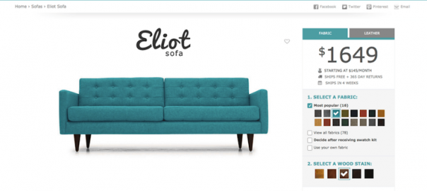
If the product comes in various colors, patterns or variations, include a photo of each possible color combination. This allows customers to actually see their options and make the right choice, and properly sets expectations for what they’ll get. If they’re forced to imagine the product in other colors, and it shows up on their doorstep in a different shade or pattern, you’ll not only be dealing with returns but may also have to deal with negative reviews or comments on social media channels.
Joybird’s customizable furniture comes in several colors, fabrics and wood stains, creating tens and sometimes even hundreds of different product image variations, which are all shown on their product pages.

By allowing your customers to get intimate with your products through various angles, high-quality imagery and available options, you can provide them with the details and experience needed to drive more engagement and sales.
Photo: Fugoo
Digital & Social Articles on Business 2 Community(157)
Report Post


