A lot of buzz has been circulating Instagram the past few months with the release of new business tools and the new Instagram algorithm.
This algorithm change puts a new emphasis on Instagram’s (previously pretty neglected) advertising platform.
If you haven’t been paying attention, it’s time to start taking notes.
Now, the advertising you create on Facebook can be pushed to include Instagram, a platform that interacts with content in an entirely different way.
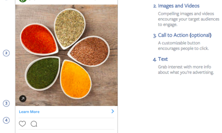
This article will break down the anatomy of a perfect Instagram ad. I’ll tell you what makes up an awesome Instagram ad plus give you some examples of great ones I’ve seen.
Before we begin, if you’re just starting out with social advertising, read through Facebook’s handy guide on how to set up your advertising account here. I’ll wait for you to read it…
Alright, you good to go?
There are three types of Instagram advertisements to choose from:
- Photo
- Video
- Carousel (a set of photos)

What makes an Instagram advertisement more effective than a regular Instagram post?
An Instagram advertisement is:
- Targeted. Based off of the massively popular Facebook ad targeting system, Instagram will make sure you reach the audience you want. This can be based off demographics of your choosing such as age, gender, location, interests, etc.
- Interactive. Unlike a regular Instagram post, by clicking on the call to action or the photo/video the viewer will be able to go directly to your website or landing page.
I’m convinced, so what makes up the perfect Instagram ad?
The perfect Instagram ad is fun.
Think about the brands and people you already follow on Instagram. What made you follow them?
When you’re brainstorming ideas, think about how your ads can blend seamlessly into your audience’s newsfeed. An ad that is feels like a native ad will perform much better than something purely promotional.
There must be a middle ground between the content of the post and the call to action.
I haven’t come across a better example than Lululemon’s Instagram video ad for their ABC (anti-ball crushing) construction in their menswear.

Instagram doesn’t allow you to embed ads, so watch the video here:
This ad hits every checkmark for me:
- It’s funny and is done in a stylish way that blends in with the other accounts I follow.
- It’s only 20 seconds.
- It’s playful and hits on a problem many men experience.
- It’s targeted excellently, as I’m an active male
- It’s attention grabbing and immediately piqued my curiosity with the visuals.
Simple and fun, this MeUndies Instagram ad also caught my attention because of it’s playful imagery.
The line “Life is more fun in matching undies,” certainly speaks to the brand’s values and communication style. It shows just how important the visual part of your ad is towards capturing someone’s attention.

The perfect Instagram ad is concise.
What you’re selling and what you want the viewer to accomplish should be clear.
NatureBox uses a video slideshow filled with closeup shots of their most popular snacks. The visual style of their photographs are done is a style similar to other popular Instagram food accounts and blends into the newsfeed effortlessly.
NatureBox makes their unique selling point clear: something for everyone — over 100 high-quality healthy snacks to choose from.
Once you wipe the drool off your face you can click on the ad and head right into their store and start browsing.

Putting it all together
The combination of Facebook and Instagram for social advertising rivals the likes of Google Adwords. It’s the perfect time to start advertising on Instagram before more brands jump onto the platform.
The levels of engagement and low cost are making Instagram the go-to platform for social advertising. If your advertising strategy relies heavily on visuals then Instagram, as an advertising platform, should be at the top of your list.
From what I’ve experienced and from the data I’ve seen, the perfect Instagram should include:
1. Excellent visuals. Instagram is a visual platform above all else. The better you can communicate through visuals the more impact your ads will have. Use visuals that belong on the newsfeed of the audience you are targeting.
2. Clear and concise communication. Life moves fast on Instagram and there isn’t much space for the written word. Clearly and quickly explain your business and the action you’d like the viewer to take.
3. Defined audience targeting. Take advantage of Facebook’s excellent ad targeting and reach the audience that is right for your business. The more refined your targeting is, the better your ads will do in the feeds of your target audience.
Remember that the rules for advertising on Instagram, as with any form of advertising, are not black and white. Videos are great for the ABC Lululemon menswear but a photo series might perform better for something else. What works for other brands may not work for you, the only way to find out is by testing.
Have you run any Instagram ads recently? I’m curious what’s worked for you, what hasn’t?
Share your experience with me in the comments below!
Digital & Social Articles on Business 2 Community
(137)
Report Post


