Copy is an integral part of any successful marketing campaign. The web is full of articles on how to optimize the main copy on your landing pages and throughout your site.
But the unsung hero of the copy world is microcopy.
Microcopy is the small pieces of text on your website that guides user experience. This could be in form fields, CTA buttons and many other places. Microcopy can be used for a variety of different roles including:
- Helping a visitor to use your site easily
- Preventing them from leaving due to frustration
- Branding
- Entertaining
- Building trust: A survey by PayPal found that 46% of Americans still fear entering payment details online. Microcopy can be a great way to alleviate these concerns.
Effective microcopy can achieve all of this at the same time.
I’m sure people are familiar with this piece of microcopy:

The use of this particular piece is twofold.
- It shows users unfamiliar with Facebook what the status section is for.
- It shapes the Facebook landscape by encouraging users to talk about their feelings over other topics.
Types of Microcopy
There are numerous microcopy types found on the web. Here are a few examples:
Microcopy can be used for a number of functions in emails.
In her monthly Yoga with Adriene newsletter, yoga teacher Adriene has added the question, Getting too much email from Adriene? along with the option to unsubscribe:

The copy adds a personal touch by including her name and asking politely instead of using robotic text such as click here to unsubscribe. It also aligns with her branding values of compassion and helping.
Password Forms
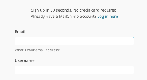
A very common use of microcopy is to assist in password generation. Below is an example from MailChimp.

This copy doesn’t inject much brand personality into the site but it gets the job done.
Call to Action Buttons
Call to action microcopy is one of the most important types when it comes to the success of your business. You are not just guiding user experience here; you are turning a visitor into a subscriber or a customer.
The words you pick are crucial.
Below is an example from our very own website, Pagewiz.

The wording is short and succinct. Using the word “take” instead of “get” – or a similar verb – emphasizes that Pagewiz is letting you have something for free.
Sign-up Forms
Choosing your microcopy carefully will ensure you maximize sign-ups to your free offers and promotions. Social Media Examiner does it well when promoting their Social Media Marketing Industry Report.

The short phrasing and the exclamation mark signify urgency creating a sense of need in the reader.
Error Pages and Notifications
Displaying errors to the user is the perfect opportunity to be helpful and add branding at the same time.
A lot of businesses make excellent use of microcopy on 404 pages.
Below is an example from construction company Ditto.

The construction-themed language and the picture match the company’s branding perfectly. The wording is also polite and light-hearted.
Hubspot’s microcopy guru Beth Dunn says that the key with error messages is not to be mean. You need to, “convey empathy and solidarity with the user. There’s always got to be a sense of us all being in it together.”
Why is Microcopy Important?
Microcopy is an integral part of the user experience of your site. It can often be the difference between a visitor signing up or buying from your site, or leaving and going somewhere else.
A study by Kissmetrics found that the number one reason a potential customer leaves a site is poor navigation.
Jared M Spool increased a company’s customer purchase rate by 45% giving them an increase in sales of $ 300,000,000 a year!
Spool achieved this by one simple act: adding microcopy to a registration form on the company’s site.
The form was a simple one, with two fields and two buttons. The fields were, Email Address and Password and the buttons, Login or Register.
The form asked users to login or register their details with the company in order to finish their purchase.
It was displayed to them when they clicked on the checkout button. This form resulted in a huge loss of sales because new users were reluctant to give their email address away for fear of being spammed and other security reasons.
Also, most existing users had forgotten their login or changed their email since their last purchase.
Spool remedied this by replacing the Register button with a Continue button and adding the following microcopy: “You do not need to create an account to make purchases on our site. Simply click Continue to proceed to checkout. To make your future purchases even faster, you can create an account during checkout.”
By giving customers the option to register or not, and telling them they could do it later on in the process, left them with much more freedom, and increased sales dramatically.
As well as guiding user experience for your site, microcopy can also be a part of your branding strategy. Good branding is essential to communicating your company’s personality and securing new customers.
Microcopy represents the voice of your business – get it wrong and you could be in trouble.
How to Make the Most of Microcopy
Getting microcopy right involves following some simple rules.
Focus on the User
The most important thing to consider when creating microcopy is the user.
Hubspot says, “writing microcopy takes more than just good writing skills, it requires a deep understanding of your target customer and a knack for translating product-speak into language that appeases and delights them.”
You must get inside the mind of the user and work out what they need. TheLadders, a job database, fell short with this when creating their job match form. The section entitled Job Goals was causing problems with users.

For those that work in the job search industry, “Job Goals” meant details of the job you were looking for. The average user read this as: things they would like to achieve at their next job.
The title was redesigned to “What job do you want?”, which gave a much a better response.
Be Conversational
Since microcopy is all about communicating with the user, you want to keep the tone conversational where possible and use natural language. Stuffy, technical language is likely to alienate and confuse your potential customers.
Hubspot believes that their microcopy is effective because they have, “always been less concerned with sounding like a serious, grown-up corporation than we are with sounding like ourselves.”
Make it Personal
The power of personal microcopy was seen in an A/B testing of Roader Studios “Famous in Five” campaign. They tested a CTA in their email campaign that originally said, Click here to continue reading.
They thought this was too bland and lacked momentum so they changed it to, Make me famous. In 2 weeks the new CTA received 8.39% more conversions.

The author of the case study believes that a large amount of its success is due to the inclusion of the personal “me” to the copy.
Keep it Short and Sweet
Numerous studies have been carried out on the readability of online text. There is a lot of debate on the exact optimal line length but one that’s approximately 50-60 characters is a good general recommendation. So when you are crafting your microcopy, less if definitely more.
Be Functional
Microcopy’s main purpose is to make the user experience easier. Always ask if it is actually needed or not? You can still be entertaining, but don’t go overboard. Prioritize functionality above all else.
Think Context
The meaning of microcopy changes depending on where you place it. Always bear in mind at which stage of the user experience your microcopy will be visible.
Brand When You Can
Microcopy is an excellent tool for branding your site, but you need to be careful where you use it, don’t try to crowbar it in where it just doesn’t fit.
Bill Beard recommends avoiding over-branding on:
- Navigation
- Forms and field labels
- Instructional text
- Selection text
- Buttons
Because at these stages the user is taking action to get to a specific point, the copy should guide the user and too much branding is likely to confuse them.
The best spots to merge microcopy and branding are on:
- Confirmation messaging
- Rewards
- Error pages
These pages do not lead anywhere and so require no action.
Test. Test. Test
Testing your microcopy is essential. Its success is dependent on its effect on the user so you need users to try it to see how it works.
A/B testing is the minimum you should be doing but if you have the budget, consider usability testing where you can monitor the users’ reactions.
Treat Microcopy as Part of the Design Process
In Basecamp’s book Getting Real they have a chapter called, “Copywriting is Interface Design.”
This couldn’t be truer and you need to get into this mindset when choosing your microcopy. Your copy is an integral part of the design process of your site, so it must work together with the layout, theme and more, to create the ideal user experience.
Focus on your Goals
Always think about the end game of your site when writing microcopy. If you want to make sales, does the copy support that? If you are looking to get sign-ups, is the copy helping you do this? Keep this in your head and craft your copy accordingly.
Case studies
Case Study #1: Betting Expert
Michael Aagaard of Content Verve ran A/B testing for a privacy policy on a sign up form for betting company Betting Expert. The results were surprisingly different and some were not what he expected at all.
In one of the tests, he compared no privacy policy to “100 percent privacy – we will never spam you”. Shockingly this change generated a fall in sign-ups by 18.7%, the opposite of what he expected to happen.

This shows that microcopy does not always help to optimize your site.
Michael believes the reason for the fall was the use of the word “spam” as even though the copy is promising not to spam you the reader still thinks of spam when reading it.
The phrasing that Michael received the best response from was “We guarantee 100% privacy. Your information will not be shared.”
Increasing sign ups by 19.47%.

He concluded that this was due to removing the word spam and because the phrasing had “Credibility, clarity, and authority”.
Case Study #2: Influitive
Influitive, a cloud software platform company got some impressive results when sending a daring email subject line in one of its email campaigns. The campaign in question was promoting the platform’s ability to gain referrals for its users.
The basis of the themes and language used in the campaign was a comparison. Asking a customer for a referral without warming customers up was like “asking someone out for a date for the first time on Valentine’s Day.” This led to the creation of the subject line: “So I’ll pick you up at 7.”
This phrase was a risky one to use as it could have had the opposite effect and been sent to spam. But instead, the campaign had a 25% open rate – Influitive’s highest ever, and a click-through rate of 2.3 %.
Jim Williams, Vice President of Marketing for the company believes it “struck a chord” with readers and is planning on continuing to push the boundaries “a little.”
Wrapping It Up
Although small, poorly-tested or non-existent microcopy can be a deal breaker to your bottom line.
If you want your site to be fully optimized for conversions, you can’t afford to ignore these extra little details that help persuade visitors and guide them along the sales path.
From the use in emails, landing pages, sign-up forms and CTAs, microcopy is what connects your big thoughts and pushes the user to take action. Use microcopy to create the ideal user experience – entertain where you can – and you will reap the rewards.
Digital & Social Articles on Business 2 Community(106)
