By Zachary Petit
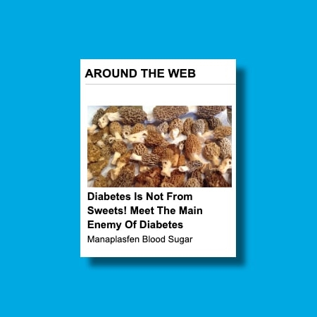
My breaking point came when I saw the headline for the 50th or so time: “Diabetes Is Not From Sweets! Meet the Main Enemy of Diabetes.” Only this time, instead of the usual imagery that ran below it—alien-looking insects, what appears to be a trio of eels, a bowl filled with (*scream*) raw testicles—there was a pile of porous objects. I squinted. And there, in the tiny square ad, was something that made even less sense: a pile of otherwise delicious (and highly sought after) morel mushrooms.

I cracked. I clicked. And once I arrived at the outbound link—a primitive Web 1.0-esque landing page simply titled “US News”—the morel mushrooms were nowhere to be found. (Nor were any eels or much in the way of explaining the promised “main enemy of diabetes.”) Instead, I found myself a cog in a much bigger machine; one that has transformed the end of so many online articles into a grid of ambiguous horror.
These chumbox advertisements—so-called for the way they lure in curious readers, akin to dumping junk bait into the ocean to capture bigger fish—are, of course, a form of clickbait. The outlandish headlines, which once seemed the highest form of absurdity, have given way to a visual language that borders on the abstract, and one that is wholly native to the internet.
Like most things, chumboxes were designed to sell a product, either directly or indirectly. The scale of the “native advertising” industry, the preferred term for advertising that mimics the look and feel of the traditional media outlets where it’s placed, is immense. One of the biggest purveyors, Taboola, boasts 9,000 “digital property partners” and 400 billion content recommendations every month. MGID, which claims the title of “the first platform to introduce content discovery through a native widget,” reaches more than 32,000 publishers and serves up an excess of 185 billion monthly impressions.
“They’re big. They’re really, really big,” says Kevin Freemore, SVP of media, technology, and data at the 4As (formerly the American Association of Advertising Agencies). “And I think it will continue to grow.”
How does it all work? In a nutshell, there are established and trusted media sites, and then there are “made-for-advertising sites,” where the average chumbox ad leads. The chumbox ads are placed on a traditional publisher’s pages, earning said publication a passive income stream in a moment when many outlets are struggling and anxious for every dollar. Meanwhile, because of the way the programmatic advertising system works, the made-for-advertising publishers then tend to score the major-client ads from the likes of, say, CVS and Disney, as Marketing Brew detailed.
As for how the imagery in these chumbox ads is chosen, Freemore says his understanding is that it varies among ad platforms. In some cases, the native advertising platform is willing to assist in the creation of the ads, and in others, the advertisers and/or agencies come with creative in hand.
On the whole, Taboola, Outbrain, and a bevy of native advertising’s biggest players—with the exception of MGID—did not return a request for an interview or offer insight into the practical workflow behind the ads. And one gets the sense that in the industry at large, the ads are a bit like the elephant in the room. It may be broke, but why fix it?
After all, it works—thanks in part to those images.
So let’s look at why.
The art of the chumbox
As VP and global head of creative insights at Getty Images, Rebecca Swift has delved deeply into the psychology of visuals in her PhD research and beyond.
The art of the chumbox: She says it stops you in your tracks because the imagery is so wholly out of the realm of what your brain expects to see. Suddenly, you’re presented with an almost M.C. Escher-like visual puzzle.
“I guess that’s—I don’t want to call it genius, but kind of the evil genius of what they do,” she says with a laugh. “It’s like, What is that? Is that . . . a pair of breasts? Or is that some buttocks? What is that? And then you find out it’s an armpit or something.”

The biggest fear of anyone creating images on the internet, she notes, is fading into the visual wallpaper. Chumbox ad creators strategically avoid doing so by employing strategies such as A/B testing. Some ads feature otherwise benign images from major stock photo providers that have been made puzzling—and thus intriguing—by virtue of being paired with juxtaposed, jarring headlines. Others embrace the grotesque to elicit clicks. Regardless, every click is a vote, which brings one to a somewhat seismic realization: Those morel mushrooms were not accidental. We, the readers, chose these images. Chumboxes are a mirror of our worst impulses; no matter how much we complain about them or the degradation of the internet, we’ve created them. And we sustain them.
While the internet has evolved aesthetically, chumboxes haven’t. Freemore says that when you’re working with lots of different iterations in algorithmic or programmatic advertising, the complexity of the ad unit must remain very low. In other words, when testing permutations of, say, six images and six headlines, it would be more difficult to create a rich asset than a simple one. So the design often comes down to efficiency. (And, it might just have found its ideal moment; as Swift points out, the lo-fi vibe of a chumbox isn’t dissimilar from the Y2K aesthetic design trend.)
María D. Molina is an assistant professor in the advertising and public relations department at Michigan State University. As a child of the ’90s, Molina says chumboxes have always been a reality of her internet life. Discussing why they drive clicks, on one hand she cites George Loewenstein’s curiosity-information gap theory, which suggests that the reason things like chumboxes work is because they tease and hook our interest—but ultimately don’t provide enough info to fully satisfy us. The brain wonders: What else?! To try to connect A to B, impulse takes over and we click.
On the other hand, Molina says we don’t have enough cognitive bandwidth when faced with a visually jam-packed website. So we’re guided by cognitive heuristics (heuristic being our imperfect ability to learn something on our own), which are essentially rules of thumb or “if/then” statements. In the case of chumboxes, that might look like this: “If this content appears at the bottom of a site like CNN, then it is likely quality content.” And then there’s the realism heuristic—the notion that if you show someone something through an image, it is more likely to be deemed credible and truthful. In fewer words: Imagery drives clicks. And suddenly there’s a lot more psychology at play in that pile of eels than we first might have thought.
Long live the chumbox?
What does the future hold for chumboxes?
“They’ll always find a way to find us,” Swift says. She has a positive outlook, though: Given how deeply the industry understands algorithms and human behavior with clicks, she believes the content will continue to improve.
Freemore says the design of such ads will continue to grow and evolve in complexity and perhaps capabilities, too.

“They’ve got a lot of staying power already,” he says. “And so I find it hard to believe that they’ll be phased out anytime in the near future.”
He adds that with current industry conversations around privacy, user tracking, and similar issues, advertisers could pump the brakes a bit—and contextual advertising may become more dominant, serving up topically relevant links based around a website’s existing content, which some native advertising does.
And speaking of content that mirrors content, Freemore says one interesting thing he has observed is that the design of some media sites has evolved to seemingly better house native ads, instead of the initial model of the grid-like ads being created to mimic the site. “It’s almost like they’re adopting the design philosophy of some of these different ad units.”
Which ultimately brings up the ethical question at the core of all of this, especially as it concerns sensationalized content, “fake news,” and the like. As media consumers, we’re quick to attack chumbox providers or made-for-advertising sites. But the traditional publishers running the ads are an essential player in this dynamic.
“I would hope that whenever these news sites are setting up relationships with these organizations, that they’re conscious enough to sit down and say, ‘Look, what are the things that you’re going to be delivering? What kind of policy do you have? What kind of checks do you have in place for the ad copy that’s loaded?’” Freemore says. “Frankly, if you’re going to put it on your site, and you’re going to make money off of it, I think it’s your job to do due diligence.”
While MGID did not answer specific queries about how the imagery used in its chumboxes is selected on a practical level, a spokesperson did note, “Since MGID does not advocate using these particular ads, we do not have any advice to provide on the design of these ads.”
Karina Klymenko, MGID’s global head of creative and compliance, wrote that they refer to this breed of ads as “below article ads,” and that “brands need to be very aware of the trade-off between their short and long-term benefits. Whilst these ads do tend to grab consumer attention, they won’t necessarily build brand equity and, for publishers, they might not reflect well on them. As a global advertising company, our mission is to deliver as much value to users as to advertisers and publishers, which is why we allow our clients to experiment with a range of ad formats while maintaining strict and continuous moderation processes.”
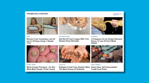
No matter what you call such ads, MGID does, indeed, still deploy them, clickbait imagery and all. The following—including a “Diabetes Is Not From Sweets!” installment—appeared on The Science Times on January 11.

While Klymenko noted that MGID adheres to guidelines that prohibit things like alcohol promotion, trafficking, weapons, and so on, Molina says that in an ideal world, there would be established ad standards on the internet similar to those that govern radio, TV, and so many other industries.
“If we are lying to the customer about what they’re getting by clicking these, then I think that’s just not appropriate. Let’s have advertising, but it has to follow ethical guidelines and legal guidelines like we have in other media environments.”
I think back to those morel mushrooms, and ponder the care with which these ads are designed. Later, I received a reply to my interview request for this story from RevContent, a native advertising platform that can be found in use everywhere from Jezebel to Breitbart.
Thank you for your interest in Revcontent! We’re happy you decided to take that first step in humanizing your revenue or ROI experience in the native ad world. We have experienced advertising and publisher experts ready and willing to help you reach your company’s revenue goals . . .
In the end, it might just sum up the amount of thought and vigilance that goes into each image on that ever-present chumbox grid.
And still, we click on . . .
(13)


