Sometimes link builders identifying promising sites think only in terms of metrics. Columnist Julie Joyce explains why usability has become one the most important things to consider.

Just the other day, I was showing a cool site that I’d just found to a (very intelligent and internet-savvy) friend, and he quickly became confused due to the ad placements on the site. The ads were shown on the top of the page below a nav bar, and they looked like categories for the site. So he clicked on them.
Then there was the search bar. Blacked out completely, you couldn’t see what you were typing into it, and it gave no error messages when you just hit enter. The 404 page had a broken image on it. One of the social buttons went to the wrong account.
And then I found the dreaded page with the lovely Lorem Ipsum dummy text still on it.
Bottom line: I didn’t really love the site so much anymore. It ranked well (that’s how I found it), but I didn’t trust it.
Ask yourself: Would you click on this link?
When I’m building links, I always ask myself if I’d want that link to my site if I were the client myself. I do get a bit irritated when clients complain about really nitpicky stuff, but if I were the client and my link-building company got a link on this site, I’d be super-irritated.
It’s not enough to rank well. I mean, it’s fantastic when you do rank well, of course, but everyone knows a top ranking is no guarantee that you’ll gain a new sale or a new email subscriber or whatever else you view as a positive conversion. With so much spam making its way into the top SERPs, users are finding out that they really can’t trust the rankings the way they used to.
So, while it’s really nice that you get a link on a site that ranks well and has some good metrics, if you depend on that link for converting traffic, the linking site’s usability can’t be ignored any more than yours can. Why have a link on a site that someone doesn’t trust?
I approve every single link that we build in my agency, and the main reason I’m turning down sites these days is for something related to usability. They have the metrics and look good on the screen, but something’s off. The page doesn’t load correctly until you try it three times, or it takes 30 seconds. The site is so covered up with ads you can’t tell what’s an ad and what’s the actual content. There are a gazillion pages that throw 404s.

Add all of this to the usual things we look for, and you’ll see that finding a great linking partner just gets harder and harder.
What should you check?
Generally speaking, I encourage our team to do an initial quick check on a few things to see if a site is even worth digging into. We do look at metrics like Domain and Page Authority (at our clients’ requests) and we check things like the country that is sending the most traffic to the site. If we don’t see any big red flags (like 90 percent of the traffic is from Hungary and it’s a US blog), then we dig deeper.
Is the content any good? My goodness, you would be amazed at all the crappy content on the web, and on highly ranking sites. I don’t mean that it’s just not my thing. I mean that it’s written with incorrect grammar and rampant typos, and there’s no real structure to it. I recently refused to order some clothes that my daughter wanted from a site where it looked like they had gotten a 4-year-old to write their “About Us” page. They didn’t list a phone number. The descriptions of some of the items we looked at seemed to be whatever happened to come with their terrible system. I don’t want to buy an item where there’s no image but there is a line reading “insert photo of tan shirt here.”
Oh, and I love to check for a Viagra or Cialis hack. Yes, those are still all over the place! Do a “cheap online order viagra” search in Google and you’ll see.

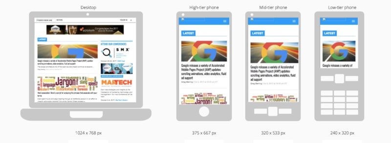
We can’t forget mobile, either, and that’s only getting more important. You know when you’re on a smartphone and you go to a site that looks like a tiny version of its regular self? Why lose the chance for a mobile conversion by placing a link on a page that won’t even be seen by users on a smartphone? By the way, I like Mobi to check this in a variety of formats, but there are various tools available.

Stop forgetting users with visual difficulties
Years ago I had a blind user show me how he navigated the web. Something I wrote then is something that I STILL see today, and it drives me nuts:
If [they] are reading a webpage that has links on it that aren’t coded to look like links which are easily recognizable as gateways to another page or site, they obviously aren’t going to find them and click. Of course, neither am I — most likely, neither are you, even if your vision is 20/20.
Sometimes webmasters (and maybe the people requesting the links) are so intent on staying “safe” that they make links blend in as if they weren’t links. It’s awful. We sometimes get links for clients and have to request that the links LOOK LIKE LINKS. How stupid is that? Why in the world would you not want your link to be clicked on? If I see a site doing this, I’m just left wondering what else they’re doing and what other bad things I have not yet found.
Always always always LOOK AT THE SITE!
It’s very clear: poor usability breaks trust. The problem is that discovering it can take time, and isn’t attached to an easy metric, other than maybe page speed. Again, we’re left with that pesky requirement to actually look at the website upon which we’re seeking links! We have to spend time going through it! And so we should.
[Article on Search Engine Land.]
Some opinions expressed in this article may be those of a guest author and not necessarily Marketing Land. Staff authors are listed here.
Marketing Land – Internet Marketing News, Strategies & Tips
(89)
Report Post


