— September 29, 2017
A little while ago we looked at the hottest brands on Instagram. Now we are taking a similar in-depth look at Facebook.
The hugely successful social media platform is a great place for brands to be. The top brands on the platform (including Facebook itself) are enjoying fantastic engagement. Bigger doesn’t necessarily mean better though.
We would like to take a look at those brands that are coming up or are just delivering a great experience on Facebook, but we have also sprinkled over the post with some slightly less recognisable faces too.
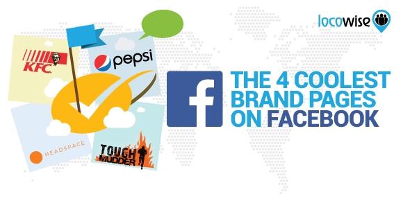
The list of the coolest brands on Facebook is as follows. We broke our coolometer by the way, so we are just going on appeal and engagement.
Pepsi (nothing to prove)
We can’t see the value in explaining what Pepsi is or what it does. You know this stuff. But the brand has historically ‘enjoyed’ a rivalry with Coca-Cola. And it has often come out as a loser.
On Facebook though, Pepsi seems to have a strong, engaging presence that just feels like it’s getting better all the time. It’s fun and incredibly cool. If you take a look at a recent post, we have an excellent tie-in with the vibe from the recent Emoji movie. This is classic marketing in that it ties in with something from the cultural landscape. And it’s cool because everyone likes seeing a point of view ride on a surfboard.
The same vibe is there in an earlier post. But it’s all bright and fun, and truly summer-orientated. The cleverness seems to be built-in with this brand that has nothing to prove but still works on engagement.
KFC (confidence in spades)
Similarly to Pepsi, everyone knows about KFC. They are huge and we know they work incredibly hard at creating a social media presence that earns engagement. But they do keep surprising us, and on Facebook they have consistently been a brand that keeps working at stuff in different ways, always searching for the right angle and the most left-of-centre way to engage. They have a Facebook presence to be proud of.
Proving that the slow death of Vine has still got much of the social media landscape in mourning, KFC brings a Vine-like video that is perfectly done when it comes to a lot of things. But one of the best things here (apart from the classy and clever feel that it creates) is the use of branding colours for Pepsi. KFC isn’t really part of the video. You know it is KFC because you can see the staff in the background. But this is confident, fun work on Facebook.
And for extra bonus cool points, the post even uses the lingo that its audience uses. Not every brand can confidently and effortlessly say ‘Pepsi Max Cherry sliding into KFC like…’
Headspace (cast iron branding around a movement)
Headspace is a new player as a brand (relatively at least). Essentially, it’s a meditation and mindfulness service that has grown and improved year on year. But the brand, again, surprises on a regular basis. Because It doesn’t have decades behind it, it works hard to be innovative, to carve its place in the landscape.
Headspace has consistently conveyed a message of fun, easy and non-threatening meditation. This sense of fun translates perfectly to Facebook where the brand is doing rather well. Taking a look at the brand’s Facebook page, you will see some very useful information and excellent videos that really do leave you a little cleverer on meditation matters. It’s smart, really smart, and the value the audience receives is incredible. We don’t care if Headspace has probably already posted this stuff on their website, it works.
The video content is often voiced by the founder of the company, which adds to compelling levels of trust. Headspace was essentially built up around the founder and his personality (which is a key aspect of his company growing quickly). It is used a lot in the content. This works because the loyal audience trusts him. They were signing up to Headspace due to his warm and calm mentoring in the first place.
Alongside all of this, the brand and its visuals and colours is uniform with the phone app and the website. It’s just a great example of what his audience likes. If you know anything about Headspace you would recognise the page immediately for what it is. And that is a page that is ‘on message’ and useful to fans.
It’s a movement. And it fosters loyalty. Headspace is cleverer than you might think. That movement is conveyed by one of the best-looking and most useful Facebook pages around.
Tough Mudder
Anyone who has heard of Tough Mudder will know that it has quite a reputation. The races it organises include everything you wouldn’t want to experience in a race. This includes electric shocks, soggy terrain and screaming people all around you.
It’s an events company because it runs a Tough Mudder (or variations of this) around the country. So if anything it should present a Facebook experience that notifies and engages all around the events it holds.
Well, it does. And if anything, the page does each event a service by keeping content up to date and showing exactly what potential competitors and old hands want to see. This is an events company that shares news and content around the events.
It’s also pretty cool too in that it focuses on the people who run the races.
If you know that your client work on data could use a little work, try a Locowise stint. We will give it to you for free for seven days. If you want to be known for solid and actionable social media metrics reporting, come visit us today.
Digital & Social Articles on Business 2 Community
(88)
Report Post