They say the only thing certain in life is taxes and death, but I think change is also a given – especially inside LinkedIn. They are always evolving, quite a lot in the last month but the one that has everyone talking today is the home page changes.
LinkedIn announced 11th December 2014 that it was about to create a single place to see how you “stand as a professional, build and keep in touch with your network, and get the knowledge you need” but what does this mean in reality? Well it means you have lost some functionality and gained a little too.
Here is what it used to look like :

LinkedIn has been trying to clean up its interface, to make it all a little clearer, cleaner and more card based in its presentation. Some of this like the profile changes has worked well but on a 24 hours experience I am less sure on the home page, it might just be the shock of something different, time will tell.
And here’s what it looks like for most users from today with it rolling out to all users soon:

Lot’s has changed, most not immediately obvious.
So lets start with the bad news:
- You can no longer customise the full descriptions of websites, a real loss, as you used to be able to give the headline and description a rewrite to give it more visual appeal and engage your audience. Not anymore, just a seventy character headline and standard web content description.
- This could be taken either way, but the people liking posts are now more hidden, so you just see a total, not even the last person or two. Yet more reasons to comment on things as opposed to “like.” You wouldn’t walk up to someone at a business event and go “like” now would you? It’s not Facebook you know!
- On the right hand side of your homepage you used to have a history of the profiles you had viewed, a real boon if you wanted to go back to someone, wanted to check or reference someone…but now it’s gone – bye.
- Share an update has become “what’s on your mind?” Now for some that in itself is a tricky question. You might want to try using this as a way to talk to your audience, a bit like when you meet them at an event or convention.
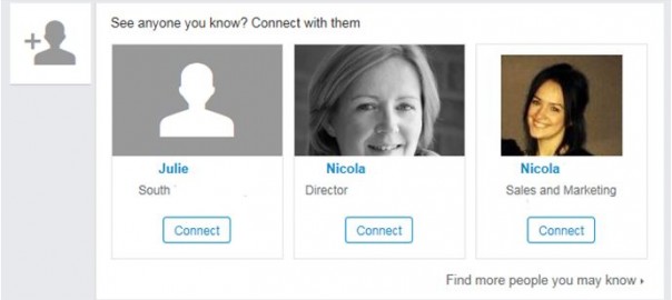
- People you may know (PYMK) has shrunk – this could be perceived as good or bad. It now shows either one or two potential people depending on your view settings. In our experience this gets less relevant once you get over the 250/300 connections mark, but then LinkedIn is all about the real connection, not the collection (read more).
- Real loss from the homepage is all the filters which used to let you filter through your home page to only see certain things like those with new roles, profile change or company updates only. It is not that this functionality has gone, it hasn’t but it is not so easily accessed on the home page. All you are left with is filters of most popular or most recent, better than nothing maybe?
- Another sadly killed off feature is the status reach report (see here) and this has already prompted quite a few to reach out to me today. It is “kind of” there but much less rich killed with no more clear visual indication of the impact on level 1, 2, and 3 of your network. Now not all users got this new functionality in the first iteration so you might have to wait a couple more days before you see this as indicated below.
- Your connections new roles have also been removed from your feed, so no more seeing new roles here.
Now before you go all doom and gloom on me there is also good news too!
The good:
- Once you get over the shock of change I think it is clearer to see the updates and the whole interface is more like the refreshed personal profile page in terms of style. Most people are always disorientated with any interface change in any system, LinkedIn is no difference and trust me to just go with it for a while and see how you get on.
- Much easier to see who has looked at you – this is a real plus move from the update I think. It is now front, top and centre to make it easy for you to access this much-used functionality. Scarily it seems to be used more than actually looking at others profiles! Of course if you started doing some “stuff” on LinkedIn more interesting people might look at you.
- The new “Keep in touch box” highlights interaction opportunities much more obviously – you can see in the picture below that the new events such as roles, anniversaries, CRM reminders and more are much easier to see, action or skip than they were previously. See image below:

- Bigger images – much bigger. The images have grown and are now a huge impactful chunk of real estate in your feed. Let’s just all hope the trite phrase and haiku brigade from Facebook don’t go mad with it.
- PYMK has taken up much less screen space, giving more space for more useful items for most users. The other thing is that PYMK suggestions are also now appearing in your feed of activity.


- Easier than ever to use the filter to sort your feed for the most recent messages, as opposed to most popular. A real boon if you want to be on top of your time based messages or just the ones that are popular in your network sphere.
- The Pulse News is not necessarily at the top of the page anymore – personally a cause for a small whoop. It is still there but only when you take the most recent view.
- They talked about feedback on status updates on the release but this has not yet materialized for many but I’m sure it will soon. I have just seen this appear on my own homepage below profile views.
![]()
I suspect it is an early release and not tracking properly yet but time will tell, so far I’ve only had this new homepage for 24 hours.
On balance some good, some bad and lots of changes to get used to. The functionality is (mostly) still there and you have gained a little too, but mostly things have just moved around a bit and I suspect it will take us all a little while to adjust.
(253)
Report Post