Roundup posts are so 2012.
I hate to say it, but they really are.
True, we still see them, and they actually still work in some niches, but by-and-large people are getting exhausted with them. Readers are becoming tired of them, industry influentials are slower to participate in them, and the overall sea of roundup noise is louder than it ever has been.
In their hay day, roundups were the golden child of link-building. Think about it. You didn’t have to create original content, there were built-in promotional angles, it opened the doors to access industry influencers that otherwise wouldn’t have exchanged emails with you (and potentially paved the way for future contact with them), and a host of other beautiful things.
All you had to do was sit back and be the Oprah of valuable content in your niche. But alas, like all tactics that marketers ruin, the sun is beginning to set on the roundup, and the law of diminishing returns is in full swing.
But before you completely shut down, there IS a solution. It’s called… (wait for it) …the graphic roundup.
So, What Exactly Is A Graphic Roundup?
Well, if a roundup post and an infographic had a baby, and then sprinkled some hyperlinks and interactive elements on top, it would be the graphic roundup.
They’re prettier than the normal text roundups we see. Their promotional value is insane, and best of all, they’re not played out yet.
Like the name would indicate, the graphic roundup is a more designed, more stylized page, that first and foremost creates a lot of visual interest. This shakes the reader out of the eyes-glazed, text-scanning mode, and subconsciously rings the value “dinner bell.”
Want to see what it looks like in the wild? Let’s take a closer look…
The Anatomy Of A Graphic Roundup
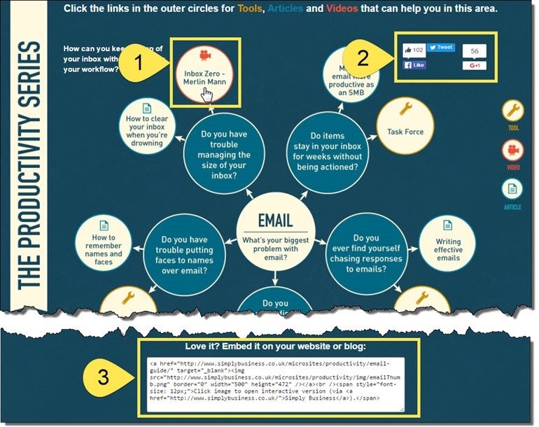
The first thing you notice when you look at this, is that it generally looks interesting (although simple). Simple color palette, some different sized text, punctuated with a couple small icons. Nothing fancy, but “see-worthy”.
Following along with the highlights above, you see:
- Outbound Reference Links
Unlike a traditional infographic, each of the circles on this graphic roundup are actually links to a carefully curated selection of resources around the web.
- Share buttons
Pretty obvious in a 2016 web world, but the share buttons are displayed prominently (Although it depends on your space, if you are in anything with a consumer goods or lifestyle angle, I would highly recommend optimizing for Pinterest).
- Invitation to Embed
Want to make it even easier for people to share and link to you? Include an embed option at the bottom. Make sure to link back to the original page of your graphic roundup, with some well-thought out — but not manipulative — anchor text.
Their promotional
value
is insaneAlthough not absolutely necessary, one other component that lends itself really well to a graphic roundup is packaging up your resources in the form of questions and answers . After you have your design dialed in, you populate it with several links to valuable content around the web. Finally, you promote it to your readers, industry influentials, and “the Linkerati” (as Brian Dean would put it).
“But Wait, I’m Not A Designer! And I Can’t Afford To Hire One.”
You don’t need a designer to pull off a successful graphic roundup. The fact that it needs to be designed, does not mean that it needs to be a Rembrandt.
And in the 2016 world we live in, there are plenty of design tools that are good enough to get the job done (Drag and drop themes, widgets, and graphic builders like Canva or Pablo). Ready to do this?
Great. Let’s get into are the steps:
3 Steps To Graphic Roundups That Generate Traffic And Links
The graphic roundup can be pretty easily broken down into 3 easy sections: Plan, Execute, Promote.
1. The Plan
Like any worthwhile endeavor, the graphic roundup requires some careful planning to really maximize results. To be laser-focused, break up the planning process:
- Topic
No matter what space you are in, content like the graphic roundup should always be created in an area of core focus. The topic should be something you and your audience are passionate about (or your client and their customers’).
Notice that this item is separate and BEFORE checking search volumes. The whole point of the graphic roundup, is to create a helpful resource that is interesting and evergreen. This needs to come from your own knowledge of the space (or your client’s), not the Google Keyword Planner. Don’t let the tail wag the dog!
- Search Volume
Once you are decided on a topic that is interesting, you DO need to find the most relevant keyword or phrase. If your topic is closely aligned with an area of your core focus, you should already have a pretty good idea of what keywords would make sense here, but spend some time on this step to make sure you have it right.
- Questions and Resources
After identifying your topic and keyword, it’s time to flesh out your piece. What are the key subtopics that you can (and should) cover in this guide or roundup? What tools and resources would be important to include? And what are the best pieces of content from around the web that you will be linking out to? If your guide was about building a house for instance, you would probably want subsections on the foundation, roof, plumbing, electrical, etc. with links out to the best helps for each one. Your goal here should be to identify the “crossroads” of the most authoritative content, created by people most likely to share it with their audiences.
- Design Concept
If you have a designer at your disposal, you can go as crazy as you want, but like many things in life, the simplest execution is often the best (back to not letting the tail wag the dog). If you are looking for inspiration, you can always scan through the guides that Simply Business has done, under their “Microsites” section. You can also check repositories of infographics at infographic submission sites like Visual.ly. [
- Promotional Inventory
Now that you have the general direction in mind, it’s time to do some thorough searching, and come up with a really solid list of people that would likely be interested in your finished piece. The biggest and most “built in” component of promotion for any roundup is promotion to the people that are actually referenced in the piece. Make a list using Google Sheets. In addition to searching related topics on Google to see what surfaces, you can use tools like Buzzsumo, or Ahrefs’ Content Explorer.
2. The Creation
With a solid plan in place, you now have a decent idea of what you need to create, and who you will be able to promote it to once it’s finished. Now it’s time to get creating!
- Design
As I mentioned above, remember that even if you don’t have a designer on your team, there are lots of “drag and drop” enabled themes these days, that allow you a lot of flexibility with image placement, background colors, shapes and other graphic elements, and even animation. Get creative and see if you can bring your idea to life. You can also hire a freelance graphic designer for your project from places like Upwork (very cheap…my buddy found a Macedonian developer for under $50 to develop these filters on this marketing post..impressive!) or 99 Designs.
- Content
One of the biggest advantages of the graphic roundup is that you don’t need to solicit quotes and original content from industry influential. All you are doing is curating a nicely designed page full of links to content that is already created. Of course you will be in contact with the content creators, but in contrast to most roundup posts you come across, you don’t actually have to get people to do anything. It’s already there! You made your list in the planning phase, not it’s time to start populating your design with these awesome reference links.
- Shareability
The one thing to REALLY make sure you get right during this phase is the shareability. Make sure your structured data is optimized for both search and social platforms. Even if you have to upload a different thumbnail image for each social platform with dimensions specifically sized for it, it’s worth it! The holy grail science of “engineering viral” means removing friction.
- Mobile
Additionally, although it’s pretty obvious these days, make sure you have a good mobile version of your page as well. Any content that’s expecting to ride on the backs of social platforms is committing suicide by not having a good mobile version.
3. The Promotion
Among all the great books, websites, and talks out there on subject of promoting content, this little entry won’t even come close to scratching the surface. So rather than trying to write a few paragraphs and pass it off as the “complete guide” to promotion, we’ll just spend a minute or two on the specific promotional inroads that you have with graphic roundups.
- Included references
As we’ve mentioned throughout this article, the biggest built-in promotional potential for graphic roundups is from the people you reference in the piece itself. If you create something that’s packaged nicely, there’s a good chance that the people you reference will be honored and want to share it with their audience. Reach out to them before your piece is even published and ask for their “permission” to link to the piece of their content that you found. This does a couple things: 1) It makes you look like the most polite internet marketer that ever walked the face of the earth (they’re thinkin, “who ever asks if it’s ok to link to something? And to my content? Absolutely!”), and 2) it alerts them to the fact that you are creating something, without asking them to do anything. Sending out these “permission” emails will get you a high response rate, that you can in turn respond to again in a week or two to let them know your guide is finished.
- Regular Outlets
Of course this piece of content will lend itself handsomely to all the regular promotion that you might already be doing—guest posting pitches (or “guestographics”), social postings, your email list, paid, press releases, or anything else that you do. Again, this is not an all-inclusive guide on every promotion tactic under the sun.
- Sneaky re-promotion
There’s one other juicy little thing about graphic roundups, you can always swap out the outbound links in your guide, to include new content from new influentials. This means that you can constantly be reaching out to more influentials, and notifying them that they’ve been included in your guide, along with the URL of the graphic post so they can promote it. Use your own judgement here, but be ethical and don’t get too greedy. Think how poorly it would reflect on you if an industry leader re-visits your graphic roundup a couple weeks after sharing your piece with his audience, only to find that the link to his content has been removed, with another in its place. Not good. Still, there’s no denying, that if you do this correctly, the potential for ongoing promotion is insane (you can always use this tactic in any article or other piece of content too).
Results?
So, with some careful planning and execution, what kind of results can you expect?
Here are the results for a similar graphic roundup on Google Analytics:
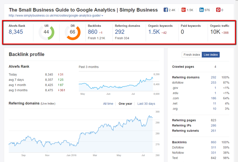
A quick look over the top line will give a sense for just how well it’s done: 860 backlinks from 292 referring domains, monthly traffic of 10,000, and ranks for 1,500 keywords. There’s also close to 5,000 social shares. Wow. What’s even more impressive for me, is that this page clearly shows evergreen performance (as opposed to that flat line with a spike in the middle—a phenomenon that most of us are unfortunately acquainted with).
A closer look at “Organic Keywords” page will reveal that these aren’t Mickey Mouse keywords we’re talking about either:

How about ranking 11th for the keyword “Google Analytics”, or even 38th for “Google?” That doesn’t suck.
What Niches Will Graphic Roundups Work In?
The sky is the limit! You really could replicate this formula in any niche—package up the value, create a thoughtful and compelling design, and be strategic in your promotion, and there is no reason why you can’t see the same success.
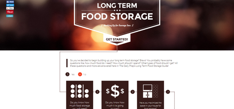
As an example, here’s a graphic roundup on food storage for the beginning prepper:
For a small site, it looks like this little guide isn’t doing too bad either—26 referring domains. Sports, politics, technology, household—you can use the graphic roundup in literally any niche you can think of. I would offer however, that as with any “tactic”, the shelf-life on something like this is probably shorter in the niches with the most marketers (think health, finance, supplements, viral sites, etc). So fire up some caffeine, put on your creative thinking cap, and put the graphic roundup to work for you!
Hand-Picked Related Articles:
- How To Create Traffic Driving Roundup Posts Efficiently
- Best Practices for Promoting Infographics
- 37 Ways To Promote Your Blog Posts
The Interactive Graphic Roundup: When Roundups & Infographics Had A Baby
The post The Interactive Graphic Roundup: When Roundups & Infographics Had A Baby appeared first on Search Engine People Blog.
Search Engine People Blog(108)

