The “meta” content formatting cheat sheet guide

Columnist Quinn Whissen offers guidelines on how to format your online articles to help you decrease your editing time, improve the quality of your content and better optimize it for search.


paper-writing-laptop-edit-mistake-22-1920

Every day, sometimes multiple times a day, I find myself editing content. I comment on, add to, subtract from, redline, revise or rephrase sections of my team’s articles. Google Doc “Suggest Mode” and Word “Track Changes” are my jam. I’m a true content editing fiend.


That’s why I created this cheat sheet guide for content formatting. So that you, your team, your freelancers or anyone who creates content for your organization can digest these guidelines easily and start using them right away.


Like the title of this article says, we’re about to get really “meta.” Don’t know what that means? Take a lesson from Macaulay Culkin on the right, wearing a shirt with a picture of Ryan Gosling wearing a shirt with a picture of Macaulay Culkin — get it?!


So Meta

I found this image on Gossip on This. So I’m going to gossip that to you in this cute little caption along with a handy-dandy link pointing right back to the kind people who should get credit.


So if I were to impart you with a simple, to-the-point thesis statement on what you should expect by reading this post (you know, to tell you what I’m going to tell you before I tell you), then this is what I’d I say: We’re going to get very self-referential here, and I’ll teach you some important guidelines on how to format a blog post by… you guessed it: formatting a blog post.


Don’t forget section headings


Section headings are vital to your web article formatting for two main reasons:


  1. Google: When you properly set up heading tags through your content management system (CMS), Google can “see” what content you have prioritized. H1 is the title, H2 is secondary priority, and on and on. It’s a great way to include semantic keywords right within a heading tag.
  2. People: This isn’t the print world anymore — people aren’t going to read walls of text online. By breaking up your text into short paragraphs with section headings, people can scan and get the gist of the content before they commit to reading it all.

If you don’t currently have a heading formatting capability, set it up NOW. Here’s a screen grab GIF of me setting up a section header just below the paragraph you’re reading right now, within my WordPress post for Marketing Land. Exciting stuff that takes less than two seconds!

<iframe src="http://giphy.com/embed/xT8qBbEK0apSLHUNWw" width="480" height="338" frameBorder="0" class="giphy-embed" allowFullScreen></iframe></p>
<p><a href="http://giphy.com/gifs/xT8qBbEK0apSLHUNWw">via GIPHY</a></p>
<p>‘ src=”http://marketingland.com/wp-content/ml-loads/2016/06/headings.gif” width=480 height=338><br />
<H3>Let’s refine the importance of headings further</H3><br />
<P>Since I’m not quite done with my diatribe on section headers, I wanted to point out how the above H3 heading is couched within my H2. It’s still a relevant topic to headings that I established above, but not unique enough to boost it to an H2. Also, there should only be <A href="http://www.verticalmeasures.com/resources/seo-tutorial-videos/using-h1-tag-improves-search-engine-ranking/" target=_blank>one H1 on any given page</A>.</P><br />
<H2>Do I have to even tell you images matter?</H2><br />
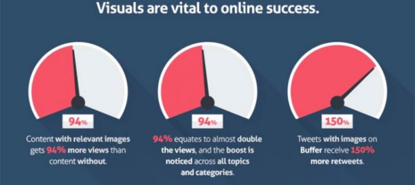
<P><A href="http://marketingland.com/visual-content-marketing-building-digital-stories-resonate-133421">Visual content is important.</A> Content with images get more views, and social engagement skyrockets when your content is shared. But don’t let me just write the facts out for you, let me show you:</P><br />
<DIV id=attachment_181753 class="wp-caption aligncenter" style="WIDTH: 810px"><IMG class="size-large wp-image-181753" alt="Power of visuals in content" src="http://marketingland.com/wp-content/ml-loads/2016/06/power-of-visuals-quicksprout-800x448.jpg" width=800 height=448 srcset="http://marketingland.com/wp-content/ml-loads/2016/06/power-of-visuals-quicksprout-600x336.jpg 600w, http://marketingland.com/wp-content/ml-loads/2016/06/power-of-visuals-quicksprout-768x430.jpg 768w, http://marketingland.com/wp-content/ml-loads/2016/06/power-of-visuals-quicksprout-800x448.jpg 800w, http://marketingland.com/wp-content/ml-loads/2016/06/power-of-visuals-quicksprout.jpg 850w" sizes="(max-width: 800px) 100vw, 800px"><br />
<P class=wp-caption-text>From <A href="http://rankwatch.com/blog/the-power-of-visual-content-in-your-content-marketing-strategy/" target=_blank>QuickSprout</A></P></DIV><br />
<P>Also, in today’s mobile world, it’s often smart to align your images in the center of your page. That way, no text will start to wrap around them as screen sizes change between devices.</P><br />
<H2>Play around with text formatting</H2><br />
<P>Another way to break up walls of text and provide a good reading experience is to use <STRONG>text formatting</STRONG>. While it’s <EM>not always appropriate,</EM> think about bolding important keyword phrases and italicizing phrases to emphasize.</P><br />
<P><STRONG>Here is my personal rule of thumb:</STRONG> Think about how you would SAY a certain phrase, and let that inflection translate to your formatting. (Capitalization counts, too… see what I did there?)</P><br />
<P>And of course, don’t forget about creating bulleted or numbered lists. Here are some tips:</P><br />
<UL><br />
<LI>Break down long sentences into digestible formats to highlight important points.<br />
<LI>Use parallel structure to create consistency (like using verbs to start each bullet).<br />
<LI>Create consistency with the length and tone of each point in your list. </LI></UL><br />
<DIV class=pull-quote>Since I don’t have a super relevant image here, I’m going to emphasize a point with different formatting to break up my text… kind of like this.</DIV><br />
<H2>Links are the currency of the internet</H2><br />
<P>Content is very important in the world of search engine algorithms, but what’s even more important is <STRONG>links</STRONG>. Even Matt Cutts, former Google head of web spam, said this during a <A href="https://www.youtube.com/watch?v=NCY30WhI2og" target=_blank>Google Webmasters Q&A video</A>, when asked if the algorithm could run without link signals:<BR><br />
<BLOCKQUOTE>We don’t have a version like that that is exposed to the public, but <STRONG>we have run experiments like that internally, and the quality looks much much worse</STRONG>. It turns out that backlinks, even though there’s some noise and certainly a lot of spam, <STRONG>for the most part are still a really really big win in terms of quality of search results</STRONG>. </BLOCKQUOTE><br />
<P></P><br />
<P>Follow this simple rule: Add a few internal links and external links to your articles. <EM>How many, you wonder?</EM> It depends on the length of your article, to be honest.</P><br />
<P>Make sure to <A href="http://marketingland.com/10-ways-link-building-changed-last-10-years-173355">build natural internal links</A> that point to relevant pages or posts on the site you’re publishing on. External links should point to websites with content your audience would find worth following up with. They should also open in a new browser tab.</P><br />
<P>Remember: <A href="http://searchengineland.com/library/link-building">Link development</A> is more of an art than a science. However, even just one link can be very powerful, driving increased traffic and conversions, like in the screen shot below.</P><br />
<DIV id=attachment_181756 class="wp-caption aligncenter" style="WIDTH: 810px"><IMG class="wp-image-181756 size-large" alt="Power of link building" src="http://marketingland.com/wp-content/ml-loads/2016/06/Referral-Traffic-Google-Analytics-800x394.jpg" width=800 height=394 srcset="http://marketingland.com/wp-content/ml-loads/2016/06/Referral-Traffic-Google-Analytics-600x295.jpg 600w, http://marketingland.com/wp-content/ml-loads/2016/06/Referral-Traffic-Google-Analytics-768x378.jpg 768w, http://marketingland.com/wp-content/ml-loads/2016/06/Referral-Traffic-Google-Analytics-800x394.jpg 800w, http://marketingland.com/wp-content/ml-loads/2016/06/Referral-Traffic-Google-Analytics.jpg 1115w" sizes="(max-width: 800px) 100vw, 800px"><br />
<P class=wp-caption-text>Source: My company’s blog, <A href="http://www.verticalmeasures.com/link-building/link-development-content-marketing-why-when-and-how/" target=_blank>Vertical Measures</A></P></DIV><br />
<H2>Publish, not perfection</H2><br />
<P>So I’ve given you a quick cheat sheet to content formatting, and I hope it’s been useful. My promise to you is that if you really, truly learn these content formatting principles:</P><br />
<UL><br />
<LI>Your editing time will decrease dramatically.<br />
<LI>Your content will increase in quality.<br />
<LI>Your writers will better understand what is expected of them.<br />
<LI>Your content will be better optimized for search engines to index. </LI></UL><br />
<P>Last but not least, don’t spend <EM>too much </EM>time formatting your content. This is the web after all, and things can be changed at any time. Don’t waste time with the little details that bog publication down.</P><br />
<P>Instead, train your writers to format in this way as soon as they start their first draft. After all, the only way you’re going to see content marketing results is if you have the content that people can find.</P><br />
<P><STRONG>Just press publish already!</STRONG></P><IMG class="aligncenter size-large wp-image-182229" alt=seth_godin src="http://marketingland.com/wp-content/ml-loads/2016/06/seth_godin-800x450.jpg" width=800 height=450 srcset="http://marketingland.com/wp-content/ml-loads/2016/06/seth_godin-600x338.jpg 600w, http://marketingland.com/wp-content/ml-loads/2016/06/seth_godin-768x432.jpg 768w, http://marketingland.com/wp-content/ml-loads/2016/06/seth_godin-800x450.jpg 800w" sizes="(max-width: 800px) 100vw, 800px"><br />
<HR></p>
<p><P><EM>Some opinions expressed in this article may be those of a guest author and not necessarily Marketing Land. Staff authors are listed <A href="/staff">here</A>.</EM></P><br />
<HR><br />
<BR><br />
<DIV class="about-author row hidden-xs"><br />
<H3>About The Author</H3><br />
<DIV class="information col-lg-12 col-md-12 col-sm-12"><br />
<DIV class=author-module><br />
<DIV class=avatar><IMG src="http://marketingland.com/images/authors/QuinnWhissen-lg.jpg"> </DIV><br />
<DIV class=about><br />
<DIV class=name><STRONG><A title="Posts by Quinn Whissen" href="http://marketingland.com/author/quinn-whissen" rel=author>Quinn Whissen</A></STRONG> </DIV><br />
<DIV class=twitter><IFRAME id=twitter-widget-0 title="Twitter Follow Button" class="twitter-follow-button twitter-follow-button" style="HEIGHT: 20px; WIDTH: 251px" src="http://platform.twitter.com/widgets/follow_button.1392079123.html#_=1392650032615&id=twitter-widget-0&lang=en&screen_name=QuinnCW&show_count=true&show_screen_name=true&size=m" data-twttr-rendered="true"></IFRAME></DIV>Quinn Whissen is the Marketing Manager for <A href="http://verticalmeasures.com">Vertical Measures</A>, a Phoenix-based internet marketing agency helping clients drive profitable growth through content marketing. Quinn has keen insights into both the high-level strategy work and day-to-day implementation that goes into creating digital marketing that drives results. She teaches content marketing workshops around the country and speaks regularly on topics of unconventional marketing, the importance of content, design, and social engagement. </DIV></DIV></DIV></DIV><BR><BR></DIV><br />
<P> </P><br />
<P><A href="http://feeds.marketingland.com/~r/mktingland/~3/1yf_oIqCIJA/meta-content-formatting-cheat-sheet-guide-181742" rel=nofollow target=_blank>Marketing Land – Internet Marketing News, Strategies & Tips</A></P></BODY></p>
<p class="bawpvc-ajax-counter" data-id="75690"> (0)</p>

<div id=

Leave a Reply

This site uses Akismet to reduce spam. Learn how your comment data is processed.