In part one of this series, we looked at the rationale behind the call-to-action (CTA) and how that influences professional services buyers’ behavior.
How should firms craft their CTAs for great marketing success? It all depends on context. By shifting the context of a CTA, you can encourage audiences to take a particular action.
And it turns out, every detail counts. For the best results, you’ll need to take a scientific approach.
Because context is so important, there is no universally ideal CTA. But certain general principles hold true across a wide range of circumstances. Important characteristics to consider include:
Color and size
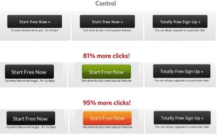
Your call-to-action should stand out from the rest of the page, while making it clear that it is a clickable button. You can accomplish this through design elements like color and size. Bright, active colors are consistently more effective than grays, which tend to appear inactive. The particular click rate on a given call-to-action can vary dramatically according to its color, so this is a detail on which testing can be highly useful.
Here’s an example of one such test:

As a rule, bigger is better for CTAs. A call-to-action typically directs users toward the single action you most desire them to take. The mind interprets the significance of page elements according to their relative prominence, so large buttons lend a CTA an immediate sense of importance and give the page a forward drive. Consider this call-to-action from Spotify:

This CTA employs both bright, appealing, and active colors as well a large and clear design for the buttons to make users’ next step clear. In this case, that next step is to download Spotify. Note that there are actually two calls-to-action directing users to the same end, one in the page’s mainstage and one in the navigation bar. While multiple calls-to-action with different goals could confuse users, this design makes it clear what they should do next.
Copy
In call-to-action copy, active language is more engaging than passive description. Similarly, the text should feel both personal and specific. There are a handful of best practices you can follow to make your CTAs as effective as possible:
- Lead with a verb. Describe exactly what it is that clicking the button will do.
- Be specific. The CTA above doesn’t say “Download app” or simply “Download.” It tells users exactly what they will get.
- Try writing the copy in the first person. The language should speak directly to a desire on the part of the user, and it should feel personal. Try filling in the blank in the sentence, “I want to __________.” Sometimes you may write the copy explicitly in the first person – “Start my free trial,” for example, tests better than “Start your free trial.”
Surroundings
Remember Dan Ariely’s comparison of three different subscription offers for The Economist? It applies to directly to online offers and calls-to-action. When an offer is positioned as the mid-point between two other offerings, it tends to convert at the highest rate – and at a higher rate than if the offer were simply presented on its own.

The middle offer benefits from the presence of less appealing options, which may be pricier on one end and insufficient on the other. Given this context, strategic highlighting may nudge users toward the desired path. Once audiences have demonstrated a preference for this option, you may even reinforce the pattern by labeling this choice the “most popular.”
Testing is Critical
When it comes to CTAs, design and copywriting best practices will only take you so far. The best practice that matters most is testing. A/B testing – comparing the statistical performance of two variants with only one difference – is the only way to learn what works best.
For optimal results, professional services marketers must take a scientific approach to CTAs and maintain that approach diligently. As marketing evolves, the leaders in the field will increasingly set themselves apart by their mastery of the science behind their art.
(151)
Report Post


