— November 2, 2017
Unpleasant name, unparalleled results
Let’s be frank.
The first image that comes to mind when you hear ‘squeeze page’ is probably not pretty.
Flashing arrows, brightly colored text, and copy that attempts to trick visitors into giving up their email have been overused and are simply not effective.
But what if I told you a squeeze page could yield conversions as high as 64%?
In this guide, I’ll show you a few design essentials that will take your squeeze page from a dried-up source of leads to one that becomes an irreplaceable well.
Let’s dive into the key elements of a successful squeeze page:
#1 – A Headline That Entices Visitors To Stay
Headlines can make or break your page’s conversion.
Get them right and visitors will stick around to hear you out, but get them wrong and people won’t think twice about ‘bouncing’ from your page.
Successful headlines need to achieve the following:
- Grab the reader’s attention
- Show the value of your offer
- Be short and sweet
A great way to achieve this is by writing engaging headlines that focus on the benefits of your offer rather than its features.
For example, let’s say you are promoting an eBook detailing email marketing solutions.
Rather than mentioning a title such as “How to automate your emails,” it’s better to say “Drive sales with perfectly-timed emails.”
Take a look at BidSketch’s squeeze page:
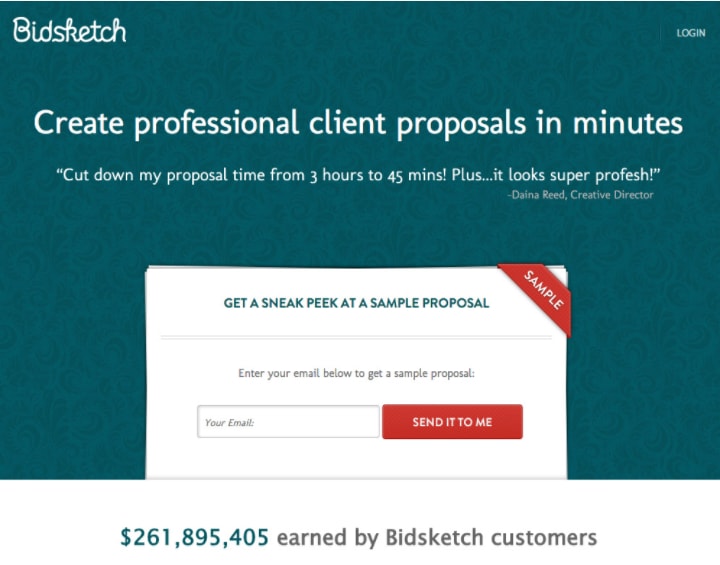
A visitor will be able to determine the value proposition with just a glance of the headline. Also, notice how a subheadline is used to further support their claim with data.
If you’re having trouble determining benefits, ask yourself:
- What problem does your product or service fix for your customer?
- What issues might cause a customer to seek out your product or service?
Alternatively, you can craft headlines filled with power words that elicit an emotional response.
As much as people like to believe they make rational decisions, the truth is that the bulk of decision-making occurs with our emotions.
Determine an emotion that matters to your audience and use power words to draw them out.
Check out this page from Copyblogger:
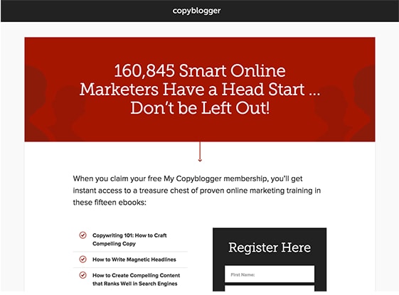
Can you guess the emotion at play here?
Fear of loss (loss aversion) – losing out on a free membership to Copyblogger that their competitors are using to get ahead – drives site visitors to register.
If you’re unfamiliar with power words, acquaint yourself with this great list over at SmartBlogger.
#2 – Scannable Copy
Copy on your squeeze page should be bite-sized and digestible.
The last thing visitors want to see is giant wall of text on your page. Instead, make your pages reader friendly by using bullet-points or numbered lists.
Every word needs to have a purpose and draw visitors closer to giving up their email.
Take a look at this squeeze page from Mindflash:
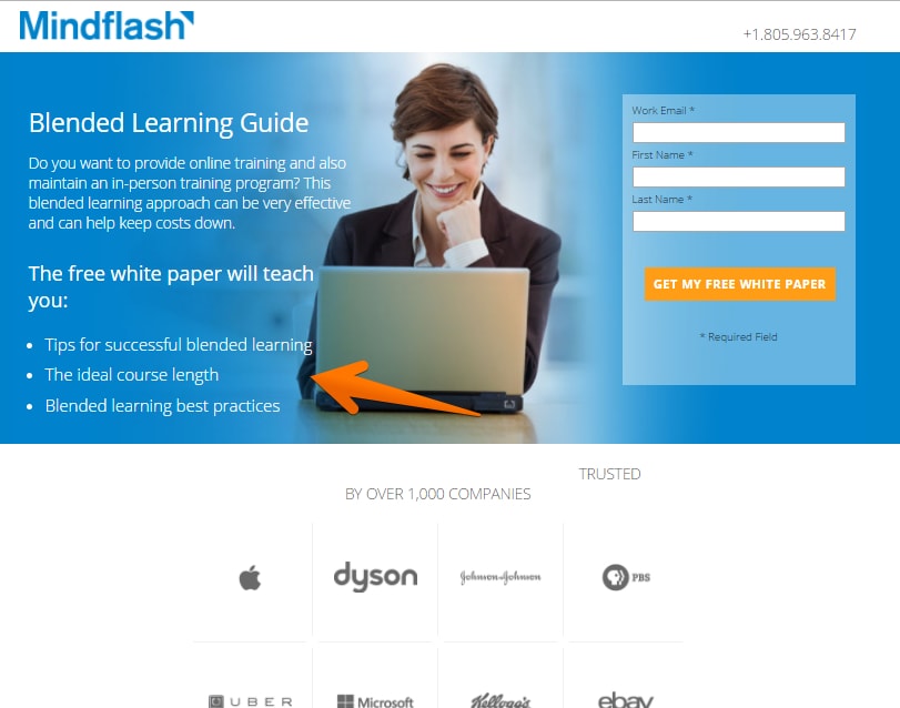
The bullet points tell visitors exactly what they will learn with this white paper.
Where you choose to place scannable copy is incredibly important as well. Studies have shown that readers follow a “F-shaped” pattern when scanning pages online.
Here’s a breakdown of their typical reading pattern:
- Horizontal movement across top of the page
- Shorter secondary horizontal movement below original
- Vertical movement down alongside left of the page
For maximum visibility of points you want readers to see, place your copy in these ‘hot spots.’
3 – Engaging Visuals
A majority of people – 65% to be exact – are visual learners.
People are drawn to images. The human brain is wired to process visuals 60,000 times faster than text.Images are engaging and break down complex information for easy comprehension.
That doesn’t mean you can start adding images of cute kittens (as much as we love them).
Images need to relate to your offer in some context.
Here’s what your images should accomplish:
- Show your product in action
- Associate an emotion with your product
For example, eBooks are generally considered to be less valuable than physical books.
To dispel these thoughts from reducing conversions, include graphics from your eBook directly onto your squeeze page so that readers can preview its value.
Take a look at Visage’s squeeze page:
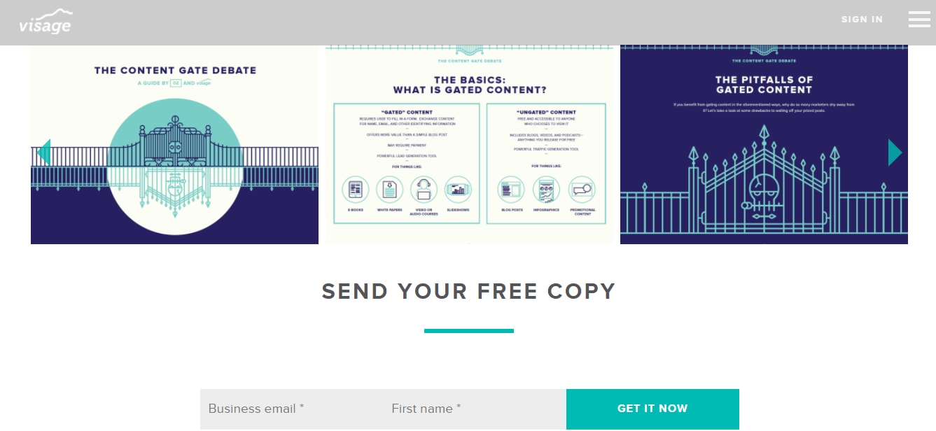
It features not one but several graphics of their eBook content.
When possible, try to add an image of a person on your squeeze page. Photos of people leave a positive impression of your brand and help to build trust.
Additionally, you can use a person’s gaze to subconsciously guide visitors to important page elements such as your opt-in form.
Check out this squeeze page from FitLife:
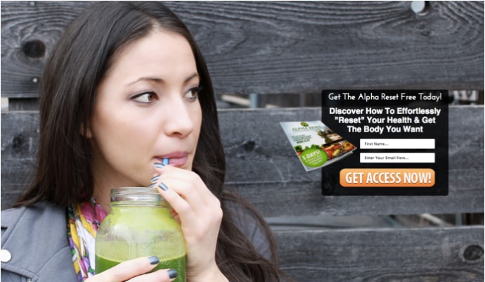
It shows their product in action (juice cleanse) and features an image of a healthy-looking woman looking in the general direction of the opt-in form.
You can also use other visual tools such as arrows to direct visitor attention where you want it.
Visual doesn’t always have to be images.
Video is becoming an extremely important medium for people to satisfy their information needs and it is perceived to have higher value than images or text.
Here’s how Market Samurai uses video on their squeeze pages:
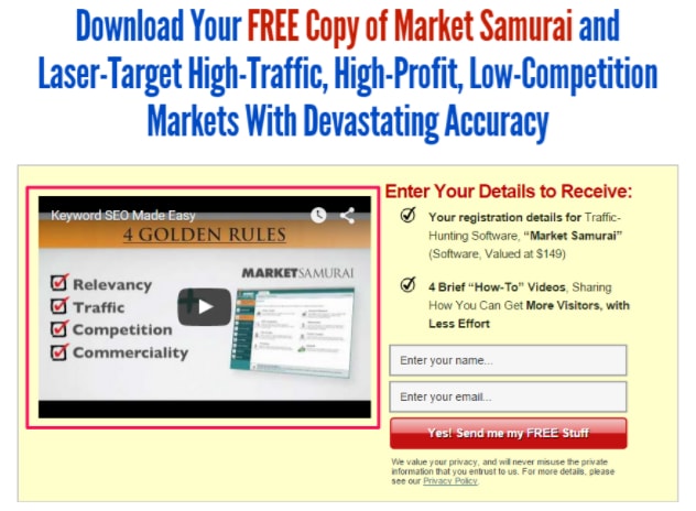
Videos can be consumed passively and make it easy to educate and convince users to provide their email.
Additionally, videos can lead to an SEO boost as they increase the amount of time spent on site. This signals search engines to rank your site as more relevant.
#4 – Don’t Get Greedy
A squeeze page’s sole purpose is to collect emails.
Ideally, you should limit your opt-in forms to one form field (at maximum two – to ask for name) to minimize any friction that may otherwise prevent visitors from giving up their email.
You don’t need a visitor’s billing address from the start.
You can gather this information as you progress a lead down your conversion-funnel.
Check out OkDork’s squeeze page:
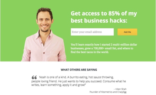
Noah Kagan’s value proposition is clear and he doesn’t make it a difficult for visitors to sign-up and receive tips from him.
Preferably, opt-in forms should be placed above the fold.
Hiding them from view confuses visitors as to what you’re asking them to do.
If you are going to place your opt-in form below the fold, make sure you plant a visual cue that tells visitors to scroll down (such as an an arrow indicating to scroll down).
Lastly, your opt-in forms should feature a strong call-to-action (CTA).
Include a clear and contrasting CTA with short actionable copy such as “Start Learning Now” to draw visitors into your offer.
Check out Fisher Investment’s landing page:
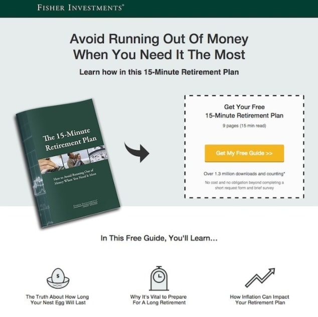
The CTA visually stands out from the rest of the page and immediately directs a visitors attentions towards it.
#5 – Establish Credibility With Testimonials and Trust Symbols
Lack of credibility or trust in a business is a major roadblock for action.
When visitors land on your squeeze page, they have no means to determine whether your offer is genuine or if you’ll end up spamming them.
Here’s how you solve this:
- Add social proof from real people that your target-audience can relate to
- Add trust symbols that showcases any public recognition your brand has received
Social proof
People don’t like to make tough decisions themselves.
Instead, they look for guidance from their peers and conform to their actions.
One tactic you can use is ‘wisdom of crowds’ in which you mention the exact number of people who are already subscribed to your email list.
For example, “Sign up to join our 9,600 satisfied subscribers.”
This makes it hard to resist your offer as it tugs at a visitor’s inherent desire to follow their peers.
Another tactic you can use is to place testimonials on your page from individuals who have already provided their emails and found real value in your offer.
This serves as a social endorsement that your offer is legit.
Take a look at Copygrad’s squeeze page:
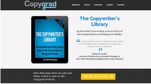
While these testimonials are great, Copygrad could have gone a step further and added images of the people who provided these testimonials.
Remember that images of other people establishes trust.
Trust Symbols
If you don’t have a large email list or know someone who can provide a genuine testimonial, you can add logos from recognized institutions associated with your brand to build credibility.
This lets visitors know that if your service was valuable to industry players, then it must be valuable to them also.
Take a look at Tim Ferris’s squeeze page:
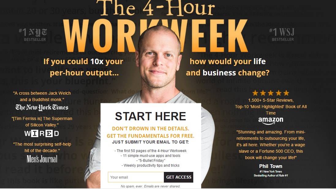
It’s littered with testimonials from well-recognized global brands.
#6 – Embrace White Space
On a squeeze page, less is always more.
White space acts as visual aid that guides visitors to the most important elements on your page, such as your opt-in form.
It does this by reducing clutter and making your page aesthetically pleasing, which leads to:
- Increased readability
- Improved user focus
- Greater comprehension of your offer
The number of items an average human can hold in short-term memory is 7 (plus or minus 2).
By limiting the number of focal points on a page, white space reduces cognitive overload which can otherwise make it difficult for visitors to absorb and retain information.
With less choices to make, it’s easier for visitors to make a decision and act.
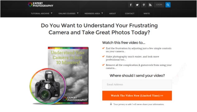
Expert Photography’s squeeze page makes effective use of white space.
#7 – Match Design To Its Traffic Source
It’s likely that an overwhelming majority of traffic to your squeeze page comes from search engine listings and social ads.
Your squeeze page needs to provide visual continuity for optimal user experience.
Any mismatch between these elements and your squeeze page leads to poor conversions.
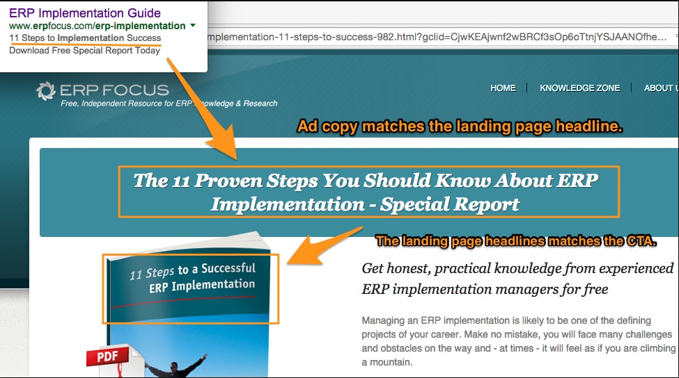
Make sure to use the same language on your squeeze page as you do in the listing or ad that brought the reader to that page.
If you lead visitors to a page with something different, you’ll lose engagement and trust.
Here’s a great example of message matching from ERP Focus:
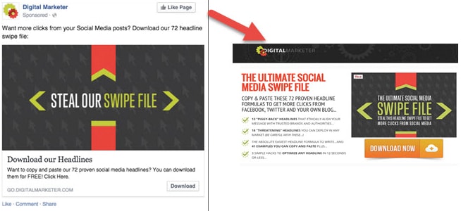
On a social ad, you need to be extra careful and ensure your design (copy, images, and theme) matches between both mediums.
DigitalMarketer.com achieves this effectively.
When visitors do land on your squeeze page, there should be no navigable links away from your squeeze page that serve to distract attention.
Let’s Get Squeezing
Now that you have a good idea of what components combine to form a conversion-focused squeeze page, it’s time to put these ideas to the test and start gathering more leads.
Start off by breaking your page down into separate sections and systemically moving elements section by section to optimize for headline, copy, visuals, opt-in form, and testimonials.
Cap off your page by making sure there is ample white space and that there is no message mismatch between your traffic source and your squeeze page.
Now sit back and watch page visitors follow your squeeze page funnel and succumb to your lead magnet.
Digital & Social Articles on Business 2 Community
(107)
Report Post


